









Blogs by Kiran Kulkarni
TL;DR
- Most B2B SaaS websites underperform because they're built for visual appeal rather than conversion.
- That’s why average conversion rates hover around 1.1%, well below the 2.9% overall B2B average.
- A lot of investment goes into driving awareness, including ads, SEO, and campaigns, bringing more people to the site. But when those visitors arrive, they’re met with generic messaging, unclear pricing, and weak proof.
- Web design agencies in Virginia offer more flexible pricing and faster timelines, making them a better fit for early-stage startups and smaller SaaS teams.
- Choosing the right agency comes down to growth stage, conversion thinking, and whether the agency has direct SaaS experience, not just a strong portfolio.
- ThunderClap takes a journey-level approach to web design, treating your website as a connected revenue system rather than a collection of standalone pages.
Virginia isn’t just “another tech state.” It quite literally runs the internet.
In fact, Northern Virginia alone handles a massive share of global data traffic, with Ashburn widely known as “Data Center Alley.” The state’s data center industry generated nearly $40 billion in economic impact in 2025, driven by a high concentration of cloud, AI, and cybersecurity companies.
Buyers here are more technical, sales cycles are longer, and your website is often the first serious evaluation layer, not just a marketing asset.
Which means web design here cannot be surface-level.
In this guide, we’ll break down 7 web design companies in Virginia that understand how to design for that level of scrutiny and complexity.
What Makes a Web Design Company Actually Good for B2B & SaaS (Not Just "Creative")
The web design market is full of agencies with beautiful portfolios and empty case studies. For B2B and SaaS companies, the gap between a good-looking site and a site that generates pipeline is enormous.
Here's how the best ones actually think.
They design for conversion, not just visuals
A conversion-focused agency starts with clarity, not color palettes. They think about what a visitor needs to understand before they’re ready to take the next step. CTA placement, information hierarchy, and message clarity come first.
Because when messaging is unclear or buried under features, leads drop off long before a form is ever filled.
A good example of this is NativeMSG. The product was strong, but the website didn’t reflect its leadership in RCS. Prospects didn’t understand what RCS could actually do. The site relied on feature lists rather than showing outcomes.
The challenge was to make the platform instantly clear, visually compelling, and category-defining.
Here’s what changed:
- Built 40+ visual mockups with real message examples so users could understand RCS in minutes
- Developed a layered visual system inspired by the logo to signal structure, security, and reliability
- Chose a green-focused palette to stand out and reinforce clarity and growth
- Shifted from features to outcomes like engagement, ROI, and conversions across industries
- Created dedicated pages for Creator, Cloud, and Connect to simplify the platform architecture
- Prioritized experience-first storytelling that was educational, interactive, and scalable
Kiran Kulkarni, Partner & Head of Growth at ThunderClap, mentioned the revamp helped NativeMSG turn education into a conversion asset and drive a more qualified pipeline.
They understand SaaS buying journeys
B2B SaaS purchases rarely happen in a single session. According to 6sense's 2025 Buyer Experience Report, the average B2B buying team includes more than 10 people, and the average deal takes just over ten months to close.
That kind of buying process involves multiple stakeholders, multiple visits, and multiple points of consideration. An agency that doesn't understand this will build pages, not experiences, and there's a meaningful difference between the two.
They align design with positioning and messaging
The best agencies don't just execute UI. They first define what the website needs to say.
A strong example of this is Ramp. Instead of listing features like expense controls or reconciliation tools, Ramp built its entire messaging around a single outcome: saving companies time and money.
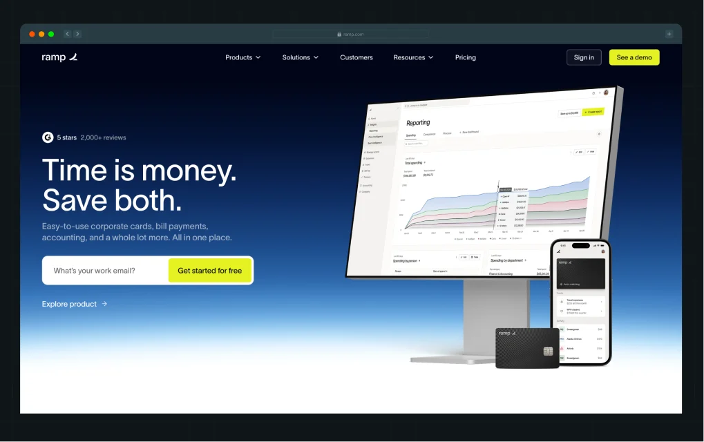
When market conditions shifted in 2022, and CFOs began prioritizing efficiency, that message became even more relevant. It wasn’t reactive. It was already aligned with what buyers cared about.
What makes this work is consistency. The phrase “Time is money. Save both.” appears across the homepage, product experience, sales conversations, and content. There’s no disconnect between what buyers read, hear, and evaluate.
This shows up in recent research, which finds that buyers spend only about 17% of their journey interacting with sales. The rest happens through independent research and internal discussions. If messaging changes across touchpoints, clarity drops, and trust follows.
They think beyond launch
In SaaS, launch day is day one, not the finish line. The agencies that deliver real results plan for iteration, CRO testing, and scalability from the start.
A static website in a fast-moving market becomes a liability fast. They also understand that user behavior post-launch tells you more than any pre-launch assumption.
That's where understanding how users move across your site over multiple sessions becomes critical.
Best 7 Web Design Companies in Virginia for B2B & SaaS Growth
Before we break down each agency, here’s a quick look at where they’re based in Virginia and the type of B2B and SaaS companies they’re best suited for, so you can quickly narrow down what actually fits your stage and growth goals.
That said, let’s get started!
1. ThunderClap
.webp)
When B2B and SaaS companies need websites that actually convert, they choose ThunderClap. We do not operate as a traditional design agency focused solely on aesthetics. We build websites that function as revenue systems and support your sales team from the first click to the final decision.
With 144+ websites launched and a strong focus on conversion rate optimization (CRO), we consistently turn strategy and design into measurable business outcomes. What makes ThunderClap a leading choice among B2B web design agencies in Virginia is a clear focus on outcomes over visuals. Every page, interaction, and design decision supports one goal: converting visitors into qualified leads. We design for B2B buyers who need clarity and guidance, not just information, and we build journeys that support complex decision-making.
We also deliver enterprise-grade websites in 8 to 10 weeks. Our process moves faster than traditional agency timelines while maintaining a strong focus on quality, scalability, and performance.
For example, Z47 partnered with ThunderClap after its rebrand from Matrix Partners to better align its positioning with an Indian audience. After the revamp, the brand saw a 50% increase in website engagement and a 54% increase in active users.
Core strengths
- Web design and development, including Figma to Webflow builds, CMS setups, enterprise websites, migrations, and custom integrations
- Revenue-focused design that connects messaging, UX, and conversion architecture
- Deep understanding of multi-stakeholder SaaS buying journeys
- Post-launch CRO and continuous iteration as part of the engagement model
- Behavioral insights that guide design decisions instead of subjective opinions
Why it stands out for SaaS
With 140+ websites launched and 10+ industry awards, ThunderClap brings proven expertise across SaaS, fintech, AI, consulting, and broader B2B industries. Our work consistently helps clients achieve measurable impact, including up to 50% increases in conversions and up to 60% increases in engagement.
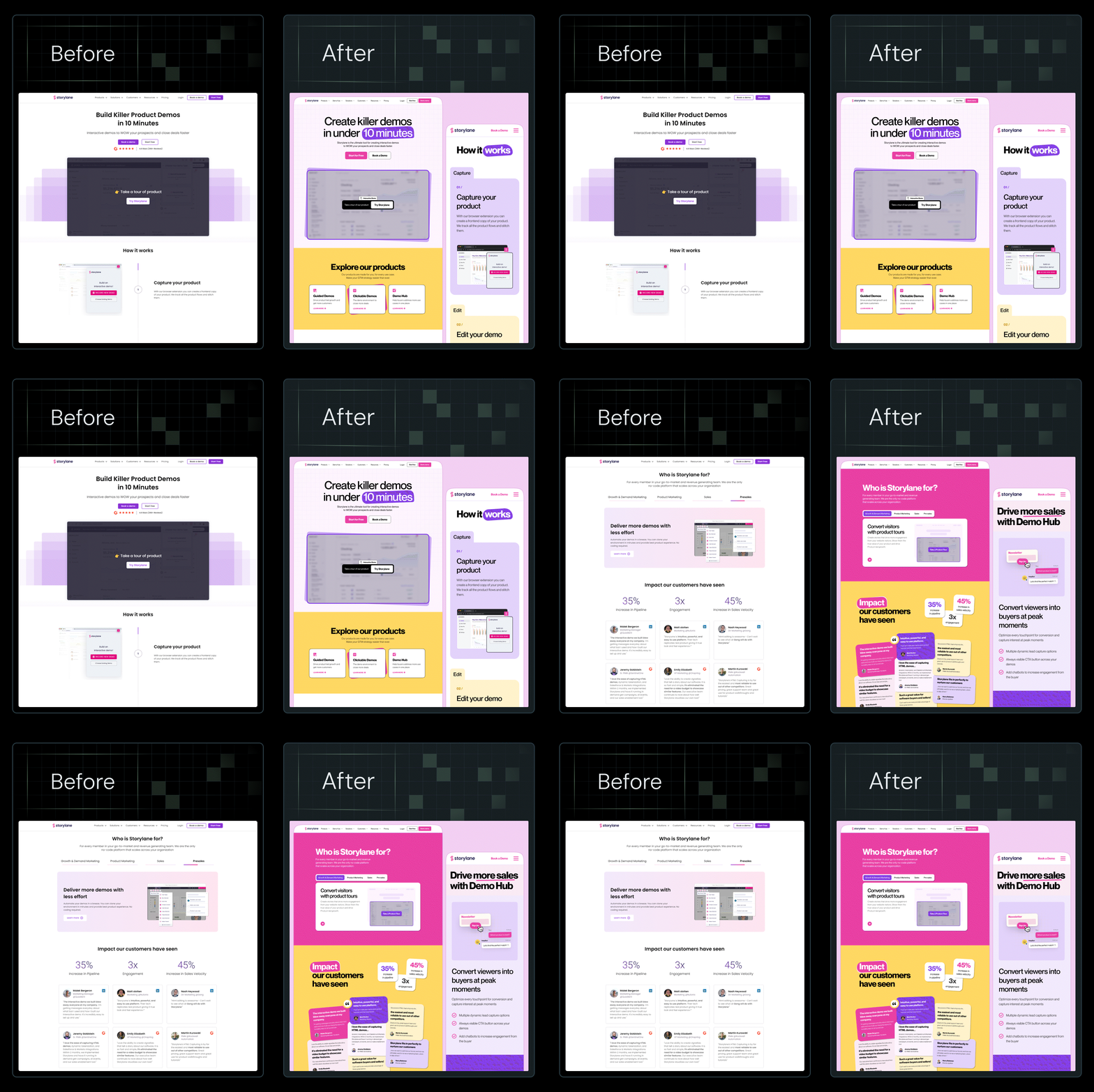
Some of our clients include Storylane (the 6th-fastest-growing SaaS on G2), ClearlyRated (top 500 U.S. SaaS per Inc.), and Deductive AI (raised a $10M seed round). ThunderClap’s projects consistently propel brand professionalism, engagement, and funding success.
2. 99medialab
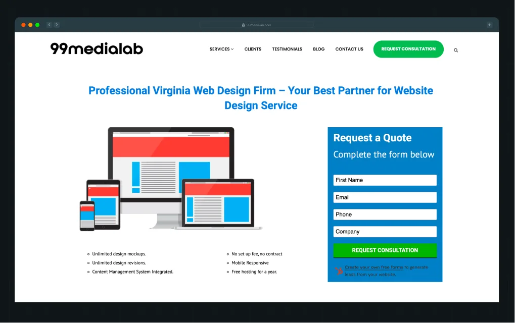
99medialab positions itself as a full-service web design partner for small businesses seeking a simple, managed, low-friction way to get online. What makes 99medialab appealing to small businesses is the promise of flexibility and ease.
They offer unlimited design mockups and revisions, CMS integration, mobile-responsive builds, and even free hosting for a year.
Core strengths
- Unlimited design mockups and revisions for fast iteration
- CMS-based websites for easy non-technical updates
- End-to-end setup including design, development, hosting, and support
- E-commerce websites focused on simple structure and usability
Why it stands out for SaaS
Its speed-first, CMS-driven approach makes it suitable for early-stage SaaS teams that need quick, functional websites without heavy strategy or long build cycles.
3. Fuselab Creative
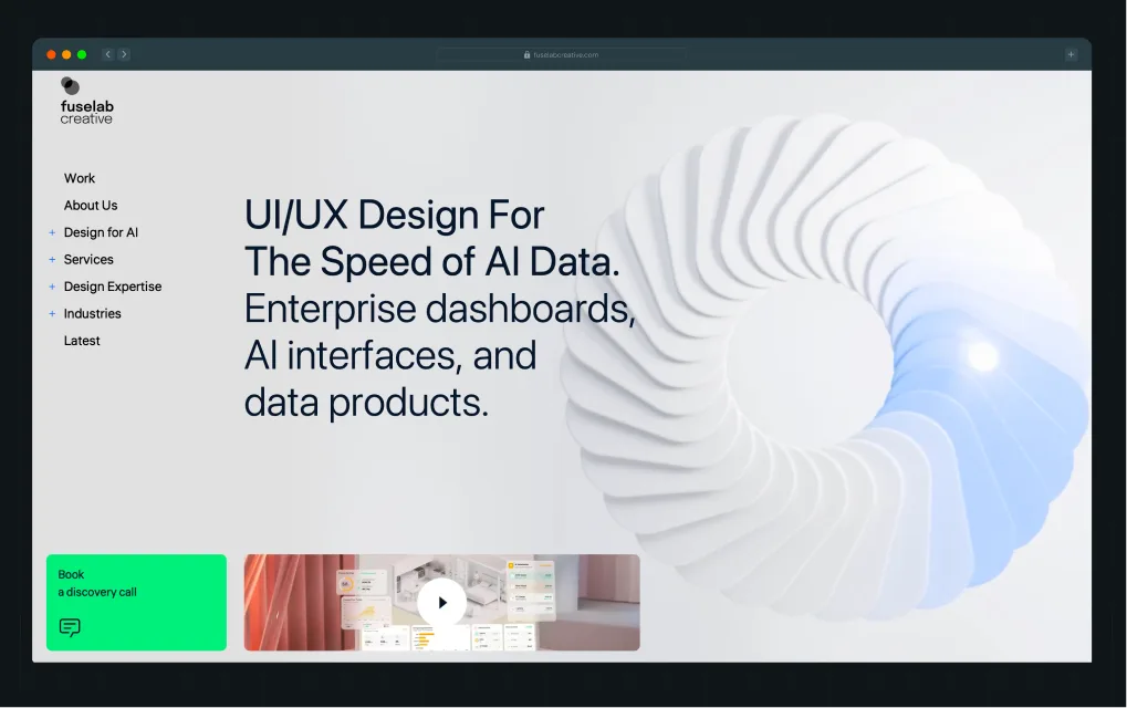
Fuselab Creative is a US-based UI/UX and digital product design agency focused on building intelligent, data-driven interfaces for complex systems.
Trusted by organizations like NASA, Uber, and Mozilla, they blend research-led UX thinking with modern interface design to help teams turn complex data and workflows into usable, high-performance digital products.
Core strengths
- Deep expertise in AI-first UI/UX and complex dashboard design for enterprise systems
- Strong focus on data visualization and turning complex datasets into usable interfaces
- Proven credibility with high-profile clients like NASA, Uber, and Mozilla
- End-to-end product design capabilities, including UX research, design systems, and prototyping
Why it stands out for SaaS
Fuselab stands out in SaaS for its expertise in designing complex, data-heavy interfaces such as admin panels, analytics dashboards, and AI-driven workflows. This makes it especially strong for SaaS products that rely on clarity, retention, and high user engagement in feature-rich environments.
4. Buarich
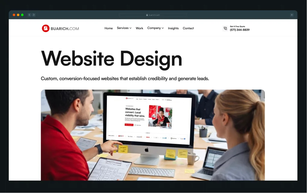
Buarich is one of the best web design companies in Northern Virginia, focused on helping local service businesses grow through websites, SEO, and lead generation systems.
The agency positions itself as a growth partner for coaches, consultants, contractors, and small businesses that want more visibility and consistent inbound leads.
Core strengths
- Conversion-focused website design built for lead generation
- Local SEO and Google Business Profile optimization for stronger regional visibility
- Funnel building and landing page systems designed to capture and convert inbound traffic
- End-to-end digital execution, including websites, SEO, content, and ongoing optimization
Why it stands out for SaaS
Its strength in conversion funnels and performance-driven local SEO makes it relevant for early-stage SaaS companies testing demand niche markets where direct lead generation matters more than brand-led positioning.
{{specficService}}
5. Materiell
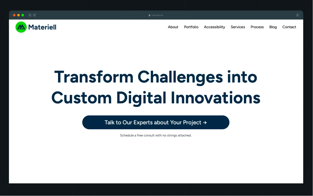
Materiell is a WordPress-focused agency with a notably strategic approach to content architecture and UX.
Their work is clean, accessible, and built around the idea that content, not just design, is what converts a skeptical B2B buyer.
Core strengths
- Strong focus on UX and accessibility across complex content structures
- WordPress-native approach that prioritizes flexibility and scalability
- Clean, structured design that keeps content front and center
Why it stands out for SaaS
For SaaS companies where blog content, resource libraries, or gated assets drive a significant share of leads, Materiell understands how to build a content experience that pulls buyers deeper rather than losing them.
6. Lounge Lizard
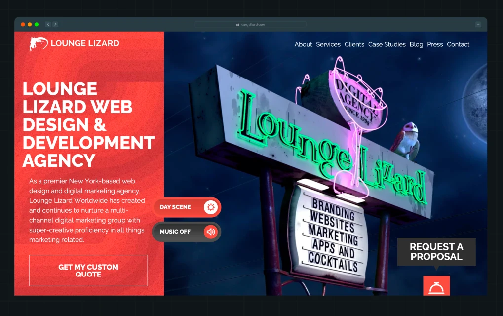
Founded in 1998, Lounge Lizard builds custom websites that combine strong visual design with reliable engineering. The agency works with established brands and growth-focused companies to create responsive websites that perform across devices and support measurable business outcomes.
Its approach blends development, branding, and digital marketing so that websites function as both experience platforms and conversion tools.
Core strengths
- Custom web development using modern front-end and back-end technologies, including HTML5, CSS3, JavaScript, and PHP
- CMS development and integration across platforms like WordPress and Drupal
- Ecommerce development across platforms such as Shopify and Magento
- Integrated brand strategy and digital marketing support aligned with website performance
Why it stands out for SaaS
It combines technical depth with brand and marketing alignment, making it suitable for product-led teams that need scalable websites with strong engineering foundations and multi-channel consistency.
7. Innostax
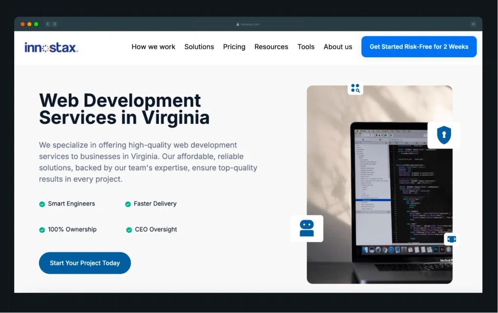
Innostax is an engineering-led partner that prioritizes speed, ownership, and technical depth over traditional design.
With a strong emphasis on backend systems, scalable architecture, and dedicated development teams, Innostax works with companies that need complex products built from the ground up or existing systems modernized for performance and scale.
Core strengths
- Custom web application development, including CRM systems, analytics platforms, and enterprise tools
- Full-stack engineering capabilities covering frontend, backend, and API driven architectures
- SaaS product development with a focus on scalability, security, and cloud-based delivery
- Dedicated development teams with end-to-end ownership, QA, and ongoing maintenance
Why it stands out for SaaS
It focuses on engineering depth and scalable product development, making it suitable for teams building or expanding complex SaaS platforms that require strong backend systems and long-term technical ownership.
Web Design Companies in Northern Virginia: What to Expect
Northern Virginia is home to more than 8,900 technology companies and is consistently recognized as one of the nation's leading tech hubs, with particular concentration in AI, cybersecurity, and cloud infrastructure.
Most of them have deep experience working with enterprise clients, government-adjacent technology companies, and organizations operating in regulated industries. Projects in this region tend to come with more complex requirements, more stakeholders, more structured processes, and correspondingly higher price points.
Here’s who Northern Virginia agencies are best for:
- Enterprise SaaS companies with multi-stakeholder buying processes
- B2B technology companies working in compliance-heavy or regulated environments
- Organizations that need advanced information architecture and enterprise-grade technical builds
- Companies willing to invest in a more comprehensive, longer-term engagement
If you're a growth-stage SaaS company with a clear enterprise focus, Northern Virginia's agency ecosystem offers real depth.
Best Web Design Companies in Virginia Beach: A Different Market Dynamic
The best web design companies in Virginia Beach operate in a very different ecosystem from that of Northern Virginia.
While Northern Virginia agencies tend to focus on enterprise SaaS, complex UX systems, and high-ticket B2B retainers, Virginia Beach is shaped more by small and mid-sized local businesses, service providers, and regional brands. This difference directly influences how agencies price, deliver, and structure their services.
Pricing and service models
Pricing in Virginia Beach is generally more flexible and accessible. Instead of large enterprise retainers, many agencies offer mid-range or budget-friendly project packages tailored to small business needs. The emphasis is often on getting businesses online quickly rather than engaging in long discovery or strategy phases.
Common approaches include:
- Entry-level website packages, sometimes advertised in the $5,000 to $10,000 range, typically include basic setup and SEO
- Mid-sized companies and professional service providers typically invest between $25,000+ for full-service website projects, including design, UI/UX development, and content strategy
- Hourly plans around $100-$300/hour that bundle hosting, maintenance, and ongoing updates
- Low-friction onboarding models such as free demos, no-contract agreements, and “cancel anytime” options
These models are designed to reduce barriers for small businesses and simplify the decision-making process.
Turnaround time and delivery
Turnaround times are also typically shorter. Because projects are often less complex and frequently built on WordPress, templates, or CMS-based systems, many agencies can deliver functional websites within a few weeks.
This contrasts with Northern Virginia firms, where projects often involve longer timelines driven by deeper strategy work, custom development, and enterprise-level requirements.
How to Choose the Right Web Design Company for Your SaaS Business
Most companies get agency selection wrong in the same way. They look at portfolios, pick what looks best, and then wonder why the site doesn't convert.
Here's a more useful framework.
Start with your growth stage
The right agency at one stage can be completely wrong at another. To give you a better idea:
- An early-stage SaaS company needs a site that validates positioning and captures early demand.
- A scaling company needs infrastructure for CRO and iteration.
- An enterprise needs a complex information architecture, and compliance-grade builds.
Know where you are before you start shopping.
Evaluate based on conversion thinking, not portfolio
A portfolio tells you what an agency can make. It doesn't tell you what those sites produced. Ask specifically:
- What did this design drive?
- What changed in the funnel after launch?
- What was tested and why?
Agencies with genuine conversion thinking will answer those questions with data, not design descriptions.
This matters because users don’t evaluate websites the way agencies think they do. As Kiran points out in a LinkedIn post on B2B website behavior, people often do a silent first-pass judgment of clarity, messaging, and credibility within seconds of landing on a site:
This reaction tells us why “looks good” is not the same as “performs well.”
Look for SaaS-specific experience
Some companies choose agencies based on industry expertise rather than location. In SaaS and B2B, this is very important, as buying decisions are rarely made by a single person. Instead, they involve a mix of technical users, non-technical stakeholders, and decision-makers who evaluate risk, ROI, and usability from different angles. This makes conversion fundamentally different from traditional marketing websites. Messaging, UX, and structure must work together to address multiple perspectives in a single journey.
Most generalist agencies miss this. They apply standard marketing or design frameworks that don’t account for layered decision-making, resulting in weaker conversion performance.
ThunderClap builds dedicated SaaS teams across UX, messaging, CRO, motion design, and Webflow development. Instead of a generalist approach, clients get a coordinated team optimized for SaaS conversion problems.
Hiring in-house often creates a single point of failure, since SaaS websites require multiple disciplines working together. One person cannot reliably cover UX, messaging, CRO, and development at a high level. Agencies reduce this risk by bringing together specialists who already understand SaaS workflows and execution patterns.
Assess their process
The discovery and strategy phase is where good agencies separate themselves.
- Do they ask about your buyer personas before they wireframe?
- Do they validate assumptions with behavioral data, not just best-practice opinions?
- Do they plan for iteration post-launch?
Process quality predicts outcome quality more reliably than portfolio quality, with strong agencies investing deeply in understanding the context during discovery before design begins.

Agencies that think in terms of user journeys across multiple sessions, not just individual page designs, tend to produce significantly better results.
This is also where post-launch tools that surface actual behavioral data make a meaningful difference in what gets optimized and when, and in which decisions actually get prioritized.
{{specficBlog}}
Why B2B & SaaS Companies Outsource Web Design to ThunderClap
You have 7 agencies to choose from here, each with its own strengths and focus areas.
But if you’re a growth-stage SaaS company that cares about clear positioning and higher conversions, ThunderClap is built specifically for that use case.
Here’s why:
Because a good-looking website is no longer enough
ThunderClap's design process starts with the buying decision, including what a prospect needs to understand, and when they need to understand it, and works outward from there.
That's a fundamentally different starting point than color palettes and hero images.
Because B2B buyer journeys don't follow page boundaries
Research suggests that 83% of direct contact with vendors occurs on your website, your competitors' sites, review platforms, and peer networks, across multiple sessions over months. Pages don't convert in isolation. Journeys do.
ThunderClap designs for how users actually move through and return to a website over time, not how they theoretically should move through it in a single session.
Because "launch" is just the starting point
The traditional agency model treats launch as the deliverable. In SaaS, launch is the beginning of an optimization cycle.
ThunderClap builds for continuous improvement, which means the engagement doesn't end when the site goes live. It shifts into iteration mode, informed by real user behavior rather than post-launch assumptions.
Because the team behind your website matters more than the deliverable
Two agencies can produce visually similar websites. What they can't replicate is the thinking that goes into them. ThunderClap brings strategy, messaging, and conversion architecture to every project. The output looks similar on the surface. The revenue impact doesn't.
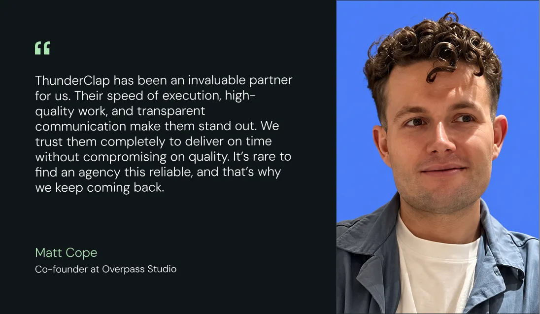
Clients often point out that this difference shows up most after launch, when execution speed and clarity of thinking become critical to growth.
Because visibility into user behavior changes everything
Most redesigns are driven by gut feel, not behavioral data. Real optimization requires understanding where users drop off, which pages create friction, and which journeys actually lead to conversions.
For example, Factors.ai’s brand evolution shows this shift in practice. Their product already supported complex, data-heavy workflows, but the website wasn’t structured to convert that complexity into clarity.
ThunderClap re-anchored the entire experience around a “Marketing Compass” concept, positioning the platform as a guide through the buyer journey rather than just another analytics tool. The redesign reduced cognitive load with clearer visual systems, improved functional hierarchy to make the story scannable, and used contextual design patterns to reinforce understanding at every step.
As Ayush Barnwal, Partner at ThunderClap, noted, the redesign helped Factors.ai establish a premium, globally ready brand.
{{ctaBlock}}
FAQs
1. How much do web design companies in Virginia charge?
Web design pricing in Virginia varies significantly based on project scope. Basic websites typically range from $5,000 to $10,000+, while mid-tier SaaS websites with CRO and strategy components usually fall between $20,000 and $40,000+. Enterprise or fully custom builds often start at $60,000+ and scale up from there. The biggest drivers of cost are complexity, degree of customization, and the extent of strategic and conversion work included in the engagement.
2. How long does it take to build a website with a Virginia-based agency?
Timeline depends on project scope and how ready your team is on day one. A basic website typically takes weeks. A mid-size SaaS site with strategy, UX, and CRO elements usually runs for months. An enterprise built with a complex architecture can take over 6 months.
3. Are web design companies in Virginia suitable for B2B and SaaS businesses?
Yes, but only the ones with direct experience in conversion-focused design and SaaS buyer journeys. Agencies like ThunderClap specialize in building websites structured around SaaS buying behavior, positioning clarity, and conversion-led design rather than mere visual appeal.

The average B2B buyer in the UAE is hard to impress. On Monday, they might be evaluating a local vendor. On Tuesday, they're sitting through a demo from a US company. By Friday, they're comparing both against a regional player they met at GITEX.
Buyers here don't think in terms of local versus global. They expect both. The polish of an international brand and the understanding of someone who knows the market. And they're quick to notice when a company feels disconnected from the one it's selling into.
That's also what makes choosing between B2B branding agencies in the UAE more difficult than it first appears. Some agencies are better at helping startups prepare for a funding round. Others are stronger in enterprise repositioning, regional expansion, or category creation.
In this article, we put nine branding agencies in the UAE through the same five-point test:
- Can they tie the brand to revenue?
- What is included in the engagement?
- Where does their process start?
- Will they challenge your thinking?
- What happens after launch?
So you can skip the discovery calls that go nowhere and find the agency that has solved your specific problem before. Also, if you're short on time, jump to the TL;DR.
TL;DR
Here’s the list of the top 9 branding agencies in the UAE at a glance:
How to Pick the Right B2B Branding Agency in the UAE: The 5-Point Test
Here are five questions worth considering before you sign with any B2B branding agency in the UAE:
1. Can they connect your brand to your pipeline?
Branding does not generate a pipeline overnight. But it does affect whether your ICP trusts you enough to take a meeting, whether your positioning holds up in a competitive deal, and whether your sales deck feels credible. Brand storytelling also matters here. Buyers are more likely to remember a clear story about the problem you solve and why your company exists than a list of product features.
When speaking with a branding agency, ask what business problem they were trying to solve for past clients and how the branding helped. Was it to enter a new market? Support a funding round? Build more credibility with enterprise buyers? Good agencies should be able to explain the thinking behind their work, not just show a polished logo or website.
For example, Skyroot Aerospace became India's first private space tech unicorn. We worked on their brand before that milestone. A good agency should be able to explain why a company invested in branding at that stage of its journey and what business challenge it was trying to solve.
2. Do they tell you what is actually included?
Scope is where most branding engagements get messy. Different branding agencies bundle things differently. Some include messaging, some do not. Some hand off brand guidelines; others help you implement them. Before you sign, ask what is core to the engagement and what falls outside it.
If the project includes a website design or revamp, ask whether the agency will also define the key website design elements, such as page structure, visual hierarchy, navigation, and conversion points, or whether those decisions will be left to another vendor. The clearer an agency is about this upfront, the fewer surprises mid-project.
3. Does their process start with research or aesthetics?
Ask what the first four weeks look like. A process grounded in brand audits, buyer research, and competitive positioning looks very different from one that leads with visuals. A fintech brand in the UAE might be pitching to an Emirati family office, a European fund manager based in DIFC, and a regional bank all at once. Those are not the same buyer. An agency that starts with a mood board is not equipped to handle that.
The stronger processes tend to start by mapping market position, user journeys, and conversion goals before any creative direction is set. Work built on that foundation tends to hold up better in the market because it's based on something real, not an assumption.
4. Will they push back or just take the brief?
Ask them for a specific time they pushed back on a client brief and what happened. It is a simple question that tells you a lot.
As Ragini Ramanathan, creative director at ThunderClap, puts it:
“The goal is never to win an argument. It is to understand where the client is coming from, weigh that against what the ICP actually needs, and work toward a decision that serves the brand. Both sides are after the same outcome.”
5. What happens after launch?
Good branding doesn't end on launch day. Ask how the brand positioning agency measures success once the work is live. Look for answers to questions like: Is the message clearer? Do customers understand what the business does more quickly? Is the sales team actually using the new website and brand assets? Good rebranding agencies should check in after launch, gather feedback, and make improvements where needed.
Which branding agencies in the UAE are best for B2B companies in 2026?
Our list started with 30+ of the best branding agencies in the UAE. From there, we filtered agencies based on the quality of their B2B work, case studies, client reviews, and industry reputation. Each agency on the shortlist was then evaluated against the five-point framework outlined above.
And here are the nine UAE branding agencies that made the cut.
1. ThunderClap
Best for: Mid-market and enterprise B2B companies undergoing a rebrand, a funding round, or market expansion that need a website aligned with their GTM efforts.
ThunderClap is a B2B web design and branding agency that has partnered with 100+ brands, including roommaster, Factors, Gen101, Razorpay, Storylane, and Skyroot. They've won 10+ industry awards, including the Webby Awards and CSS Design Awards.
Website: thethunderclap.com
Clutch Rating: 4.9
Company Size: 11 to 50
Services Offered:
- Brand strategy
- Brand positioning
- Website copy
- Web design
- Web development
- Website migration
- Website maintenance
Why choose ThunderClap for B2B branding?
- Conversion outcomes are part of the conversation from day one: roommaster saw an 80% rise in demo requests after their rebranding. In both cases, the work started with understanding how buyers evaluate, trust, and decide in those markets rather than jumping straight into visual direction.
- Experience across SaaS, AI, FinTech, VC, and HR tech: Each B2B sector comes with different credibility signals, buyer committees, and reasons why high-intent visitors drop off before booking a demo. That context shapes how we approach B2B branding strategy, positioning, messaging, and website structure.
- The same team stays involved from strategy through launch: We have an in-house PMM team working alongside designers and developers throughout the project. The people responsible for understanding your market, buyers, and GTM strategy remain involved as decisions are made.
- 30 days of post-launch support is included: Navigation issues, form drop-offs, and messaging gaps often become visible only after real buyers start using the site. The post-launch period exists to identify and fix those issues early.
Reviews:
"The team is thoughtful, responsive, and has exceptional design sensibility. Bringing our collective brand vision to life wasn't easy, but the results speak for themselves." - Darryl Pinto, Growth Marketing Manager, Amazon.
Notable clients:
1. WizCommerce is a wholesale commerce platform built for manufacturers, distributors, and wholesalers. When the team approached us, they already had strong messaging. What they needed was a brand that gave the product the same level of credibility.
The project focused on aligning the visual identity with the story the platform was already telling. Ayush Barnwal, Founder and Head of Design at ThunderClap, shares more about WizCommerce's branding here.
2. Factors.ai That's where the Marketing Compass came from, a concept inspired by the product's ability to make complex buying journeys easier to understand. Here’s another LinkedIn post from Ayush where he walks through the idea behind the Marketing Compass in this post:
3. VuNet: VuNet helps banks monitor billions of transactions across complex systems. The challenge was helping buyers understand the platform without first sitting through a product demo.
We did this by simplifying the messaging, clarifying the product story, and making the platform easier to navigate. Here’s a post from Ayush explaining how ThunderClap simplified a complex banking platform for enterprise buyers.
{{specficBlog}}
2. Neue World
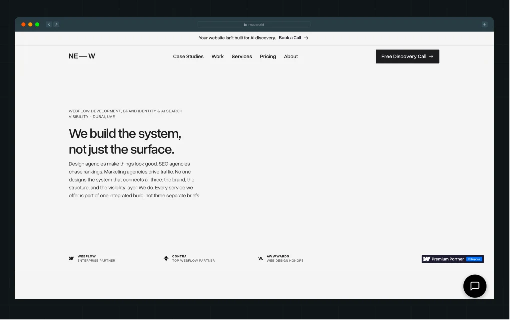
Best for: B2B companies in fintech, climate tech, AI SaaS, and government infrastructure that need brand positioning and AI search visibility handled as one system
Neue World is a Dubai-based branding, web design, and AI search visibility studio founded in 2021. They are a Webflow Enterprise Partner, a Contra Top Webflow Partner, and an Awwwards-recognized studio with 80+ projects across the UAE, the US, and the UK.
Website: Neue World
Clutch Rating: 4.9
Company Size: 9
Services Offered:
- Brand identity design
- Web design
- Generative AI design
- Webflow development
Why choose Neue World for B2B branding?
- Looks at how AI tools understand the business: Neue World looks at how buyers, investors, and AI tools currently describe the company before recommending changes to the brand. This can uncover gaps between how the business presents itself and how it is understood by others.
- They work in sectors where vague positioning does not survive: They have built brands for climate tech platforms, fintech operators, government infrastructure, and AI SaaS companies. In these buying environments, undifferentiated positioning gets ignored before a conversation even starts.
- Challenging briefs are part of their stated process: They will tell you upfront that they push back when a design decision contradicts your positioning or when copy does not match the market you are targeting. Misalignments get caught at the brief stage, not after work has already started.
Trade-offs: Neue World may not be the best fit for companies seeking low-cost branding work or very fast turnaround projects, as they are intentionally selective.
Notable clients: Ahya Technologies, MarHub Port Community System, Alvren.
3. Tenet
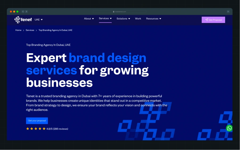
Best for: Mid-market and enterprise B2B brands in healthcare, technology, and finance that need brand strategy, identity, and growth marketing handled under one roof.
Tenet is an award-winning branding and digital agency based in Dubai, with 450+ completed projects across 15+ countries. Like ThunderClap, they follow a strategy-first approach to branding and web design, helping businesses build brands that align with their market, audience, and growth goals. They have worked with startups and global enterprise brands across healthcare, technology, finance, and real estate.
Website: wearetenet.com
Clutch Rating: 5.0
Company Size: 40+
Services Offered:
- Brand strategy
- Brand research
- Brand identity
- Rebranding
- UI/UX design
- Web development
Why choose Tenet for B2B branding?
- B2B positioning grounded in buyer and market data: Before recommending a positioning direction, Tenet conducts audience research, brand perception studies, and competitive analysis. This reduces the risk of making brand decisions based solely on internal stakeholder opinions.
- Experience across industries where trust influences buying decisions: Their portfolio includes technology, real estate, healthcare, and fintech branding projects. These sectors often involve longer buying cycles, multiple stakeholders, and higher scrutiny, which requires a different branding approach than consumer-focused markets.
- Brand systems that support growth after launch: Their partnership extends beyond creating a visual identity. Tenet develops governance frameworks and brand guidelines that help internal teams maintain consistency across campaigns, markets, and new business initiatives without relying on the agency.
Trade-offs: Tenet's pricing falls on the premium end, making it a better fit for mid-market and enterprise budgets than early-stage companies.
Notable clients: Gartner, G42 Healthcare, Microsoft, IROS, M42, CPX, Mubadala Health, Emirati Genome Programme
4. NEXA

Best for: B2B companies already on HubSpot looking for a single agency to handle branding, website development, and marketing automation without adding vendors.
NEXA is a full-service branding and B2B marketing agency based in the UAE, with offices in Riyadh, New York, London, and Melbourne. They are recognized as a Top 1% Elite Tier HubSpot Solutions Partner, the first agency with a physical GCC office to reach that status, with 100+ in-house specialists and 2,000+ projects delivered across 30+ countries.
Website: digitalnexa.com
Clutch Rating: N/A
Company Size: 100+
Services Offered:
- Brand development
- Web design
- We development
Why choose NEXA for B2B branding?
HubSpot-integrated brand and marketing system: As a Top 1% Elite HubSpot Partner, NEXA builds brands, websites, and marketing systems within the HubSpot ecosystem. If you are already using HubSpot, you will not need to coordinate between separate branding, website, CRM, and marketing vendors.
Long track record in the UAE market: NEXA has operated in the UAE since 2005 and has worked across education, healthcare, automotive, real estate, and B2B services. Few agencies in the region can point to the same breadth of experience across sectors.
Branding closely tied to lead generation: NEXA does not treat B2B branding as a standalone service. Brand development sits alongside website development, CRM implementation, lead generation, and marketing. This is particularly relevant if you are planning to update your brand and amp up your marketing efforts simultaneously.
Trade-offs: Their portfolio leans heavily toward real estate, automotive, and hospitality, so companies looking for deep SaaS branding experience may find fewer relevant case studies to evaluate.
This means you might find fewer B2B SaaS projects to evaluate their competence.
Notable clients: Microsoft, Bosch, CBRE, Tabadul, Berkeley.
5. Planet Green Solutions
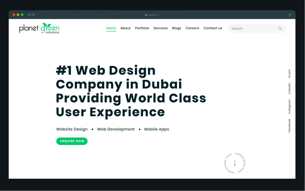
Best for: Enterprise and institutional B2B organizations in the UAE looking for a branding agency with proven experience in large-scale government and corporate projects.
Planet Green Solutions is one of the top branding agencies in the UAE, founded in 2011 and delivering 800+ websites to 400+ global clients. Their portfolio includes some of the most prominent government institutions in the country, including the Ministry of Investment, the Ministry of Culture, and the Federal Tax Authority, making them one of the few branding agencies in the UAE with genuine institutional credibility.
Website: pgsuae.com
Clutch Rating: N/A
Company Size: N/A
Services Offered
- Brand naming
- Logo design
- Brand architecture
- Web design and development
Why choose Planet Green Solutions for B2B branding?
- Institutional-grade client portfolio: Planet Green has built brands for the Ministry of Investment, Federal Tax Authority, TAQA, and Etihad Credit Insurance. For organizations in regulated or high-scrutiny sectors, the agency already understands the UAE institutional, compliance, and stakeholder contexts before the brief even starts.
- End-to-end branding solutions: Their branding scope covers naming, logo, brand story, audit, and architecture as a connected process rather than separate deliverables. For enterprise organizations managing complex brand hierarchies or sub-brands, having a single team manage the entire system reduces inconsistencies caused by briefing multiple vendors at different stages.
- Website maintenance support: Beyond B2B web design, Planet Green offers ongoing website maintenance for B2B clients who need a reliable partner for long-term updates rather than managing them in-house.
Trade-offs: Since their strongest work is in government and institutional sectors, B2B brands looking for modern, conversion-optimized website design may find their portfolio less relevant to their specific needs.
Notable clients: Ministry of Investment UAE, TAQA, Abu Dhabi Terminals, Etihad Credit Insurance, Federal Tax Authority
6. Cheval
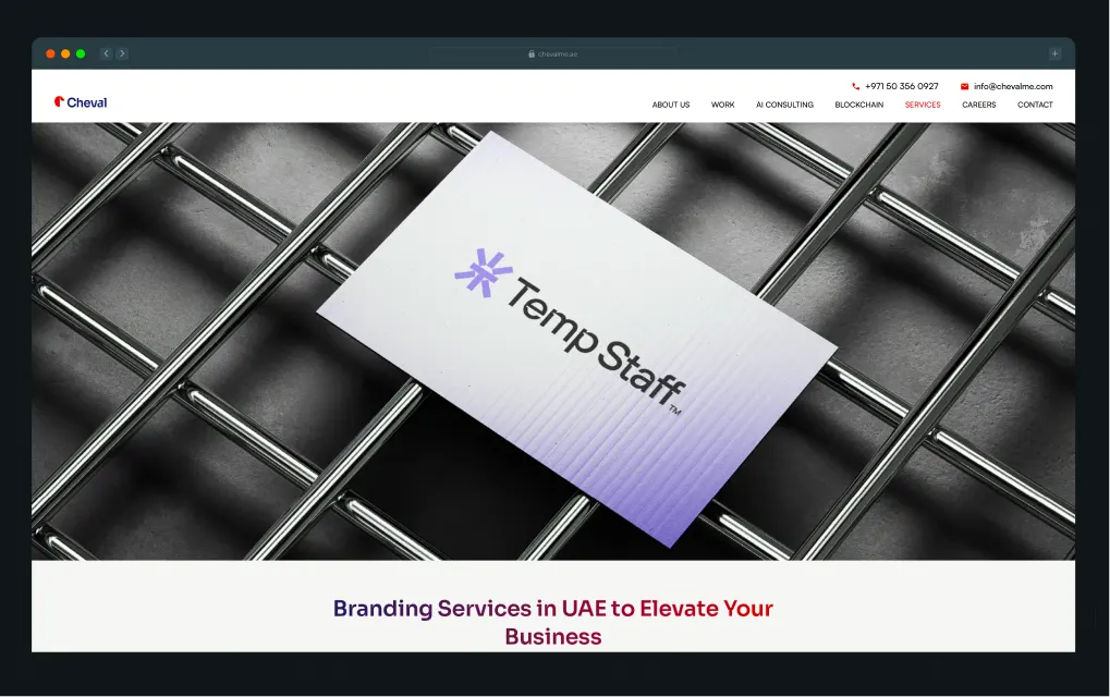
Best for: B2B companies that need both online and offline branding handled by one team, from website to trade show collateral.
Cheval is a Dubai-based branding agency with 20 years of experience, 800+ clients, and 1,200+ completed projects. Based in Business Bay, they serve clients across the UAE, Abu Dhabi, and Saudi Arabia.
Website: chevalme.ae
Clutch Rating: N/A
Company Size: 30+
Services Offered
- Brand strategy and positioning
- Visual identity
- Packaging and print design
- Web design and development
Why choose Cheval for B2B branding?
- Online and offline under one roof: Cheval handles brand strategy, visual identity, web design, packaging, brochures, and signage as one connected system. If your brand needs to show up at a trade show, live on your website, and go out in a sales deck, nothing gets lost in translation between vendors.
- Detailed brand guidelines are part of the offering: Their guidelines cover tone of voice, visual elements, and design principles across digital and print touchpoints. This gives internal teams a clearer reference point when creating new marketing, sales, or event materials.
- Experience across commercial and government projects: Cheval works with SMEs, enterprises, and government departments across the UAE and Saudi Arabia. That breadth of experience may be relevant if your business operates across different sectors or stakeholder groups.
Trade-offs: Cheval's case studies don't include performance numbers to back up the work. You need to ask them for specific results during the discovery call.
Notable clients: Faraj Fund, Planet Pay, Afritrac, 3SH Consultancy, Qcon.
7. Carril Agency
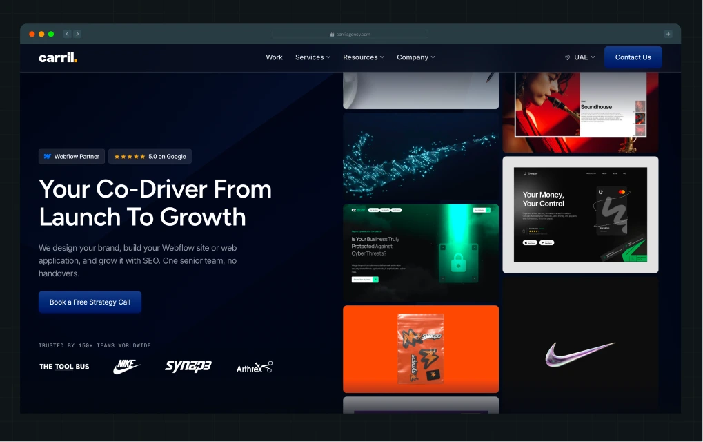
Best for: Early-stage B2B startups that want senior attention on their project without the price tag of a large agency.
Carril Agency is a boutique branding and web design agency with offices in Dubai, Mauritius, and Dallas. Since 2022, they've delivered 500+ projects with a 95% client retention rate and a 5.0 Google rating. They are also a Google Ads Partner.
Website: carrilagency.com
Clutch Rating: N/A
Company Size: Small team, founder-led
Services Offered
- Brand identity
- Brand guidelines
- Stationery and collateral
- Web design
- Webflow development
Why choose Carril for B2B branding?
- Brand system your team can use without ongoing agency support: Their branding scope covers logo systems, typography, color, tone of voice, and brand guidelines designed for internal teams. The goal is to leave companies with a system they can manage themselves rather than depend on an agency to maintain.
- Founder-led delivery: Ezekiel, Carril's founder, runs every project himself from start to finish. This usually means fewer back-and-forths, faster decisions, and more visibility into what is happening and why.
- Experience with venture-backed and growth-stage companies: Carril's clients span SaaS, fintech, proptech, hospitality, and consumer brands, with a combined valuation exceeding $3 billion. That track record may be reassuring if you're evaluating smaller, founder-led agencies.
Trade-offs: Carril works across hospitality, consumer, and B2B. You wouldn’t find similar projects if you are in a niche or compliance-heavy industry.
Notable clients: CZ Cybersecurity, Synap3, Alma Consultancy, Wire Ninjas, and Arthrex.
{{specficService}}
8. Lucidly
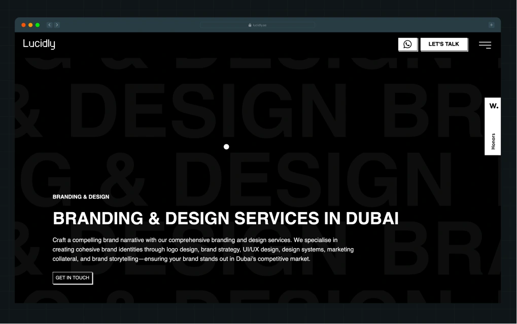
Best for: B2B companies in the UAE and GCC that need a design agency with strong regional market knowledge and conversion-focused web development.
With an Awwwards Honorable Mention (2025) under their belt, Lucidly ranks 8th on our list of the best Dubai-based branding and web development agencies. They cater to SaaS, healthcare, and other B2B industries, including shipping and construction.
Website: lucidly.ae
Clutch Rating: N/A
Company Size: 20+
Services Offered
- Brand identity
- Logo design
- Brand strategy and positioning
- UI/UX design,
- Marketing collateral
- Web development
Why choose Lucidly for B2B branding?
- UAE-first branding approach: Dubai buyers operate differently. High competition, mixed demographics, fast buying cycles, and heavy reliance on trust. Lucidly builds brands around those dynamics rather than retrofitting frameworks designed for Western markets.
- AI-assisted design workflow: Lucidly uses tools such as Figma, Framer, Webflow, Midjourney, and Miro throughout its design process. AI helps the team explore more creative directions early on and move faster during ideation, while the final execution still stays grounded in human design thinking and strategy.
- Experience with large regional organizations: Their portfolio includes companies in logistics, healthcare, construction, technology, and real estate. Clients such as SCA Group suggest experience working with organizations that operate across multiple business units and markets.
Trade-offs: Their website mentions post-launch support, but to know more about retainers, maintenance scope, or ongoing support, you will have to reach out to them directly.
Notable clients: Abvtek, SCA Group, Cube26, Giki, Magrabi Health
9. Bird
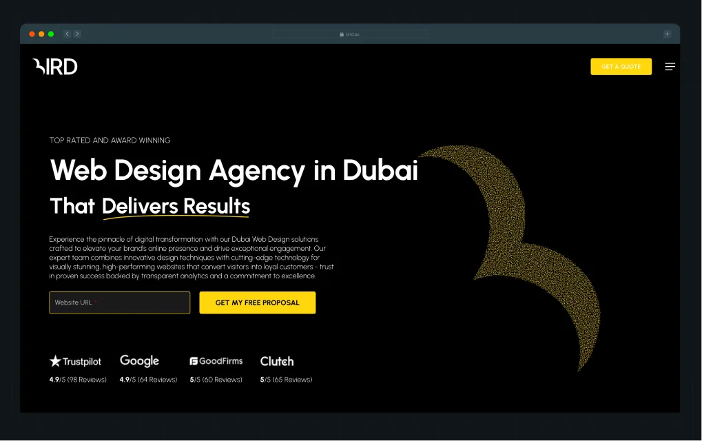
Best for: B2B companies in the UAE that want a CMS-agnostic agency handling branding, websites, and digital marketing under one roof.
Bird is one of the highest-rated branding and digital agencies in Dubai, with offices in Dubai Silicon Oasis and Abu Dhabi. DesignRush named them the Best B2B Digital Marketing Agency, backed by a 4.9/5 rating across 200+ reviews on Google, Clutch, and Trustpilot.
Website: bird.ae
Clutch Rating: 4.9
Company Size: 10+
Services Offered
- Logo design
- Brand strategy and positioning
- Rebranding
- Web design
Why choose Bird for B2B branding?
- Experience beyond startup and SME branding: Bird's portfolio includes organizations such as Abu Dhabi Accountability Authority, Department of Energy Abu Dhabi, Abu Dhabi Oil Co., and SEHA. That experience may be particularly relevant if your branding project involves multiple stakeholders, approval layers, or longer decision-making cycles.
- Bilingual branding built for the GCC market: Bird builds brand identities and websites in both Arabic and English. If your brand needs to communicate across both audiences, that capability is built into their process.
- Branding, web, and marketing under one roof: Bird offers branding alongside web design, SEO, PPC, hosting, and ongoing website support. If you prefer working with a single agency rather than managing separate branding, web, and marketing partners, that broader offering may be useful.
Trade-offs: Bird’s web design and SEO teams operate as separate departments. According to one client review on Clutch, this led to some extra back-and-forth when moving between services, which may be worth considering for projects that span multiple teams.
Notable clients: Gigasys Solutions, Micabi, MedSol Group.
UAE-Based vs. Remote Branding Agency: Which Should You Choose?
If most of your buyers are in the UAE or GCC, a local agency is often the safer choice. They already understand how decisions get made, who needs to sign off, and what buyers expect before they trust a company.
If your buyers are international or your product competes in a global category, like SaaS, fintech, or AI, a remote agency with deep B2B industry experience often matters more than physical presence. Your buyers are comparing you against companies in the US, UK, or Singapore, regardless of where your agency sits, so category expertise carries more weight than local familiarity.
For companies selling into both audiences, which is common in the UAE, the decision becomes less about location and more about experience. Has the agency worked with your type of buyer before? Have they helped similar companies solve similar problems? Those questions usually matter more than where the team is based.
Picking the Right B2B Branding Partner
Choosing a branding agency in the UAE comes down to one question: what problem are you trying to solve?
Choose ThunderClap if:
- You are a mid-market or enterprise brand selling a complex product in SaaS, fintech, AI, VC, or HR tech, and need buyers to understand your value faster
- You want the rebrand grounded in customer research, competitive analysis, and positioning work before a single design concept is created
- You want a team that can take a project from strategy to launch without turning it into a six-month marathon
Choose Neue World if:
- You operate in climate tech or infrastructure
- You want branding and Webflow development handled by the same team
- You prefer working with a smaller senior team
Choose Tenet if:
- You need branding and growth marketing handled by the same agency
- You're a mid-market or enterprise company with multiple stakeholders involved in brand decisions
- You're comfortable investing in a more premium partnership to support a larger-scale rebrand
The remaining agencies on this list each serve a different type of buyer, from HubSpot-first organizations and institutional brands to companies looking for GCC market expertise.
If there's one pattern we've seen repeatedly, it's this: companies rarely come to us because they want a brand makeover. They come to us because the business has evolved, but the brand hasn't kept up.
We've worked with 88+ B2B companies like Storylane, Factors, VuNet, Skyroot, and Roommaster during funding rounds, category shifts, market expansion, product evolution, and major repositioning efforts. In each case, the goal wasn't simply to improve how the brand looked. It was to ensure the website reflected the company they had become and to attract the right kind of customers.
{{ctaBlock}}
FAQs
1. How do I choose the right branding agency in the UAE?
Start by asking whether they have B2B-specific case studies with measurable outcomes, not just a strong portfolio. Then look at what is actually included in the engagement, whether their process starts with research or aesthetics, how they handle pushback, and what support looks like after launch. Based on our own discovery calls, the brands that tend to find the right fit fastest are the ones that come in with these questions already prepared.
2. What is the cost of hiring a branding agency in the UAE?
The cost of hiring a branding agency in the UAE depends on factors such as the agency's experience, project scope, and timelines. Most B2B branding projects typically start from around AED 55,000 ($15,000), while premium agencies and larger rebranding engagements can cost significantly more.
3. How long does a branding project take with a UAE agency?
Most B2B branding projects in the UAE take around 8 to 10 weeks. At ThunderClap, most projects are completed within that window, with 30 days of post-launch support included after handoff. Projects delivered faster may skip research and strategy work, while those that stretch beyond it can signal unclear scope, back-and-forth, or execution gaps.
There are hundreds of branding agencies across the San Francisco Bay Area. Finding one isn't difficult. Finding a brand strategy agency in San Francisco that actually understands B2B.
Because after five or six agency websites, everything starts to blur together. Every agency promises bold ideas, memorable brands, and differentiation. Before long, they all start looking like peas in a pod.
That's a problem because choosing the right partner has a measurable impact. According to Gartner, companies with a strong brand strategy are twice as likely to exceed their business goals.
The difference usually isn't in what agencies claim. It's in how they approach strategy. The best B2B brand strategy agencies in San Francisco understand long buying cycles, multiple decision-makers, category positioning, and how brand strategy connects to your website, messaging, sales conversations, and go-to-market efforts.
To make the decision easier, we evaluated the top brand strategy agencies in the San Francisco Bay Area, including our own, using the same evaluation criteria. Instead of ranking agencies on creative work alone, we looked at the capabilities that matter when building a B2B brand that needs to earn trust, drive sales, and grow with the business.
TL;DR
- We reviewed 35+ brand development agencies to identify the strongest B2B brand identity design partners based on strategy, execution, and business impact.
- Whether you're a startup, scaleup, or enterprise, every agency includes a Best For recommendation to help you find the right fit.
- The best agencies go beyond branding, helping shape your positioning, messaging, website, and go-to-market strategy.
- Most brand strategy engagements take 4–12 weeks, depending on the scope, research, and stakeholder involvement.
- ThunderClap, Clear Digital, Sköna, Ramotion, and Transmission each serve different business needs, so the right choice depends on your goals, not just the agency's reputation.
Best Brand Strategy Agency in San Francisco: At a Glance
How Did We Choose These San Francisco Brand Strategy Agencies?
We reviewed 35+ B2B brand strategy agencies using Clutch, DesignRush, Google Search, agency websites, client case studies, and community discussions on platforms like Reddit.
First, we filtered for B2B focus. Agencies without a dedicated B2B brand strategy expertise didn't make the cut. We also excluded agencies that primarily focused on consumer brands, general branding, or creative services. That narrowed the list to 22 brand strategy agencies.
Next, we evaluated each agency's B2B expertise, strategy process, deliverables, and business outcomes. Agencies that couldn't demonstrate a clear methodology, relevant client experience, or measurable impact were removed. That reduced the shortlist to 13 branding agencies.
Finally, we evaluated each agency's collaboration model and post-launch support to understand how they work with clients beyond the strategy engagement. Only 7 B2B branding agencies in San Francisco consistently met our evaluation criteria and earned a place in this guide.
We used the B2B Brand Strategy Evaluation Framework below to evaluate every agency consistently.
Note: To keep this guide accurate, up to date, and unbiased, we review it every six months. No agency paid for inclusion or placement in this guide.
What Makes a Great B2B Brand Strategy Agency?
According to Gartner,
"A strong, high-performing brand strategy is one that is fully aligned with business strategy, consistently executed across functions, and recognized by executive leadership as critical to both past and future growth."
In simple terms, brand strategy sits above your website, messaging, campaigns, and visual identity. It defines how your business competes, how buyers perceive you, and the decisions that shape every customer touchpoint.
A great B2B brand strategy agency doesn't start with design. It starts by understanding your business, your buyers, and where you want your brand to go. The best B2B brand strategy agencies focus on five things:
1. Positioning your brand to compete
The SF Bay Area is home to more than half of last year's Enterprise Tech 30 founders. More companies mean buyers have more options, making differentiation more important than ever. The right B2B brand strategy agency knows how to navigate that complexity.
Whether you're moving upmarket, repositioning for category leadership, or entering a new market, it starts by understanding how buyers see your business today. Those insights become the foundation for your positioning strategy, messaging, website, and brand experience.
2. Turning research into strategic decisions
B2B brand strategy shouldn't be based on opinions in a workshop. When Factors.ai partnered with ThunderClap; the brand audit revealed that while the product had matured into an enterprise ABM platform, the brand still felt like an early-stage startup.
The research also uncovered an advantage worth preserving: its distinctive flaming orange identity in a category dominated by corporate blue. Instead of replacing that equity, ThunderClap built on it, evolving the brand to reflect the maturity of the product and the market it wanted to win.
3. Creating a strategy that the business can execute
Gartner found that a strong brand strategy improves more than marketing performance. It also influences product, customer service, HR, and other business functions because it's executed consistently across the organization. A good branding agency gives every team a shared language for communicating your value, not just another strategy deck.
4. Building leadership alignment before execution
If you're a PMM or CMO, you've probably spent more time aligning stakeholders than building the strategy itself. A good agency doesn't just gather opinions. It challenges assumptions with customer evidence, facilitates difficult conversations, and helps leadership commit to a single direction.
For instance, Factors' PMM, Tanvi M, described her experience with ThunderClap in three simple words: "ThunderClap made my life easier." Here's Ayush's LinkedIn post, where Tanvi explains what made her say that.
5. Connecting brand strategy to business outcomes
A successful partnership shouldn't stop at a better-looking brand. The agency should be able to show how its work changed customer perception, strengthened advocacy, improved go-to-market execution, or helped the business compete more effectively.
For example, here's what WizCommerce's Senior PMM, Aamir Kanchwala said after the rebrand. According to him, the new brand finally reflected the business they had become, leading to stronger customer advocacy.
Top 5 Brand Strategy Agencies in San Francisco (Reviewed & Ranked)
Here are the top five brand strategy agencies in San Francisco, based on their B2B expertise, work process, deliverables, strategy, results, and post-launch support.
1. ThunderClap
.webp)
Best for: Mid-market and enterprise B2B companies in SaaS, fintech, AI, and healthtech industries looking to strengthen their market position, enter new categories, or align their brand with their go-to-market strategy.
ThunderClap is a B2B branding agency that helps SaaS, AI, fintech, healthcare, and other B2B companies develop brand strategies that support go-to-market goals. Its services span brand strategy, positioning, messaging, visual identity, website design, web development, and CRO, allowing companies to move from strategy to launch without coordinating multiple vendors.
The agency places product marketers at the center of the branding process, using customer, competitor, and category research to shape positioning and messaging. This approach is particularly valuable for companies investing in a rebrand or new website, as it helps clarify positioning before design begins. ThunderClap also has experience creating messaging for regulated B2B industries, where claims often need to withstand legal and compliance reviews.
Website: thethunderclap.com
Clutch rating: 4.8
Company size: 11-50 employees
Core services
- Brand strategy & positioning
- Brand messaging
- Visual identity & design systems
- UX/UI design
- Website design
- Webflow development
- Conversion rate optimization
What customers have to say
The team is thoughtful, responsive, and has exceptional design sensibility. Bringing our collective brand vision to life wasn't easy, but the results speak for themselves. It looks amazing!" - Darryl Pinto, Growth Marketing Manager at Amazon
Notable Clients
WizCommerce
When WizCommerce partnered with ThunderClap, the goal wasn't to rewrite the messaging. It was to build a brand and website that made buyers feel its value before they read a word.
Guided by the idea of "Light in the Labyrinth," ThunderClap translated the company's positioning into a visual system that made a complex wholesale platform easier to navigate while giving the brand a distinctive identity in a crowded market.
VuNet
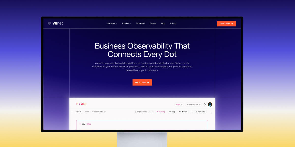
VuNet partnered with ThunderClap to simplify how it communicated a technically complex observability platform for banks. Instead of reducing the product's sophistication, the team made it easier for buyers to understand through clearer messaging, brand storytelling, and information architecture.
After launch, the company reported stronger brand perception, while the sales team began using the website as a key part of its sales process.
roommaster
roommaster collaborated with ThunderClap to reposition its 30-year-old hotel operations platform for the next stage of growth. ThunderClap led the strategy, visual identity, website, and Webflow development, centered on the positioning of "Hospitality Architects," giving buyers a clearer understanding of the product's role. The redesigned website contributed to an 80% increase in demo requests and organic traffic.
{{specficService}}
2. ClearDigital
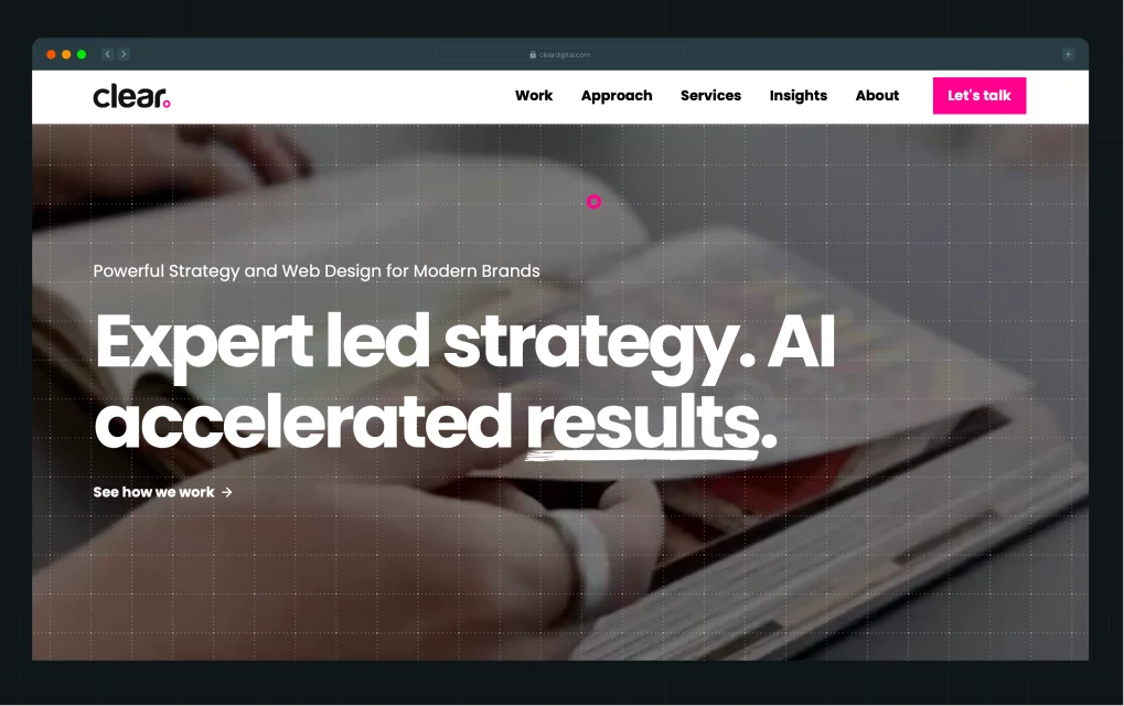
Best for: Enterprise B2B companies in complex industries like manufacturing, semiconductors, healthcare, renewable energy, construction, and financial services that need both brand strategy and website execution.
Clear Digital is a Silicon Valley-based B2B brand strategy and digital agency with over 25 years of experience. Instead of stopping at positioning, it helps companies bring their brand to life through websites, digital experiences, and ongoing marketing.
With offices across California, Texas, Illinois, and New York, the agency has built a strong track record working with enterprise organizations in complex B2B industries. It also reports an 81 Net Promoter Score, reflecting its focus on long-term client relationships.
Website: https://cleardigital.com
Clutch Rating: N/A
Company Size: 51–200 employees
Core Services
- Brand Strategy
- Brand Messaging
- Visual Identity
- User Research
- Website Design
- UX/UI Design
What customers have to say
"Clear Digital has the proven expertise that we looked for in a partner, and their support has been key to delivering on our vision." — Juan Novella, Director of Marketing, Habu
Notable B2B clients
Cisco, Honeywell, Centrio, McAfee
3. Sköna
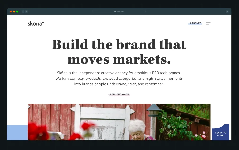
Best for: B2B companies looking for one agency to build and roll out their brand across digital, print, campaigns, events, and marketing.
Sköna is a brand strategy agency in San Francisco with over 20 years of experience helping B2B companies reposition their brands, launch new categories, and tell a clearer story to buyers. With offices in San Francisco and Stockholm, the agency combines brand strategy, messaging, design, and advertising to build a consistent brand across every customer touchpoint.
Sköna has worked with more than 100 B2B brands and has won awards from the Webby Awards, Muse Creative Awards, and Transform Awards
Website: https://skona.com
Clutch rating: 5
Company size: 11–50 employees
Core services
- Brand strategy
- Positioning & messaging
- Visual identity
- Campaign strategy
- Advertising
- Brand rollout
What customers have to say
"We have had several significant brand revisions with Sköna. It's really consistency that drives a brand. Sköna is that consistency." — Senior Vice President, Snowflake
Notable clients
Snowflake, Sigma Computing, Omada, Kleer
{{specficBlog}}
4. Ramotion
%20(1).webp)
Best for: Startups, mid-market, and enterprise B2B companies looking for flexible branding support, whether they need a full rebrand, a new brand, or an extension of their in-house team.
Ramotion is one of the top startup brand strategy agencies in San Francisco, with more than 17 years of experience and over 350 completed projects. It offers branding, website design, and development services through a structured process that begins with stakeholder workshops, market research, positioning, and concept validation, then moves into visual identity.
Website: https://www.ramotion.com
Clutch rating: 4.9
Company size: 10-49 employees
Core services
- Brand strategy
- Brand identity
- Web design
- UI/UX design
- Web development
- Design systems
What customers have to say
"Our brand sets us apart from our competitors. The logo Ramotion created captures that brand perfectly." — Josh Fabian, CEO, Kitsu
Notable clients
Redis, Mozilla, HackerRank, Firefox
5. Transmission
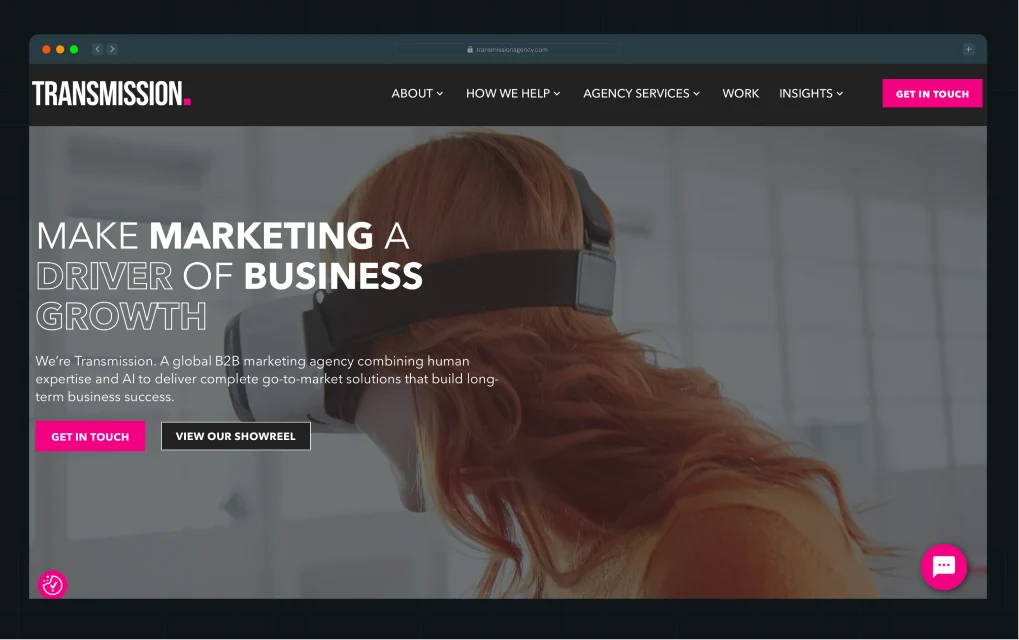
Best for: Enterprise and mid-market B2B companies that want brand strategy, creative campaigns, and marketing execution from one partner.
Transmission is a San Francisco-based B2B marketing agency founded in 2013 that helps enterprise and mid-market companies turn brand strategy into business growth.
With offices across North America, Europe, and Asia-Pacific, it supports global B2B organizations with multi-market branding initiatives. In 2025, the agency won a B2B Brand Catalyst Award (North America) for Qualcomm's Power to Move Your Business campaign.
Website: https://www.transmissionagency.com
Clutch rating: N/A
Company size: 201–500 employees
Core services
- Brand strategy
- Brand identity
- Go-to-market strategy
- Creative campaigns
What customers have to say
"The strength of proposition and creative theme is impressive. We look forward to measurable business outcomes as a result of this work. Our brand now has a clear purpose and identity." – Jo Gilhooley, CRO at Adarma
Notable clients
Qualcomm, Salesforce, Cisco, Autodesk, ADP, Adarma
Does Your Brand Strategy Agency Need To Be In San Francisco?
If you'd asked this question ten years ago, the answer would probably have been yes.
Back then, branding happened in boardrooms. Teams flew in for multi-day workshops, filled whiteboards with sticky notes, debated positioning around conference tables, and spent days refining ideas face-to-face. Choosing a brand strategy agency in San Francisco made sense because much of the work depended on being in the same room.
Today, that's no longer true. Remote collaboration has become the norm, and buyers have become far more comfortable working with distributed teams.
What matters now isn't where your rebranding agency is based. It's whether they understand your market, solve the right business problems, work seamlessly with your team, and bring in the right specialists when you need them.
That said, location isn't completely irrelevant. There are still situations where a local San Francisco brand strategy agency is the better choice.
For most B2B companies, expertise matters more than proximity. Agencies like ThunderClap work with B2B companies worldwide, reflecting a broader shift toward choosing the best-fit partner over the nearest one.
Which Brand Strategy Agency Is Right for You?
There's no single "best" brand strategy agency in San Francisco. There's only the one that's best for your business.
- If you're an enterprise company in a complex B2B industry looking for a long-term digital partner, Clear Digital is a solid choice.
- If your priority is building a brand that stays consistent across your website, campaigns, events, and every other customer touchpoint, Sköna stands out.
- But if you're a mid-market or enterprise B2B SaaS, fintech, AI, or healthtech company, ThunderClap is built for a different challenge: turning brand strategy into pipeline. Instead of treating branding, messaging, website strategy, and CRO as separate projects, we bring them together so every decision moves your business closer to revenue.
That's why 88+ B2B brands, including Razorpay, RoomMaster, Shopline, Factors, Wix Commerce, Vunet, and 101 GenAI, have trusted ThunderClap to sharpen their positioning and build websites that convert.
{{ctaBlock}}
Frequently Asked Questions About B2B Branding Agencies in San Francisco
1. What does a brand strategy agency in San Francisco do?
A brand strategy agency in San Francisco helps define your positioning, messaging, target audience, and competitive differentiation, then translates that strategy into your visual identity. A well-crafted brand strategy makes your business easier to understand, remember, and choose.
2. How do I choose the right brand strategy agency in San Francisco?
Choose a B2B brand strategy agency with experience in your industry, a research-driven strategy process, and proven results. Review its portfolio, case studies, and client testimonials to see whether it has solved problems similar to yours, not just created attractive brands.
3. How long does a brand strategy project take?
Most brand strategy projects take 4 to 12 weeks, depending on the scope, stakeholder alignment, research involved, and whether the engagement includes brand identity, messaging, or website design.
4. What is the difference between a branding agency and a brand strategy agency?
A brand strategy agency defines how your company should be positioned, who it serves, and why buyers should choose you. A branding agency focuses on expressing that strategy through visual identity, brand assets, and creative execution.
5. Do I need a brand strategy before redesigning my website?
Yes. Your website should communicate your positioning, messaging, and value proposition. Without a clear brand strategy, even a well-designed website can struggle to attract the right buyers or drive conversions.
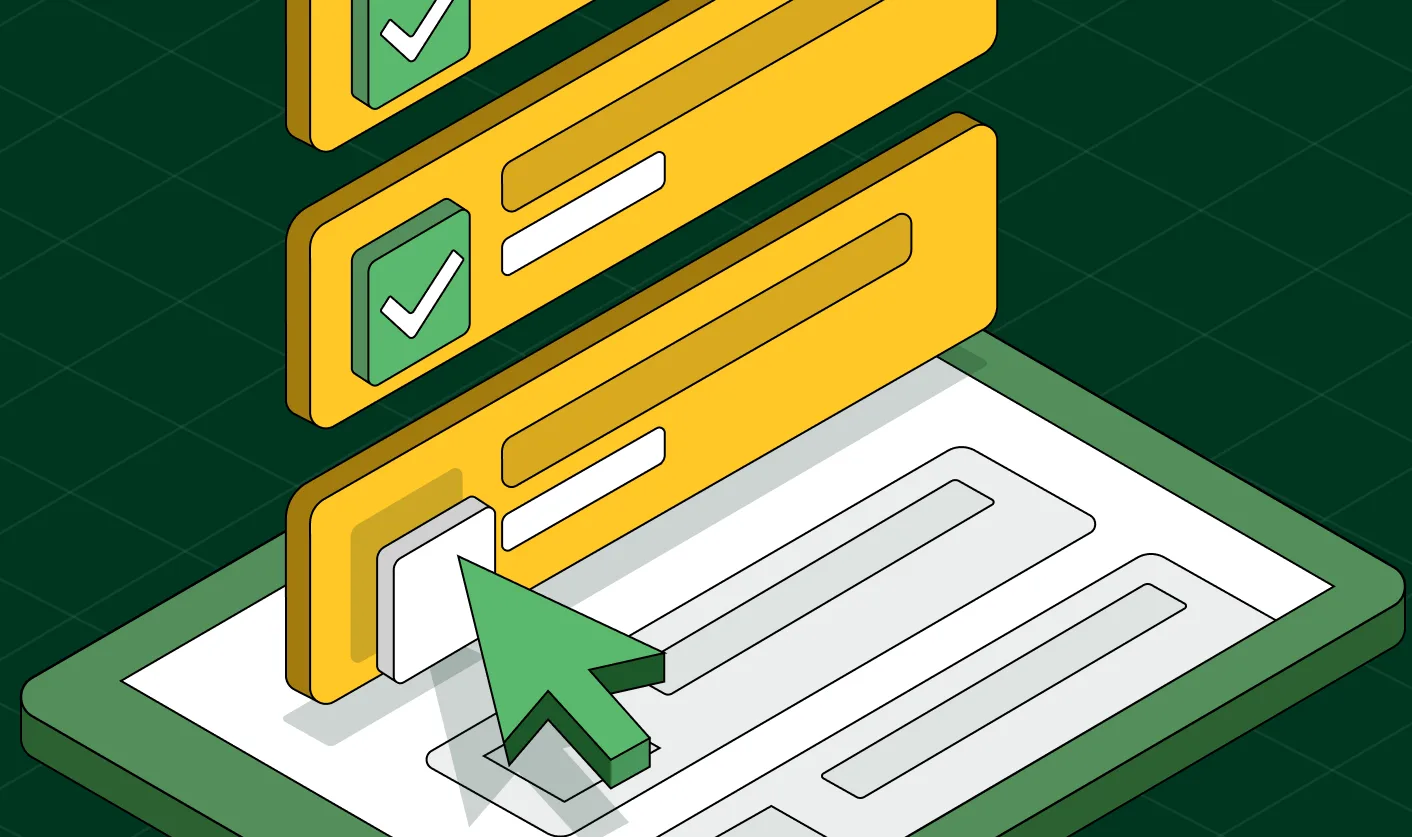
9-Step Website Copy Audit Checklist to Improve Conversions (Examples from Top B2B Brands)
If a buyer landed on your website for the first time today, what would they actually walk away knowing about you? Would they understand what you do and who it's for? Or would they get hit with “supercharge your workflow” and “unlock seamless growth,” the same vague claims they just read on three competitor websites?
Running a website copy audit matters more now because generic messaging could keep you off your buyer’s shortlist entirely. More buyers use AI tools to research and compare products before visiting vendor websites. If your messaging is vague, those tools have little reason to recommend you.
That's why we created this 9-step website copy audit checklist, straight from our product marketing manager, Priyanka Chakraborty. It's the same framework we use when building websites for B2B brands like roommaster, WizCommerce, Freehand, and Factors, from strategy and messaging through design and development.
For each step, we also explain what to look for, using real examples from B2B brands like Clay, ClickUp, Wispr Flow, etc., along with a 3-step audit checklist.
What Is a B2B Website Copy Audit?
A B2B website copy audit is a review of your website's messaging to determine whether it clearly explains what your product does, who it's for, what sets it apart, and why buyers should choose you.
It also checks whether your positioning is clear, your messaging reflects customer needs, and your pages answer buyers' key questions. It shows whether your website attracts the right buyers and gives them enough confidence to book a demo or talk to sales.
The audit can also include a web content audit and content gap analysis to check whether the right pages and information exist in the first place and whether buyers can find the answers they need to evaluate your business.
More specifically, a website copy audit reviews the following:
A copy audit is also one of the first steps when building or redesigning a website. What you uncover shapes the messaging and content architecture first, then the UX, design, and development decisions that follow.
Instead of guessing whether your headline needs work, you can identify whether the real issue is your positioning, customer language, proof, or information hierarchy.
When Should You Perform a Website Copy Audit?
While regular copy audits are good practice, some events call for an immediate review. Here are the most important trigger events you should watch out for:
What Are The 9 Steps In A B2B Website Copy Audit (With Examples From B2B Brands)?
Here’s the 9-step website copy audit checklist we use at ThunderClap, straight from our product marketing manager, Priyanka Chakraborty.
We primarily focus on nine areas: hero clarity, buyer fit, reasons to change, brand memorability, buyer language, social proof, content hierarchy, CTAs, and AI readiness. For each one, we break down what to look for, how it works on real B2B websites, and three steps you can use to audit your own copy.
1. Make Sure Your Hero Says What You Do in 10 Seconds
When the right buyer lands on your website, they should quickly know what you do, who it's for, and why it matters. According to Wynter, 96% of CMOs visit vendor websites before making a purchase. 80% of them reach sales calls already familiar with the vendor.
As one CMO put it, “I never go into a demo blind anymore. I've already done my homework.”
Your hero should make that homework easier. But how direct you need to be depends on what buyers already know about your product and category.
A brand like HubSpot can say, “Where go-to-market teams grow better,” because buyers already know the company and its products. For a lesser-known company, such a broad copy can leave buyers guessing.
Here’s what you can do to avoid it:
1. Lead With a Problem Buyers Already Recognize
This works best when buyers know the problem but don't yet know your category or see your type of solution as the obvious answer.
- Eyebrow: Set the category or product context.
- Headline: Name the broken status quo.
- Subhead: Explain what you do and the outcome.
Case in Point:
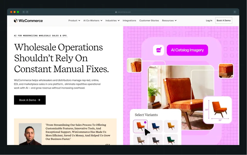
One of our clients, WizCommerce, an AI commerce platform company, uses this approach. Wholesale teams already know manual work is the problem. The hero starts there, then shows how the product reduces that work and helps grow revenue.
2. Lead With Capabilities Buyers Already Understand
When buyers already understand the problem and category, repeating the pain adds little. Use that space to show what your product helps them do instead.
- Eyebrow: Name what buyers can do with your product.
- Headline: State the outcome they want.
- Subhead: Explain what makes your approach different.
Case in Point:
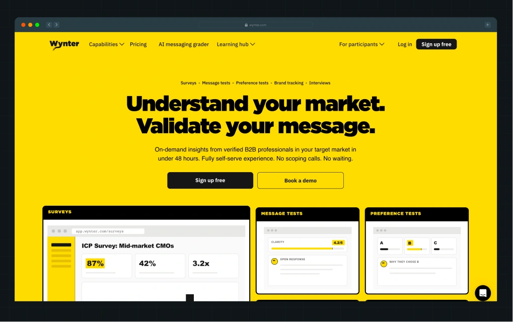
Wynter does this well. The eyebrow copy shows what buyers can do, the headline states the outcome, and the subhead adds the differentiator: insights from verified B2B professionals in under 48 hours.
Run These 3 Checks
- Show only the hero to someone who knows your space but not your product. Ask what you sell, who it's for, and why it matters.
- Remove the logo and compare it with three competitors. Flag any line they could use unchanged.
- Read the eyebrow, headline, and subhead separately. Each should add something that the previous one didn't.
2. Help the Wrong Buyers Rule Themselves Out
Getting your ICP right doesn't mean every lead you attract will be a good fit. Take LinkedIn outreach tools. “Built for sales teams” could mean a founder sending a few messages a week, a 20-person SDR team running outbound, or an agency managing dozens of client accounts.
They're all sales teams, but they don't all need the same product. So, how do you help the wrong buyers figure that out before they book a demo?
Here are two ways:
1. Show Who Gets the Most Value
Be clear about the scale or type of work your product is built for.
Case in point:
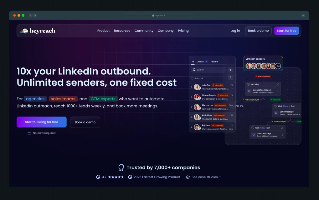
HeyReach makes it clear right from the hero that it's built for agencies, sales teams, and GTM experts looking to reach 1,000+ leads weekly. Features like unlimited senders and account rotation make the point even clearer: this is a tool for running LinkedIn outreach at scale.
2. Make Deal-Breakers Easy to Find
Don't make buyers book a demo to find out your product is missing something they need.
Case in point:
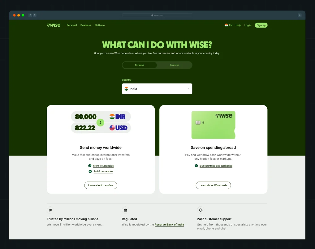
Wise has a dedicated availability page where buyers can check which features are available in their country. If the service they need isn't supported where they live, they'll know right away rather than finding out later.
Run These 3 Checks
- Pull up the leads your sales team disqualified in the last few months. Write down the top 3 reasons.
- Check whether your website answers those questions before someone reaches the demo form.
- Ask someone who fits your broad ICP but not your best-fit customer to browse the site. Can they tell the product isn't really built for them?
3. Give Buyers a Clear Reason to Change
Buyers come to your website with a simple question: Is this better than how I do things today? Their current alternative isn't always a competitor. It could be a legacy tool, a spreadsheet, several disconnected products, a manual process, or simply doing nothing.
Your copy should make that comparison easy. Show buyers what falls short today, how your product changes the way they get the job done, and what improves as a result.
How you do that depends on what buyers are replacing.
1. Show Why Your Product Beats the Tool They Use Today
When buyers already use a product in your category, compare against the gaps they know firsthand. Don't stop at claiming you're faster, smarter, or easier to use. Show what they can do with your product that they couldn't do before.
Case in Point:
.webp)
Factors does this in its “Why teams switch” section. Legacy tools track accounts. Factors identifies the actual buyers inside them. The comparison makes the reason to switch clear without relying on generic claims.
2. Show How You Improve the Job Buyers Do Today
When buyers are replacing a messy process built around manual work, disconnected tools, and workarounds, show what's broken and how your product offers a better way.
Case in Point:
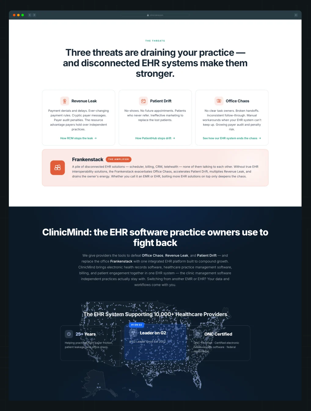
.webp)
ClinicMind names three problems practice owners face and shows how disconnected tools make them worse. The " From → To section then shows the specific improvements buyers can expect.
Run These 3 Checks
- Identify the main alternative your product competes against: a direct competitor, legacy tool, manual process, disconnected stack, or doing nothing.
- Check whether your copy clearly shows what falls short with that alternative and how your product helps buyers do the job better.
- Flag broad claims like “work smarter” or “drive efficiency.” Replace them with specific changes buyers can compare with their current way of working.
4. Make Your Brand Stand Out From Competitors
When Wynter surveyed 100 B2B SaaS marketing leaders in 2025, only 6% said their brands were very distinctive. The other 94% felt they blended in to some degree. That's the risk. Buyers may understand what you sell and still forget your brand minutes later.
To be remembered, you need to give buyers something they won't find on every competitor's website. That could come from what you do differently or simply how your brand looks and sounds.
Here are two ways to do that:
1. Find Something Competitors Aren't Already Saying
Most B2B products could lead with several stories: category, capabilities, approach, or outcomes. If competitors use the same SaaS marketing strategies and lead with similar stories, find a product strength worth owning in your brand messaging.
Case in Point:
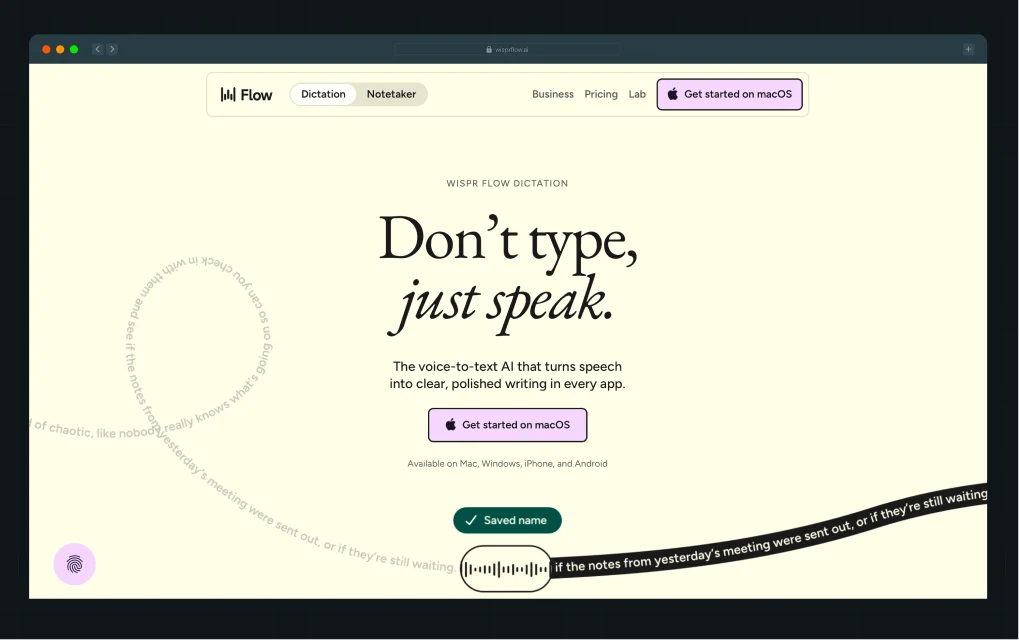
Wispr Flow could lead with AI or voice dictation. Instead, “Speak naturally. Write perfectly.” leads with the experience buyers want and gives them something clearer to remember.
2. Make Your Brand Look and Sound Like Itself
You don't always need a product feature nobody else has. How you write and design the website can also make your brand easier to remember.
Case in Point:
.webp)
Factors, one of our SaaS website design clients, does this well. Lines like “AI that's not on shrooms” give the brand a voice buyers can recognize. The design carries the same personality throughout the website, making Factors harder to confuse with other ABM platforms.
Run These 3 Checks
- Compare your website with five competitors. Flag claims, language, and visual patterns that feel interchangeable.
- Write down one thing you want buyers to remember about you. Check whether the copy and design make that clear.
- If you can't find anything worth emphasizing, the problem may go deeper than website copy. Use a brand strategy framework to revisit your positioning, differentiation, and what you want buyers to remember about you.
{{specficService}}
5. Use Buyer Language Instead of Generic Buzzwords
Jargon and buzzwords often get treated as the same problem. They’re not. As Diane Wiredu, messaging strategist and founder of Lion Words, puts it, “When you know your buyers well, you use jargon to make a connection and show you get their world.”
Jargon helps the right buyers understand you. If your buyers use a term every day, replacing it with simpler language can make your copy less useful.
Buzzwords do the opposite. Words like “seamless,” “supercharge,” and “next-generation” sound impressive but tell buyers very little. The difference is simple: does the word help your buyer understand something specific?
Case in Point:
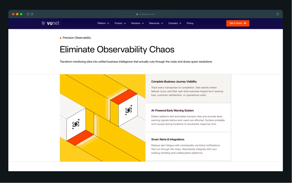
VuNet, one of ThunderClap’s SaaS clients, uses terms like “alert fatigue,” “monitoring silos,” and “root cause analysis.” To outsiders, these terms may sound technical. To SRE and IT Ops teams, they describe the work they do every day.
Run These 3 Checks
- Pull five sales calls or interviews. List repeated technical terms and check whether your website uses them.
- Highlight vague claims like “seamless” or “innovative.” Ask how? If the copy doesn't answer, replace it with what the product does.
- Compare three competitor homepages. Flag repeated words and claims, then check whether yours says anything more specific.
6. Give Buyers Enough Proof to Believe You
Most social proof on B2B websites is overused to the point of becoming white noise. Buyers expect a logo wall near the top of the page or a conversion cue that says, “Trusted by 100+ marketers.”
According to Casey Hill, CMO at DoWhatWorks, “In B2B, we often see plain logo bars, star ratings, and quote testimonials lose in A/B testing. One reason is that these signals are easy to fake.”
That doesn't mean social proof isn't important. But before adding another testimonial or logo, think about what buyers actually want proof of. It usually comes down to three questions:
1. Do companies like mine use this?
2. Did the product deliver the outcome being promised?
3. Is it better than the alternative I'm considering?
Here are three ways to make your proof work harder:
1. Make Your Logo Wall Say Something
Don't just show who uses your product. Use the logos to tell buyers something useful.
Case in Point:
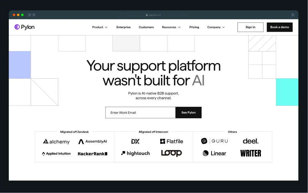
Pylon groups its logos by customers who “Migrated off Zendesk,” “Migrated off Intercom,” and “Others.” This turns a standard logo wall into evidence that companies are switching from the alternatives buyers are likely considering.
2. Put Proof Next to the Claim It Supports
Don't make buyers connect a product claim in one section with a testimonial they saw three folds later.
Case in Point:
.webp)
Clay backs its claim about launching GTM plays faster with a specific customer result: Rippling achieved 2x better cold email performance. The proof sits right beside the capability it supports.
3. Let Customers Answer Buyers' Questions
Your own copy isn't always the most convincing way to handle common questions and objections.
Case in Point:
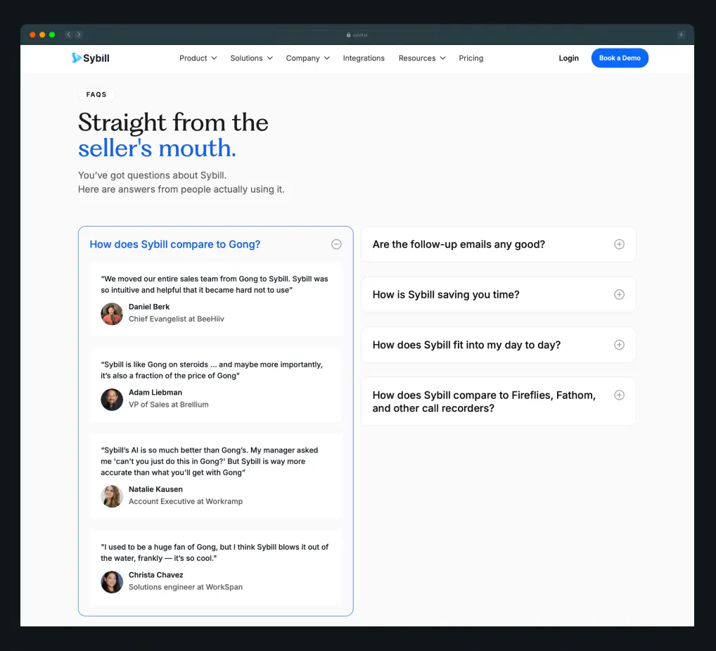
Sybill uses customer testimonials to answer questions like “How does Sybill compare to Gong?” and “Are the follow-up emails any good?” Buyers get answers from people who have actually used the product, rather than from claims made by the company selling it.
Run These 3 Checks
- Review your logo wall. Does it tell buyers anything beyond who uses your product?
- Check your major claims. Is there specific, relevant proof nearby?
- List your buyers' biggest questions and objections. Could customer proof answer any of them better than your own copy?
7. Answer Buyers’ Questions in the Right Order
At ThunderClap, we train our internal PMM team to review website copy through a few basic buyer questions:
- What is it?
- Who is it for?
- What’s in it for me?
- Why should I believe you?
- Why should I act now?
- What should I do next?
But we don’t turn these questions into a fixed homepage template. As Priyanka explains,
“Every industry is different.” A fintech buyer may already understand the problem they’re trying to solve, while buyers in a newer category like healthcare AI may need more education before they can evaluate the product.”
Here are two things to consider when deciding your content hierarchy:
1. Start With What Buyers Need to Understand First
Some buyers already know the problem and category. Others need more context before they can evaluate your product.
Case in Point:
One of ThunderClap’s clients, Rezolv, a fintech debt collection platform, serves buyers who already understand the problem. So the website quickly shows what the platform can do and how it brings the entire debt collection process into one place.
.webp)
While our healthtech client, 101 GenAI, needs to educate buyers first. The website shows why auditing only a fraction of clinical interactions is a problem, then explains how AI helps and where the product fits into healthcare workflows.
{{specficBlog}}
2. Give Important Buying Questions Enough Space
If an issue can affect whether buyers move forward, don’t bury it.
Case in Point:
.png)
Both Rezolv and 101 GenAI handle sensitive data, so security and compliance get dedicated sections covering certifications, data protection, deployment, and access controls.
Run These 3 Checks
- List the questions buyers need answered before moving forward. Check whether each gets enough space.
- Rank them by when buyers need the answer. Check whether the section order matches.
- Ask sales what buyers still ask after visiting the website. Move missing or buried answers earlier.
8. Make the Next Step Clear and Easy to Take
Multiple CTAs are the norm on B2B websites. Buyers can book a demo, start a free trial, watch a demo, check pricing, or talk to an AI agent. But each CTA should make it clear what buyers will get when they click.
Generic CTAs like “Learn More” don't. In one A/B test, Glean saw a 166% increase in click-through rate after replacing “Learn More” with specific CTAs like “Watch Video,” “See Product Overview,” and “See Forrester Report.”
Clear CTA copy is only one part of making the next step easy. Here are two more things to check:
1. Make Self-Serve Paths Easier to Navigate
If you sell multiple products or features, don't drop buyers into a large product and make them figure out where to start.
Case in Point:
.webp)
ClickUp lets buyers choose the capabilities they want, such as Projects, Chat, or Scheduling, before activating their workspace. Buyers can start with what they came for instead of figuring out the entire product first.
2. Answer Questions Buyers Have Before They Click
Think about what could make someone hesitate: How long will this take? What will it cost? Do I need a credit card? What happens after I sign up? Answer the questions that matter next to the CTA.
Case in Point:
Navan says buyers can “Get started in minutes” and that Navan Travel is “Free. No platform fees.” Buyers know how long it takes and what it costs before signing up.
Run These 3 Checks
- Click every CTA on your key pages. Does the button clearly tell buyers what they'll see or do next?
- Try your self-serve flow as a new buyer. Is it obvious where to start based on what you came to do?
- List the questions buyers ask before signing up or booking a demo. Does the copy around the CTA answer them?
9. Make Sure AI Tools Can Understand and Recommend Your Business
Forrester surveyed nearly 18,000 buyers and found that generative AI and conversational search now play a bigger role in buyer research than vendor websites, product experts, and sales teams.
So, the website you're auditing isn't only being read by buyers anymore.
Everything we've covered so far still matters. Your website needs to clearly explain what you do, who you help, why buyers should choose you, and why they should believe you.
But now, AI tools need to find and understand that information well enough to recommend it to you.
As Axel Sukianto, VP of Marketing at Truescope, puts it, “Your marketing has two audiences now: the human buyer and the AI deciding whether to recommend you to them.”
That adds two more things to your audit:
1. Make Sure the Right Information Exists
AI tools can't recommend you for questions your website doesn't answer. Use a web content audit and content gap analysis to find missing pages and information, then create dedicated pages for the ICPs, use cases, comparisons, and buying questions you want to be found for.
Case in Point:
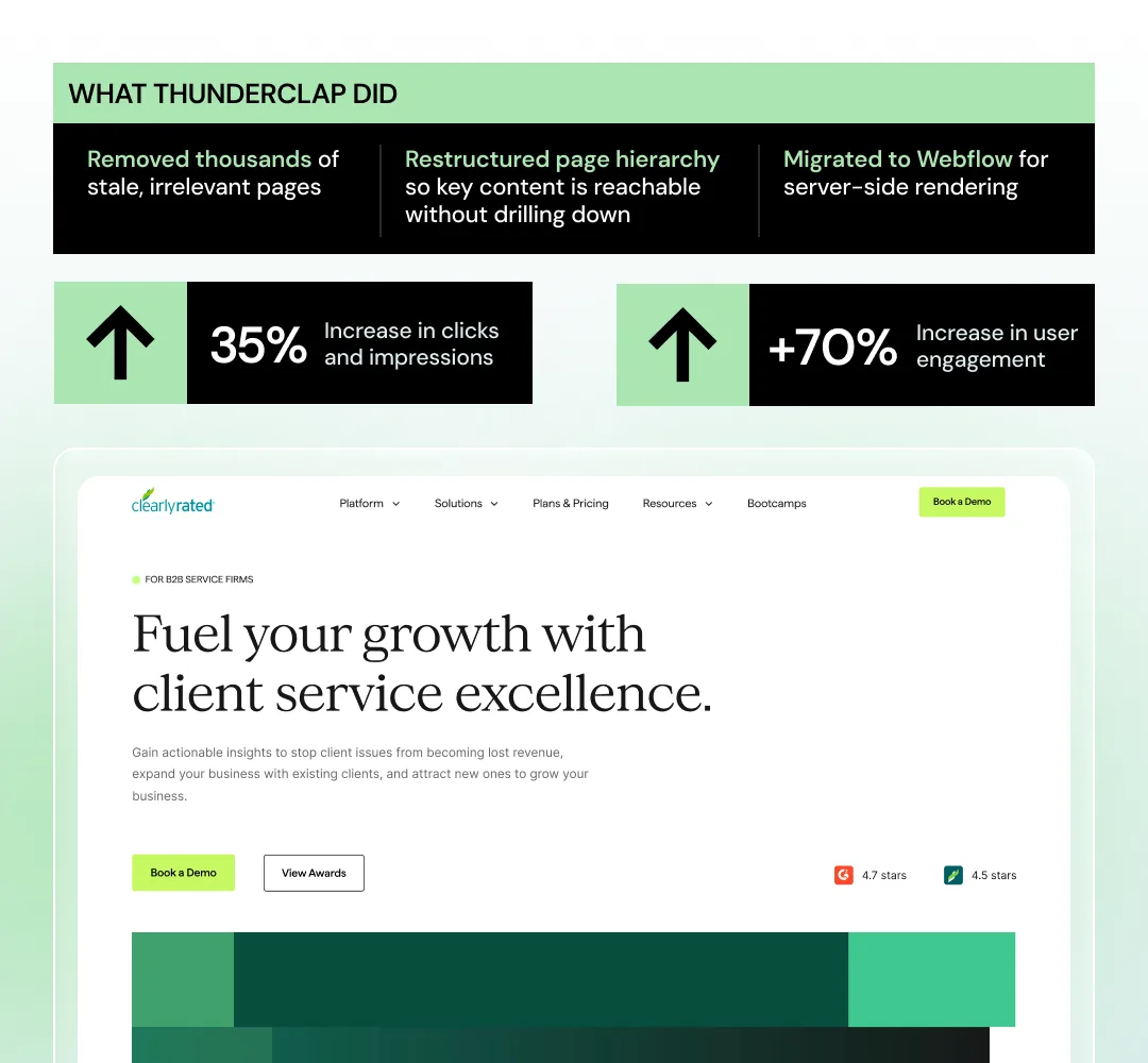
ClearlyRated had thousands of stale pages that made important content harder to find. ThunderClap removed irrelevant pages and restructured the site so key information was easier to reach.
2. Make Your Business Easy to Understand
Having the right pages isn't enough. Clearly state what your product is, who it's for, and what makes it different. Keep that information consistent across your website.
Case in Point:
.png)
For roommaster, ThunderClap added FAQs, spruced up the content, and ensured the product was described consistently across pages. These changes helped improve its visibility in AI search.
→ Want to go deeper? Check out this LinkedIn post by Margarita Loktionova, created in collaboration with ThunderClap, where we share the 6-part AI readiness framework we use to audit client websites.
Run These 3 Checks
- Ask three AI tools what you do, who you're for, and when they'd recommend you. Flag wrong or missing answers.
- Check whether your website covers the ICPs, use cases, comparisons, and buying questions you want to be found for.
- Review key pages. Is your product, category, and audience described clearly and consistently?
Use Our 9-Step B2B Website Copy Audit Scorecard
Use this website copy audit scorecard to see how well your messaging holds up across the nine areas covered above. Give yourself 1 point for every “Yes,” then add up your score out of 27 to identify your biggest gaps.
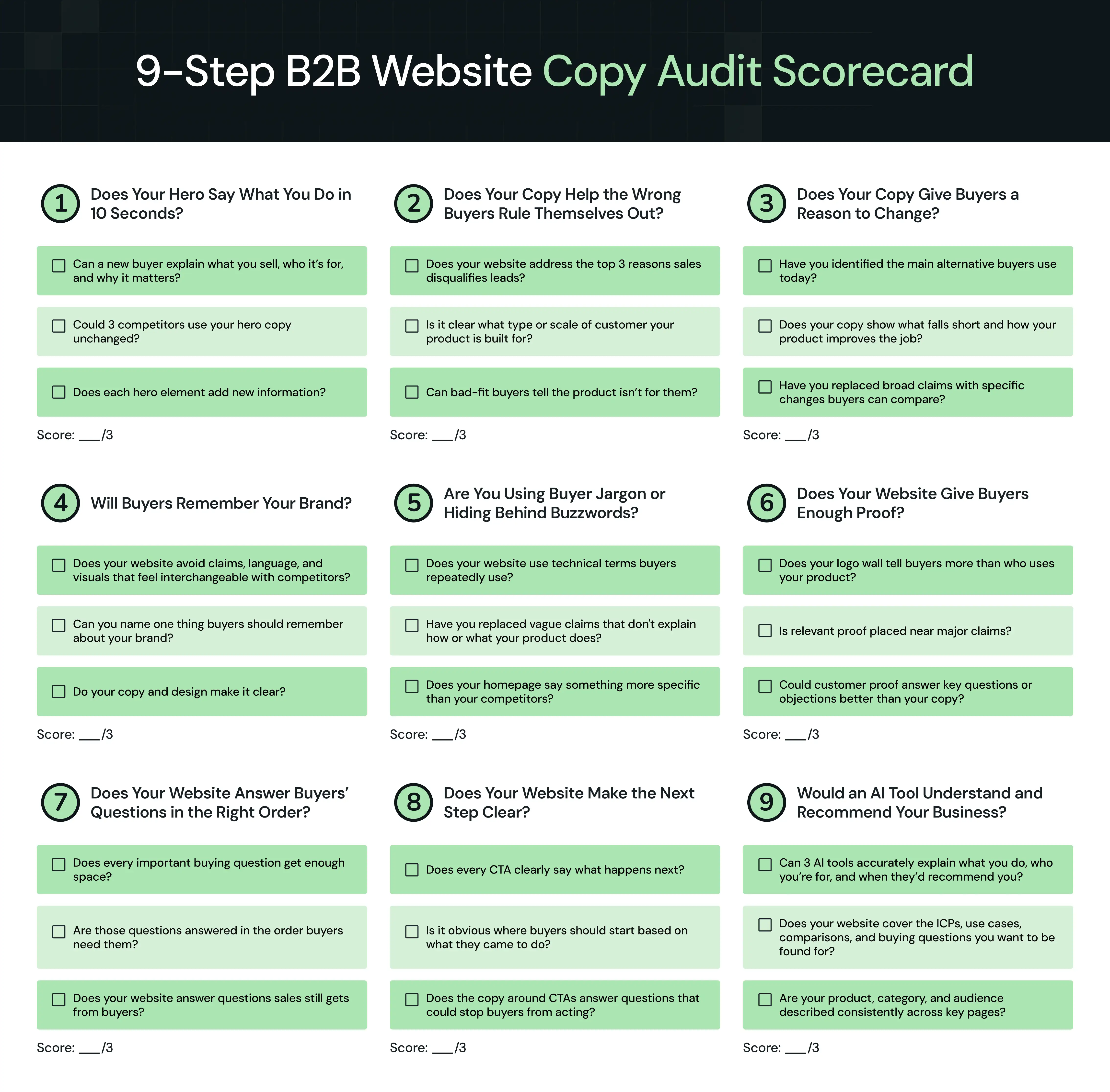
You’ve Audited Your Website Copy. What’s Next?
A website copy audit can show you why buyers aren't converting, why sales keep getting bad-fit leads, or why your website sounds like every competitor's. But fixing those problems isn't always as simple as rewriting the copy.
An unclear hero could point to weak positioning. A forgettable website may need a stronger brand, not punchier headlines. A messy content hierarchy may mean you don't understand what buyers need to know and when.
That's why our B2B website strategy starts before copy, design, or development. We research the market and buyers, sharpen the positioning and messaging, plan the content architecture and UX, then design and develop the website around it. We're also platform-agnostic. Whether the right build calls for Webflow, WordPress, Framer, or another stack, we choose the platform based on the business, content, and technical requirements.
So far, 100+ B2B brands across SaaS, fintech, AI, VC, and HRTech, including Factors, VuNet Systems, WizCommerce, and roommaster, have trusted ThunderClap with their websites.
Here’s why:
- Proven B2B experience: roommaster saw an 80% increase in demo requests after its revamp. ClearlyRated saw 35% more clicks and impressions.
- In-house PMMs: Our PMMs have experience across SaaS, fintech, healthtech, and all major B2B industries. They know whether your website needs sharper category differentiation, stronger category leadership, brand storytelling, or simply needs to catch up with your brand's current maturity.
- 30-day post-launch support: Every website comes with 30 days of free post-launch support. We track what's working, spot what isn't, and help you improve the website after it goes live.
{{ctaBlock}}
Frequently Asked Questions (FAQs)
1. What is a website copy audit?
A B2B website copy audit reviews whether your messaging clearly explains what you do, who it’s for, what makes you different, and why buyers should choose you. It also checks whether your website reflects customer needs, answers key questions, attracts the right buyers, and gives them enough confidence to take action.
2. What are the key elements of a website copy audit?
A website copy audit should review hero clarity, buyer fit, reasons to change, brand memorability, buyer language, social proof, content hierarchy, CTAs, and AI readiness.
3. How often should you audit your website copy?
Audit your website copy at least once a year and whenever your product, positioning, ICP, or market changes. Also, run an audit before a website redesign or when conversions drop, lead quality declines, or buyers keep asking questions your website should answer.
4. What tools can you use for a website copy audit?
Use CRO tools like GA4 and Search Console to spot performance gaps, Clarity or Hotjar to track visitor behavior, Wynter for message testing, and ChatGPT or Perplexity to check whether AI tools accurately understand and recommend your business.
5. Who should run a website copy audit?
You can run a website copy audit in-house with help from a product marketer or outsource it to a web design and development agency with B2B messaging expertise. The right external team can often spot gaps your internal team may overlook.
Your homepage has exactly 5 seconds to grab someone’s attention. You don’t need to wow them or blow their minds. Just need to make them care enough to keep scrolling.
Most SaaS homepages fail this test. It’s rarely because they look bad. They try to do too much at once. There’s too much text, no clear direction, and visitors are left figuring out what the product actually does. The value prop gets buried, the CTA competes with three other buttons, and the hero image is usually another lifeless stock photo of people shaking hands in a meeting room.
The truth is, you cannot build a high-converting website homepage design by simply making it look modern. In this article, we’ll break down the 12 specific elements that separate sites that actually convert from the ones people leave in seconds, using some of the best website homepage design examples in the industry.
What Is a High-Converting Homepage?
A high-converting homepage is a website's front door, designed to direct the right visitors toward a single defined action, such as a free trial sign-up, a demo booking, or a click to a feature page.
For SaaS companies, this conversion rarely means an immediate purchase. Successful companies focus on a low-commitment entry point like starting a trial, requesting a demo, or watching a product tour.
This difference is important because a great homepage layout must handle two jobs at once:
- It has to qualify the visitor (Is this product for me?)
- It has to create enough desire to drive that next step
The average SaaS landing page converts at 3.8%, but top performers convert over 10% by removing every element that does not directly drive action. When you implement the best conversion rate optimization strategy, you bridge that gap by using these 12 essential elements.
What Should SaaS Brands Keep in Mind Before Designing a Homepage?
Before you create a single layout, run your ideas through two different lenses:
The design lens
When you maintain consistency between your brand identity and your homepage, you build subconscious trust. You must also design for mobile first, as a large share of SaaS trial signups now occur on mobile devices, especially for product-led tools.
But great homepage design goes beyond aesthetics. As ThunderClap Founder Ayush Barnwal shared after auditing 100+ B2B SaaS websites, many companies still assume their conversion problems come from technical tweaks like button colors or page speed optimizations.
In reality, the biggest gaps are often strategic. The highest-converting SaaS homepages succeeded because they built trust quickly, supported self-serve buying, and communicated value with clarity.
The copy lens
Lead with outcomes instead of features. A phrase like "Close deals 40% faster" lands much harder than "AI-powered CRM." Your homepage speaks directly to one reader, your ideal customer profile, and that niche specificity builds your conversion rate.
If a visitor has to work to understand what your product does, they have already mentally left. This is why you must clearly state your value proposition at the very top of the page.
The 12 Key Elements of a High-Converting Website Homepage Design
If you want to stop the bounce rates and finally turn casual visitors into active signups, you need a web design and development blueprint that prioritizes clarity over clutter.
Here are the 12 key elements of a high-converting layout that map out exactly where your copy and design need to meet, backed by the best website homepage design examples.
1. A value proposition that lands in under 5 seconds
Before you start the design process, answer three specific questions:
- Who is this homepage for?
- What problem do they bring with them?
- What is the one action you want them to take?
The strongest SaaS homepages keep the messaging simple and outcome-focused. Your headline should use the largest typography on the page, while the subhead underneath adds clarity and context in an 18px to 20px font size. Avoid cramming the hero section with extra banners, competing headlines, or animations that distract from the core message.
A reliable homepage messaging formula looks like this:
[Verb] + [Outcome] + [For whom] + [Without what friction]
Focus on the result people want, not the category you belong to. Most buyers do not care whether you call yourself an “AI-powered collaboration platform.” They care about saving time, closing deals faster, reducing manual work, or improving performance.
We applied the same principle while repositioning Zamp's homepage. The original messaging focused on what the company did, but it didn't clearly communicate why enterprise finance teams should choose Zamp over established competitors.
We rewrote the homepage around the outcomes buyers care about, highlighted Zamp's strongest differentiators, simplified the information hierarchy, and created clearer paths to book a demo. The result was a homepage that communicated Zamp's value within seconds instead of forcing visitors to piece it together themselves.
Loom too demonstrates this perfectly on its homepage. They use the headline, "One video is worth a thousand words."
Directly underneath, their subheadline adds immediate context by stating that users can “easily record and share AI-powered video messages with teammates and customers to supercharge productivity.”
They follow this with a clear call to action to get Loom for free, and mention that millions of people across 400,000 companies choose their platform. The copy avoids technical jargon and lets the simple value proposition drive emotional connection in under a second.
2. Minimal, intentional home page navigation
Most effective home page navigation bars include only a handful of essentials:
- Product
- Pricing
- Customers or Use Cases
- Login
- Contact
- One primary CTA
Sticky navigation works especially well because it keeps the conversion path visible as users scroll through the page.
Consistency also matters more than most teams realize. Your navigation CTA should match the hero CTA exactly. Small differences, like “Start free trial” in one place and “Get started free” elsewhere, create subtle friction. Consistent language builds trust and makes the experience feel more cohesive.
Avoid mega menus that pack more than twenty links into a desktop view. You should also avoid desktop hamburger menus and navigation links that lack a clear visual hierarchy.
For example, Linear keeps its navigation bar remarkably clean. The header includes only a few top-level links like Product, Resources, Customers, Pricing, Now, and Contact, alongside a single prominent “Sign up” button.
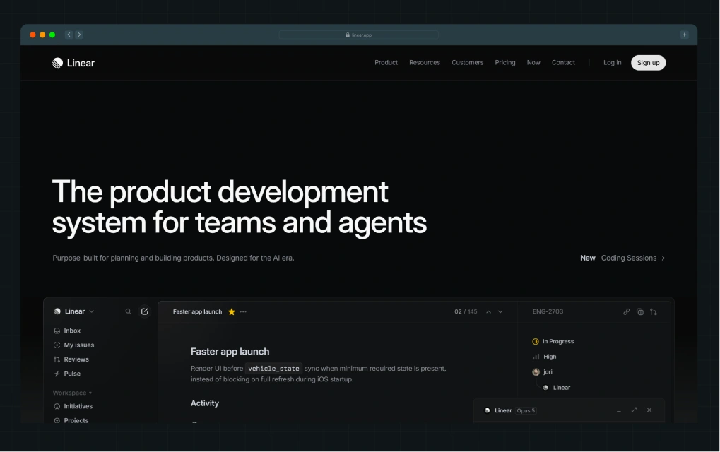
Even with a Resources section in the navigation, Linear avoids crowded menus and excessive options. The structure creates a focused browsing experience that directs attention toward the product and the sign-up action.
3. A hero section that does the heavy lifting
The hero section sits entirely above the fold. It combines your value proposition, a product visual, and your primary call to action into a single cohesive unit.
From a design perspective, your main visual must show your software in action. SaaS companies typically use interface walkthroughs, live dashboard previews, workflow animations, cursor interactions, or short product demo loops that immediately show how the platform works. To keep the section visually balanced, leave plenty of breathing room between your headline, your visual asset, and your buttons.
From a copywriting perspective, a two-button setup works incredibly well. Feature your high-intent action, such as "Start free trial," as your primary button, and place a lower-commitment option, such as "See a demo," right next to it.
To optimize this section, test your layout with heatmaps. While the button always gets the most clicks, the second most-clicked element on a software page is almost always the product graphic itself.
Freehand entered the market with a positioning challenge as much as a design challenge. Enterprise buyers first needed to understand where the platform fit within existing freight workflows. We worked with stakeholders across strategy, messaging, branding, and design to build a hero section that communicated the product's value immediately and gave the rest of the homepage a clear narrative to follow.
As Ayush explained, the project focused on aligning stakeholders around a single market narrative before translating that strategy into the website experience.
4. Visual hierarchy that guides the eye
Most users scan web pages rather than reading them word for word. As UI/UX Designer Manan Desai highlighted, visitors follow predictable F and Z-shaped scanning patterns, which makes visual hierarchy critical to a conversion-focused homepage layout.
Your most important elements must command the highest visual priority. Many brands accidentally weaken their main action by scattering their primary accent color across every button, graphic, and icon. Your primary CTA needs the strongest contrast on the entire page.
You can test your page layout by simply squinting at your screen for a few seconds:
- If decorative graphics or secondary links grab your attention first, your hierarchy needs work.
- When you blur your vision, you should only notice your headline, your primary button, and your product visual.
Intercom establishes an undeniable flow across its main layout, making it one of the best website homepage design examples for guiding a visitor's eyes straight to the call to action. They use a bold headline to state that they offer the only helpdesk designed for the AI Agent era, noting that their integrated AI agent improves every customer conversation.
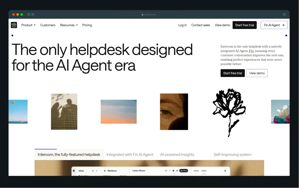
They place this text against a clean, high-contrast white background and use a bold black button for their free trial. Because their interface elements use a vibrant blue as a precise accent color, it visually ties the layout together and directs attention directly to the primary action.
5. One primary CTA with a supporting secondary
Every homepage needs one clear primary action. If visitors see too many competing CTAs, they hesitate rather than convert.
Your primary CTA should stand out visually with a filled, high-contrast button style. The secondary CTA should feel lighter through a ghost button or text-link treatment. Display both options in your hero section, and then repeat them at natural breaks throughout the page, such as after your social proof or at the bottom of feature lists.
For SaaS companies, if your main goal is to secure live platform demos, make your secondary button read "Watch a three-minute product tour" instead of introducing a second high-barrier request. When done right, this primary-and-secondary pairing allows you to target different segments without cluttering your focus.
For example, Notion's hero runs its primary CTA ("Get Notion free") alongside a supporting secondary CTA ("Request a demo").
.webp)
The first CTA appeals to individual users who want instant access. The second supports enterprise buyers who need approvals, stakeholder buy-in, or sales conversations before moving forward.
6. Social proof: Logos, numbers, and context
Social proof delivers visual evidence that real companies trust your product by displaying customer logos, user counts, and third-party ratings.
To maximize credibility, place a clean logo bar directly below your hero section. Feature a continuous selection of client logos using an infinite marquee with a muted or grayscale treatment on a solid background.
Numbers also need context to feel believable. “10,000 users” sounds generic. “10,000 marketing teams cut reporting time in half” communicates a measurable outcome people can actually care about.
Early-stage SaaS brands can still build trust without enterprise logos. Strong G2 ratings, review counts, founder-led case studies, or short customer quotes often create more credibility than anonymous logo collections.
At ThunderClap, we’ve applied this website strategy by placing an infinite-scrolling logo marquee directly below the main fold, showcasing SaaS brands such as Dropit, Amazon, Razorpay, Storylane, and Factors.ai.
We anchor this dynamic ticker with an absolute statement about helping 88+ B2B brands outpace boring competitors, right alongside a clear Clutch rating badge. (And yes, we are slightly obsessed with showcasing client love. We even built a dedicated Wall of Love and portfolio experience for it.)
7. Testimonials that convert, not just compliment
Inline testimonials provide contextual proof exactly where you make a big product claim, rather than hiding in a crowded carousel at the very bottom of the page.
Placing a specific quote adjacent to a CTA button or a pricing section creates a highly effective proof sandwich. This structure stacks your claim, your proof, and the required action together to drive conversion rates.
Strong testimonials always include three key pieces of information:
- The pain point
- A measurable business result
- Clear attribution containing a real name, photo, title, and company logo
One outcome-specific quote easily beats ten generic compliments. Always source these insights from your ideal customer profile because a small-business review on an enterprise-targeted page actively drives away large buyers.
When tax platform Zamp partnered with us, they needed to turn their software strengths into an authoritative market presence.
We overhauled their entire brand positioning around elite accuracy, built persona-driven user paths, and placed managed-service highlights directly on the front page. Backed by $30 million in funding and top G2 rankings, the updated layout gives buyers an undeniable reason to trust the platform before a sales call even starts.
8. Product visuals that show, don't tell
Your product visuals should help visitors understand the experience before they sign up. Screenshots, walkthroughs, short demos, and interactive product tours consistently outperform generic illustrations because people want to see how the product actually works.
Copy-wise, every visual asset requires a clear headline that names the underlying value rather than just labeling the feature. Writing "Your full pipeline, at a glance" lands much harder than a cold label like "Pipeline Dashboard View." Interactive product tours built on platforms like Storylane or Arcade also keep use rs engaged far longer than static images do.
ThunderClap utilized this visual philosophy when rebranding Factors.ai. They previously described their platform in flat, technical terms such as dashboards and integrations. We tied their new identity back to the Marketing Compass metaphor, using watchtower-inspired web design elements and contour lines throughout the user interface.
We paired these animations with a sharp, emotionally resonant headline: "Know how your buyers move. Run campaigns that win."
9. A feature-benefits section (not a feature dump)
Most SaaS websites overload visitors with feature grids that list capabilities without explaining why they matter.
Strong feature sections connect functionality to a real business impact. For example:
- “Automated reporting” becomes “save 12+ hours every week.”
- “Custom workflows” becomes “cut approval delays from days to 8 hours.”
The benefit matters more than the tool itself.
Layout also plays a major role in engagement. Traditional three-column icon grids have become so common that many users scroll past them automatically. Alternating layouts with visuals, use-case groupings, or modular content blocks creates much stronger engagement and scroll depth. Segmentation improves performance even further.
ClickUp executes this brilliantly by turning a standard feature list into an interactive, all-in-one ecosystem map. They completely ditch the boring checklist. Instead, they pack dozens of micro-capabilities into a massive grid layout and anchor the entire section around a prominent central block. This centerpiece splits cleanly into four primary quadrants: Projects, Docs, Brain (AI), and Chat.
Visitors skip reading a long wall of text. They instantly see every capability, click a core quadrant, and land directly on a dedicated feature page.
10. Trust signals beyond social proof
How do you prove your software is actually safe to buy before a user hands over their data?
With trust signals like security badges, compliance certifications, integration logos, and live uptime statistics.
Displaying a row of operational badges for SOC 2, GDPR, or ISO compliance near your pricing section or footer sets a professional standard. If security is a primary differentiator for your audience, elevate these details to a higher position on the page.
We implemented this structured approach during our project with FillHQ, a secure eSignature platform preparing for regulated-market expansion into healthcare and finance. The layout had to scale to support a massive SEO plan while maintaining the existing brand colors.
We built a comprehensive messaging framework and prioritized security compliance markers for HIPAA, SOC 2, and GDPR directly on the primary pages. By highlighting these non-negotiable trust signals alongside automated workflows, we positioned the brand as a credible market leader and successfully drove qualified leads straight to their enterprise demos.
11. A pricing signal or friction reducer
A pricing signal manages buyer expectations around cost and commitment right next to your primary button without requiring a full detour to a separate pricing page.
Placing a subtle note like "Free plan available" or "Plans start at $9 a month" adjacent to your call to action dramatically reduces user hesitation. You can also eliminate micro-hesitations at the exact moment of decision by adding clear friction reducers like "No credit card required" or "Cancel anytime."
Airtable handles this perfectly in their hero section and serves as one of the best website homepage design examples for getting visitors to click without hesitation.
.webp)
Their primary buttons explicitly state “Get started for free” (and “Sign up for free”). Right above the main action button, they drop a crucial friction reducer: “No code required.” This tiny phrase instantly removes the fear of technical complexity at the exact moment a user decides to click.
12. A footer that converts, not just closes
The bottom of your homepage represents a high-intent zone because visitors who scroll all the way to the end have already consumed your core message. This action signals real buying intent, yet most companies waste this valuable space on basic copyright text and messy link columns.
A lot of brands treat the footer like an afterthought: a few corporate links, legal pages, and that’s it. But Cal.com uses the entire footer as a resource hub. Instead of making you hunt around the site, they give you direct access to almost every part of their ecosystem right from the bottom of the page.
They’ve added a full grid of download buttons for iPhone, Android, and major desktop browsers alongside security and compliance badges. So the moment someone decides, “Okay, I want to try this,” they don’t have to search for the right app or next step.
What’s smart is how they’ve turned a section most users ignore into a genuine onboarding space. You’ll also find structured links for different use cases, products, and support resources, all in one place, making the footer feel less like an exit point and more like a launchpad.
{{specficBlog}}
Weak Homepage vs. Strong Homepage: What Changes at Each Element
Here’s what separates a homepage that simply looks good from one that actually converts.
Bonus read: Best B2B Website Designs: What You Should Copy to Increase Conversions
Is Your Homepage Converting the Way Your Product Deserves?
Knowing what a great homepage needs and building one that delivers are two very different problems. Most SaaS teams get stuck in the gap between them.
At ThunderClap, we approach every homepage as a strategic system, not a design exercise. We establish a clear value proposition before we touch a single layout, design a sharp visual hierarchy that makes your main button the most obvious element on the page, and embed social proof exactly where it drives action.
As Sreeram explains:
"Branding is not just about making things look good visually. It directly affects how people perceive, trust, and remember a company across the entire funnel. When the storytelling, visuals, and positioning become memorable and emotionally distinctive, people tend to connect with the brand faster and remember it much longer."
For example, when we rebuilt ClearlyRated's website, fixing their messaging wasn't even the original brief. Our audit revealed that their product pages explained what the platform did without making clear why it mattered to buyers. We rewrote the copy to lead with business impact for each ICP, and post-launch, they saw a 101% increase in active users, an 82% increase in total views, and a 14% increase in organic clicks.
{{ctaBlock}}
FAQs
1. What is a high-converting homepage?
A high-converting homepage is a webpage designed to effectively persuade visitors to complete a desired action, such as signing up, booking a demo, or making a purchase. It achieves this through clear messaging, intuitive navigation, a strong visual hierarchy, compelling CTAs, and trust-building elements.
2. What are the most important elements of a homepage design?
The most important elements of a homepage design include a clear value proposition, a strong primary CTA, product visuals, social proof, and trust signals. SaaS homepages perform best when visitors immediately understand what the product does and why it matters.
3. How does UX impact homepage conversions?
UX shapes how easily visitors navigate the homepage and take action. Confusing layouts, weak hierarchy, slow load times, and poor mobile experiences lower conversions. Strong UX keeps the experience intuitive, focused, and easy to follow.
4. What role does social proof play in homepage design?
Adding social proof on the homepage lowers the perceived risk of buying your software. For SaaS buyers evaluating multiple tools, seeing logos from recognizable brands, verified star ratings, and outcome-driven testimonials signals that the product works and that industry peers trust it.
5. How many CTAs should a SaaS homepage have?
You should use one primary call to action and one secondary option on the SaaS homepage. The primary CTA drives the main conversion goal, while the secondary CTA supports visitors who need more information before committing.
6. Should my homepage show pricing?
Your homepage does not need a full pricing table, but adding a pricing signal helps reduce hesitation. Phrases like “Free plan available” or “No credit card required” make the next step feel lower risk and more approachable.
You just watched a 45-second video on LinkedIn that explained a SaaS concept so clearly that you immediately thought, "We need to do this."
You stop scrolling, rewatch it, and notice something. It's neither flashy nor cinematic. It's just clear, focused, and it made you want to learn more.
If that moment felt familiar, you've just witnessed the future of B2B video marketing.
By 2026, video won't become more elaborate. It's becoming smarter. It's shorter. It's personalized. AI powers it. And it's converting at rates that text-based content can't touch.
At ThunderClap, we've worked with over 129 B2B websites for SaaS, fintech, AI, and enterprise tech companies, including Factors AI, Amazon, Razorpay, Storylane, and Deductive AI, and one thing we've learned is this: the best-performing B2B videos aren't about production value. They're about clarity, strategy, and platform fit.
Video marketing is no longer optional for B2B companies. 87% of B2B marketers plan to invest in video in 2025, and the trends shaping 2026 reveal why. Landing pages with video convert 86% higher than those without, 90% of marketers report positive ROI from video (the highest ever recorded), and 49% revenue growth separates companies that invest in video from those that don't.
In this blog, we'll walk you through the 10 video marketing trends that will define 2026, show you what's changing in production and strategy, and help you avoid the mistakes competitors are still making.
TL;DR
- Short-form vertical video (under 60 seconds) is the #1 format driving ROI in 2026, replacing long-form as the default engagement play.
- AI-generated and AI-assisted video will power 75% of marketing videos by 2026, reducing production costs by 70% while enabling mass personalization.
- Personalized video is rising. 68% of marketers say it improves engagement and reply rates, with brands creating multiple versions per campaign.
- B2B video must integrate with CRM and analytics systems for real-time lead scoring, smarter follow-ups, and measurable ROI tracking.
- Interactive AI video generation is emerging, allowing real-time scene adjustment and dynamic storytelling based on viewer behavior.
- The V.I.D.E.O. Trend Framework (Vertical, Integrated, Data-Driven, Experienced, Outcome-Focused) separates high-performing video strategies from vanity projects.
- Video success in 2026 requires a scalable video content marketing system that is in sync with trends, too. Not isolated one-off productions.
Why 2026 Is a Turning Point for B2B Video Marketing
If you watched B2B video in 2025, you saw what traditional agencies produced: polished, long-form, cinematic content that looked impressive but often failed to convert.
2026 is different.
The video scene shifted in four fundamental ways:
- First, platforms have spoken. LinkedIn, YouTube Shorts, and TikTok now reward short-form vertical video with algorithmic reach.
75% of US adults watch up to 2 hours of short-form video daily, and B2B buyers are no exception. They're scrolling the same feeds, consuming the same content formats, and making decisions based on the videos they see in 30 seconds or less.
- Second, AI has democratized production. You no longer need a $50,000 budget and a six-week timeline to produce a professional video. AI reduces production costs by 70% and timelines to nearly instant. 87% of creative professionals now use AI tools for video creation, with 66% using them weekly. By 2026, 75% of marketing videos will be AI-generated or AI-assisted.
- Third, buyers demand personalization. Generic videos for all audiences no longer cut it. 68% of marketers say personalized video improves engagement and reply rates. In SaaS, that means different versions for product managers vs. CFOs vs. IT leaders, all from a single source asset.
- Fourth, video is no longer a marketing-only tool. 84% of B2B buyers rely on social media during their purchase journey, and 53% of businesses report that video has directly reduced support requests, saving internal resources. Video lives across sales decks, onboarding flows, product education, and customer success.
If your 2026 video strategy hasn't accounted for these shifts, you're already behind.
The 10 Video Marketing Trends Changing B2B SaaS in 2026
Video Marketing Trend #1: Short-Form Vertical Video is Now Your Baseline
By 2026, the question isn't "Should we make short-form video?" It's "Why aren't we producing short-form first?"
The data is unambiguous:
- Videos under 60 seconds have the highest completion rates
- Short-form videos (15-30 seconds) saw a 48% lift in click-through rate YoY
- 52% of B2B buyers prefer concise videos that "get to the point"
- Short-form is the #1 format marketers plan to invest more in for 2026
What does "short-form" mean? 30 to 90 seconds, vertical orientation, mobile-first design. This is the sweet spot for LinkedIn, YouTube Shorts, and TikTok, the platforms where 80% of B2B decision-makers are hanging out.
The shift away from 3-to-5-minute explainers isn't about dumbing down content. It's about respecting the buyer's attention. In a crowded feed, you have 3 seconds to prove the video is worth watching. Short-form forces clarity.
What to do now:
- Prioritize 30-90 second video productions in your video content marketing plans (try to include trends too)
- Optimize for vertical format (9:16 aspect ratio)
- Test captions and text overlays (50% of viewers watch without sound)
- Measure completion rates, not just views
Video Marketing Trend #2: AI-Generated and AI-Assisted Video is the Competitive Standard
Here's what's happening: AI video tools have moved beyond novelty. They're becoming table stakes. By 2026, 75% of marketing videos will be AI-generated or AI-assisted. Not because agencies want them to be. Because AI enables speed, scale, and personalization that manual production can't touch. The technology is advancing fast. Platforms like Google's Veo 3, OpenAI's Sora, and HeyGen now allow you to:
- Generate high-quality video from text prompts.
- Automate editing, voice-over, and motion graphics
- Create video variations for different audiences
- Produce, test, and optimize in days instead of weeks
The cost advantage is staggering: AI reduces production costs by up to 70% while cutting timelines to nearly instant. But here's the critical insight: AI isn't a replacement for strategy. It's a force multiplier. The brands winning with AI video aren't just hitting "generate." They're combining strategic direction, brand guidelines, and clear conversion goals with AI tools. They're using AI to produce variations and test which narrative hooks work best. They're repurposing assets across campaigns at scale. 87% of creative professionals now use AI tools for video creation. The question for your team isn't whether to use AI. It's how to use it without producing generic, homogenized content.
What to do now:
- Experiment with AI video tools (HeyGen, Synthesia, Runway)
- Build a brand prompt library so AI-generated videos stay on-brand
- Use AI for production speed, not creative direction
- Test AI-generated variations against human-produced content
- Never sacrifice clarity for efficiency
Video Marketing Trend #3: Personalized Video is Rising (And It's Getting Easier)
A single generic video for all audiences underperforms. Your CFO cares about ROI. Your product manager cares about workflows. Your IT security team cares about compliance.
One video can't speak to all three. 68% of marketers now say personalized video improves engagement and reply rates. In 2026, the barrier to creating personalized videos is collapsing. Emerging AI technologies like SoulID are making character consistency across multiple videos possible. Dynamic scripting tools allow dialogue and messaging to adapt based on viewer data. Some platforms now allow you to create branching video paths where viewer decisions alter the narrative flow.
What does this look like in practice?
Imagine a product demo where:
- The intro changes based on company size (5 employees vs. 500)
- The features highlighted match the viewer's role
- The CTA is personalized to their stage in the buying journey
- Follow-up messaging adapts based on video engagement
The challenge: Scale. Producing 50 video variations manually is impossible. But producing one master video and using AI to personalize dialogue, messaging, and imagery? That's viable today.
What to do now:
- Map your core audience segments (by role, company size, industry)
- Identify the 3-5 key messaging variations needed
- Use AI personalization tools to create multiple versions from one base asset
- Test which message variants drive higher engagement
- Automate follow-up based on video engagement signals
Video Marketing Trend #4: Video Analytics Integrate with CRM for Real-Time Lead Intelligence
For years, video was a black box. You'd produce great content, publish it, and wonder: "Did anyone actually watch this? Did it matter?"
2026 is different.
Video analytics are now integrating directly with CRM systems, offering real-time insights into viewer behavior. This changes everything about how you think about video ROI.
Instead of guessing, you now know:
- Which prospects watched your product demo (and for how long)
- Which competitors did they research before watching your video
- Whether they visited your pricing page after engaging with your content
- Which video hook drove the highest conversation rate
- Which B2B accounts are showing buying intent based on video engagement
This data enables smarter follow-ups. Instead of sending a generic email to everyone who watched, sales can prioritize prospects who watched 80% of your demo video. Marketing can score leads based on video engagement patterns. Product teams can see which features resonate most through video behavior.
What to do now:
- Implement video tracking in your CMS or marketing platform
- Integrate video analytics with your CRM (HubSpot, Salesforce, Pipedrive)
- Define what "high engagement" means for each video type
- Create lead scoring rules based on video engagement
- Share insights with sales so they can reference video engagement in outreach
Video Marketing Trend #5: Interactive and Real-Time AI Video Generation
This is where things get weird (in a good way). By late 2026, static AI video generation will feel outdated. The next evolution is interactive, real-time video generation, where creators direct AI like a live production.
Imagine being able to:
- Adjust lighting and camera angles in real-time
- Modify character expressions mid-scene
- Change backgrounds without re-rendering
- Experiment with different narrative directions instantly
Platforms with an AI video generator like Higgsfield are already moving in this direction. The implication is profound: video creation becomes closer to improv and real-time collaboration than traditional production.
For B2B marketers, this means:
- Faster creative iteration (test 10 narrative approaches in a day)
- More control without needing technical expertise
- Ability to respond to market feedback in weeks, not months
- Real-time personalization based on viewer data
This won't fully mature until 2027-2028, but the trends are clear. AI video is moving toward interactivity, not just automation.
What to do now:
- Stay informed on emerging AI video tools
- Run pilots with interactive video platforms
- Don't bet your entire 2026 strategy on tech (it will break)
- Focus on proven AI tools while experimenting with emerging ones
Video Marketing Trend #6: Product Videos and Animations Drive "Aha" Moments
Explaining software through written copy is exhausting. Your buyers are busy. They want to see how your product works, understand the value in seconds, and move on. Product videos are now ranked as the most impactful video type by Wistia. And 36% of marketers report that animated content has a measurable impact on their major KPIs.
What works in product video for 2026:
- Animated explainers simplify abstract concepts; instead of explaining how your API works, show it. Instead of describing your workflow automation, animate it.
- Live-action product demos build trust. When a real person uses your product to solve a real problem, buyers feel the credibility.
- Hybrid approaches (animation + live action) help you stand out. Pure animation can feel sterile. Pure live-action can feel slow. Blending them creates visual interest while maintaining clarity.
- Feature-led storytelling demonstrates how specific parts of your product fit into real workflows. This is where
See how ThunderClap redesigned the Factors AI website with cool product illustrations:
What to do now:
- Audit which product features are hardest to explain in copy
- Prioritize video for those features
- Mix animation, live-action, and UI screenshots (don't pick just one)
- Test different explanation styles to find what converts
- Place product videos near CTAs on your
Video Marketing Trend #7: Long-Form Thought Leadership Still Wins Bottom-Funnel
Short-form dominates. But don't kill long-form yet.
Long-form educational content still performs strongly on YouTube, particularly for bottom-funnel buyers, with viewers staying engaged for an average of 6 minutes.
Webinars continue to deliver exceptional ROI: 213% average ROI, with B2B SaaS seeing peaks of 430%.
Videocasts, podcasts, and in-depth interviews still drive thought leadership. The key difference in 2026 is repurposing.
You produce one long-form webinar. From that asset, you extract:
- 10 short-form clips for LinkedIn
- 3-4 quote videos for TikTok
- 1-2 highlight reels for YouTube Shorts
- 1-2 email-friendly animated clips
- Transcripts for blog content
One production, multiple formats, maximum reach.
What to do now:
- Keep producing long-form educational content (webinars, deep dives, interviews)
- Build a repurposing system to extract short-form clips
- Use AI-powered editing tools to speed up the process
- Track which short-form clips drive the highest engagement
- Double down on messaging from your best-performing clips
{{specficBlog}}
Video Marketing Trend #8: Vertical Video and Silent-First Production
Here's what's really happening: Mobile is no longer an afterthought. It's the primary format. Vertical video consumption continues to grow, especially on LinkedIn and TikTok. Your B2B buyers are watching videos on their phones while scrolling between meetings.
This changes everything about how you produce video:
No sound? No problem. Most viewers watch without audio. Your video must communicate without sound. Captions, text overlays, and visual clarity become critical. If your video only makes sense with audio, you're losing 50% of your audience.
What to do now:
- Shoot all B2B videos in a 9:16 vertical format
- Assume no sound (use captions for everything)
- Add text overlays for key points, not just transcripts
- Test mobile viewing before publishing
- Optimize thumb-stop rate (can you hook viewers in 3 seconds?)
Video Marketing Trend #9: Sales Teams are Adopting Short-Form Video
For years, video was a marketing department thing. In 2026, sales teams are doing it too. B2B companies are increasingly incorporating short-form video into sales processes, with customer-facing teams using bite-sized content to engage prospects throughout the sales cycle.
This is powerful because sales has objection-handling content. Instead of explaining a pricing model in an email (which gets ignored), a sales rep sends a 60-second video addressing the exact objection the prospect just raised.
Video accelerates deal velocity. Prospects understand product value faster. Sales reps spend less time on repetitive explanation calls. Sales can show prospect-specific ROI. A custom 2-minute video showing how your solution saves time for a prospect's specific workflow? That converts better than any generic demo.
The system becomes scalable. Marketing creates a library of short-form videos addressing common objections, features, and use cases. Sales reps use these as templates, customize as needed, and scale impact.
For this to work, video quality must be consistent but not overproduced. Sales reps don't need Spielberg-level production. They need clear, authentic, customizable content.
What to do now:
- Build a sales-focused video library (objections, features, ROI proofs)
- Make videos easy for sales reps to customize and share
- Train sales teams on when and how to use video effectively
- Track which sales videos drive engagement and follow-up meetings
- Create templates that sales can use to produce their own short-form content
Video Marketing Trend #10: AI-UGC Hybrid Content Balances Authenticity with Scale
Here's a challenge in 2026: How do you scale authentic user-generated content without losing the human touch that makes it credible? AI-UGC is the answer. A hybrid approach that combines the authenticity of user-generated content with the scalability of AI.
Here's how it works:
A customer creates an authentic testimonial video on their phone. It's genuine but rough. Instead of cleaning it up manually (which takes time), you use AI to:
- Add professional captions
- Improve audio fidelity
- Optimize for different platforms
- Translate into multiple languages
- Extract short-form clips
The result? Authentic, credible customer content at scale, without sacrificing quality. It usually shows that UGC and AI-generated content (AIGC) are competing, but AI-UGC brings the best of both.
What this means: By 2026, customer testimonial videos won't require a film crew. They'll be authentic, AI-enhanced, and deployed across your entire website, sales decks, and social channels.
What to do now:
- Encourage customers to create simple testimonial videos
- Invest in AI audio and caption tools to polish UGC
- Create a system for extracting and repurposing customer videos
- Build a library of AI-enhanced testimonials
- A/B test AI-UGC against professionally produced content
The V.I.D.E.O. Trend Framework
So far, we've covered 10 B2B video marketing trends. But how do you know which ones matter for your business?
At ThunderClap, we've seen teams invest heavily in video and see no results. And we've seen modest video budgets drive 50%+ conversion increases. The difference is rarely the production quality.
The difference is strategy.
We call it the V.I.D.E.O. Trend Framework, a way to evaluate whether your video strategy will convert in 2026.
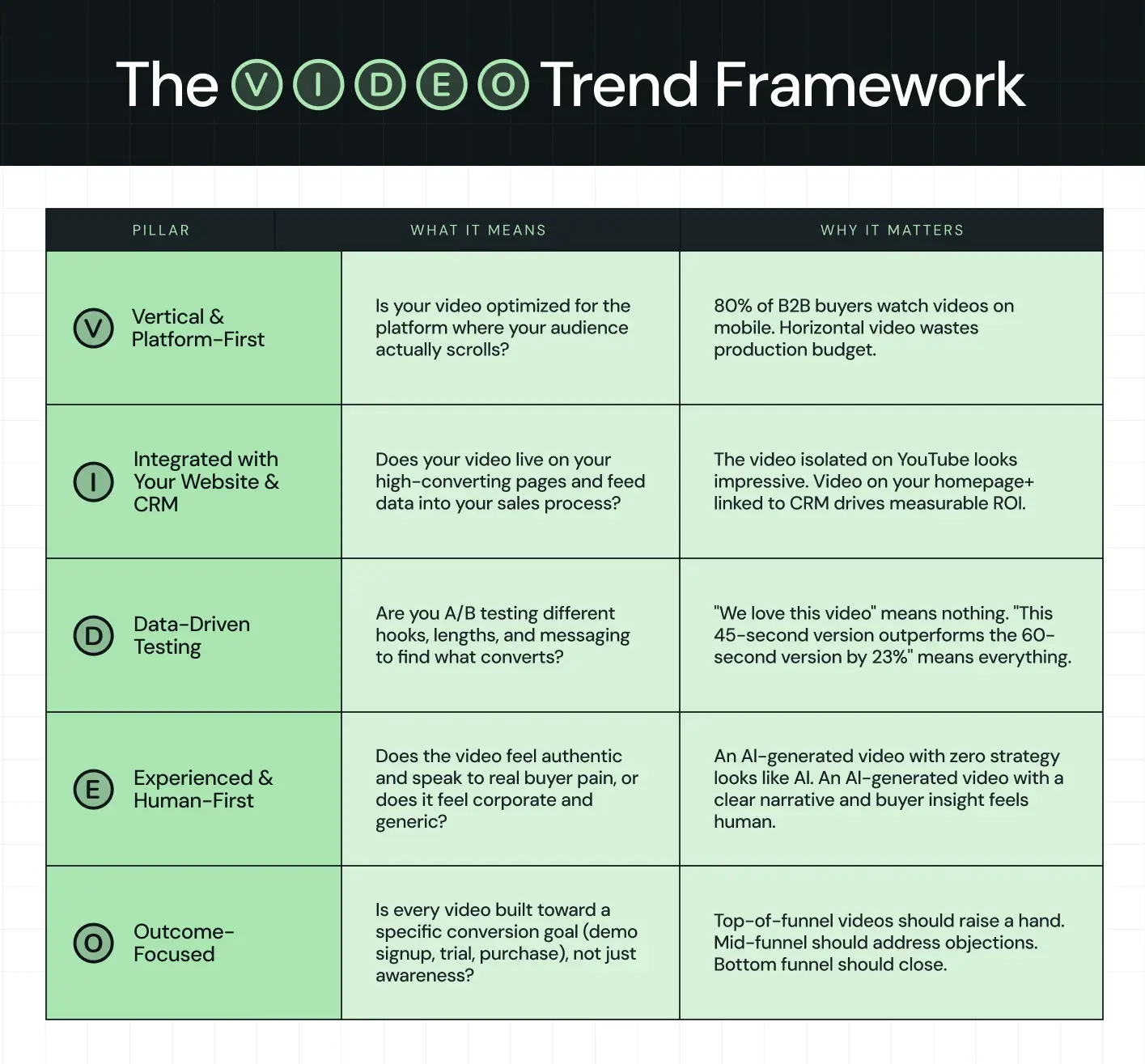
Use this framework when evaluating ANY video you're considering:
Does it check all five boxes? If yes, produce it.
Missing one? Reconsider. A beautiful AI-generated video that doesn't integrate with your CRM is a wasted production budget. A personalized video that isn't platform-optimized won't see engagement. A data-driven test without an authentic narrative will feel forced.
How to Build Your 2026 Video Strategy: Starting Today
The B2B video marketing trends are clear. The tools exist. The question is: How do you actually build this into your operations?
Here's a practical playbook:
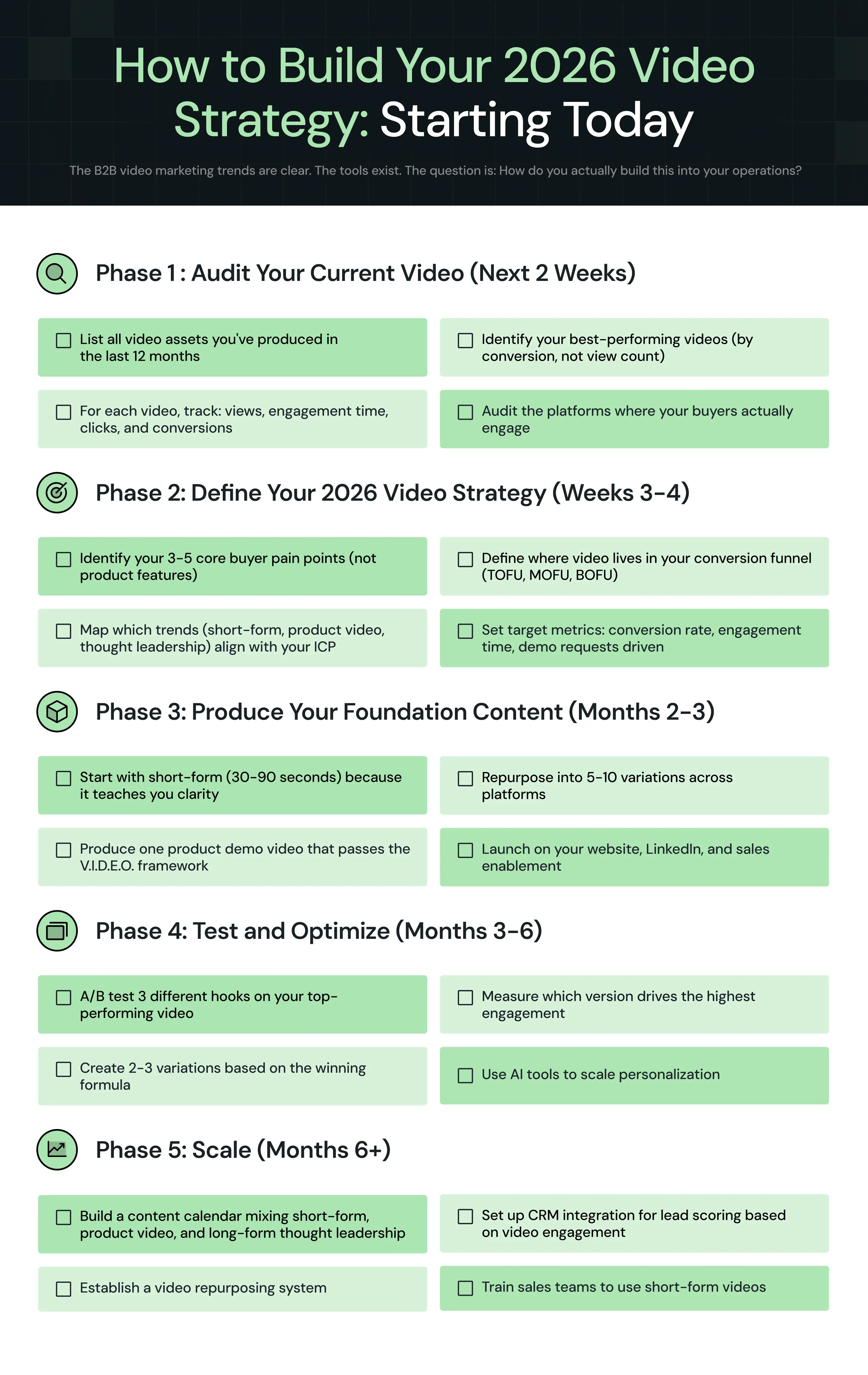
Why Video + Website Strategy is the Winning Combo
A stunning explainer video doesn't convert if it's buried on page 3 of your website.
At ThunderClap, we've rebuilt 129+ B2B websites and produced dozens of video campaigns. The most successful clients are those who think of video and websites as an integrated system, not separate projects.
Your website is where your video lives. Your video is what clarifies your website's value prop. Together, they form the conversion engine.
This integrated approach requires:
- Website platform flexibility: Your CMS needs to handle video embeds, custom integrations, and dynamic personalization.
- Webflow is built for this.
- Consistent messaging: Your video narrative should mirror your website copy and positioning.
- Strategic placement: Don't just slap video on your homepage. Place videos contextually where they answer specific buyer questions.
- Performance data: Track how video engagement correlates with conversion rates, lead quality, and sales cycles.
If your video strategy doesn't account for where video lives and how it integrates with your digital presence, you're missing 70% of the opportunity.
Ready to evaluate your video and website strategy together?
{{ctaBlock}}
%20Audit%20That%20Actually%20Improves%20Revenue.webp)
How to Do a Conversion Rate Optimization (CRO) Audit That Actually Improves Revenue
TL;DR
- Most conversion rate optimization (CRO) audits fail because they focus on page-level tweaks instead of buyer decisions. Changing button colors will not resolve hesitation or build trust.
- Companies using CRO tools report a 223% ROI, yet only 39.6% have a documented CRO strategy. The gap is in execution, not tools.
- High-pressure environments reduce the odds of a purchase by 43%, and much of this friction is not visible in standard analytics.
- An effective CRO audit identifies friction across the entire user journey, not just at the final conversion point.
- Segmenting users by intent, such as cold, warm and high-intent, is the step most teams skip, and it's where the biggest revenue opportunities hide.
- The future of CRO is not a one-time audit. It is a continuous system that evolves, adapts, and improves alongside your buyers.
You ran a CRO audit. You got a 47-slide deck. Your developers fixed some CTAs, your designer tweaked a hero banner, and your conversion rate moved from 2.1% to 2.3%.
Champagne? Not quite.
Here's the thing about most CRO audits: they look at the right data but ask the wrong questions. They tell you what happened on your pages, including clicks, scrolls, and drop-offs, but not why your buyers hesitated or left quietly to evaluate your competitor instead.
A real conversion rate optimization (CRO) audit doesn't just measure behavior. It maps decisions. And for B2B teams in high-stakes markets, that is the difference between a good-looking report and actual revenue growth.
Why Most Conversion Rate Optimization Audits Don’t Move the Needle
Only 28% of companies are satisfied with their conversion rates, while 37% report being either quite dissatisfied or very dissatisfied. The reason isn't that they lack data. It's that the data they're acting on doesn't tell the whole story.
They optimize pages, not buyer intent
The classic CRO audit obsesses over button colors, CTA placement, and microcopy.
These things matter at the margins. But they don't resolve the core problem.
High-pressure environments reduce the probability of purchase by 43%, and that friction rarely occurs at the CTA. It lives in unanswered questions, vague positioning, missing trust signals, and pricing pages that feel like a locked door.
When a VP of IT at a defense contractor lands on your product page, they're not bouncing because your button is the wrong shade of blue. They're bouncing because your page didn't answer the question, "Is this built for organizations like mine?"
They treat traffic as uniform
A first-time visitor who found you through a blog post is not the same as a returning buyer who just visited your pricing page three times this week.
Same URL. Very different intent.
B2B buyers go through an average of 27 touchpoints before making a purchase decision, distributed across different channels, devices, and times. This means what looks like a single “user journey” is actually a series of fragmented interactions.
This fragmentation makes the journey difficult to track and even harder to interpret:
- 61% of B2B marketing managers say they lack a clear view of the customer journey
- Only 21% of companies can effectively measure the ROI of their content marketing efforts
- 84% of B2B companies still rely on last-click attribution models
When visibility is this limited, decisions become flawed. Teams optimize for what they can measure, not what actually drives conversions, and critical intent signals get ignored.
Audits that treat all traffic as a single segment average across wildly different journeys and draw conclusions that apply to no one in particular. A government contractor in Texas doing early-stage research needs completely different information than a procurement manager in Florida who's already shortlisted two vendors.
They rely too heavily on surface-level data
Heatmaps tell you where people clicked. Scroll depth tells you how far they read. Neither tells you what they were actually thinking or what stopped them from moving forward.
B2B buyers spend only 17% of their total purchase journey talking to sales reps, split across all vendors. This suggests your company's actual share of that interaction is less than 5%. The rest happens in self-directed research, your analytics can't fully see.
Heatmaps capture the visible tip of that iceberg. The doubt, the internal alignment conversations, the competitor comparison happening in a different browser tab, and none of that shows up in a scroll depth report.
This is where most CRO audits fall short. They track behavior, not intent. High-performing teams, such as ThunderClap, do the opposite, building their messaging on real customer insights (instead of behavioral data).
As highlighted in a LinkedIn post by Rahul Nair of VuNet Systems, this shift from surface-level data to deep customer understanding can fundamentally change how websites perform.
For example, when VuNet Systems revamped their website, the team based every line of copy on actual ICP discovery calls with stakeholders. Instead of relying only on behavioral data, they focused on how their customers think, evaluate solutions, and make decisions.
The result was not just a visual upgrade, but a measurable business impact:
- Stronger brand perception
- Clearer product positioning across their customer base
- More effective communication of solutions and differentiation
- Improved interaction with prospective customers
What a High-Impact CRO Audit Actually Does Differently
A high-impact audit doesn't pick one of these lenses. It uses what we call The 4-Lens CRO Audit Framework to understand not just what users do, but why they do it and how those behaviors connect to revenue outcomes.
Each lens reveals a different layer of the B2B buyer journey. When combined, they provide a complete picture of conversion friction and opportunity.
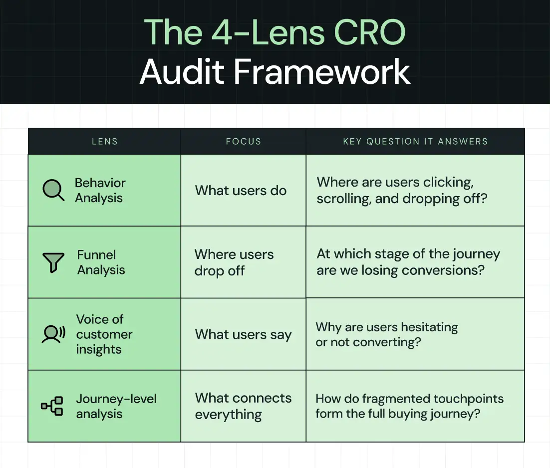
Behavior analysis (What users do)
Clicks, scrolls, navigation paths…this is the foundation.
But where do users go? Where do they stop? Which paths lead toward conversion and which ones lead to exit?
Behavior data is your starting map, but it's still just a map.
Funnel analysis (Where users drop off)
Entry points to exit points, conversion paths, and where the gap between traffic and revenue lives. A one-point lift in B2B website conversion, say, from 2% to 3%, can cut customer acquisition cost by 15–25%.
This makes funnel clarity one of the highest ROI investments you can make. However, it’s not enough.
The real question is: What's actually causing the drop?
That's what funnel data alone can't answer.
Voice-of-customer insights (What users say)
Surveys, on-site feedback, and sales call analysis. Forrester data shows that more than 90% of B2B buyers trust peers in their industry, while only 29% trust vendor sales reps.
That trust gap shows up in your conversion data, and closing it requires actually listening to what buyers tell you about why they hesitated. Sales call recordings, in particular, are a goldmine. The objections your reps hear on calls are often the same doubts silently killing conversions on your website.
Journey-level analysis (What connects everything)
This is where most teams struggle, connecting fragmented touchpoints into a single, coherent buyer journey. Pre-visit influence, multi-session behavior, and off-site research provide the full picture of how a buyer went from being vaguely aware to ready to buy.
Platforms like ThunderClap are built to surface these patterns, not just isolated interactions.
The Modern CRO Audit Framework (Step-by-Step)
The CRO audit framework we’re going to walk through consists of 6 steps (yes, just 6 this time, but don’t worry, we’re not cutting corners).
Each step builds on the previous one, so by the end of this, you won’t just have a checklist. You’ll actually understand how conversions happen and what’s stopping them on your website.
Let’s get into it.
Step 1: Start with conversions, not traffic
The first thing you need to do is shift how you think about your website.
Most teams start with traffic. They look at how many people are visiting, where they’re coming from, and how to increase those numbers. But here’s the problem. Traffic doesn’t mean anything if it doesn’t convert.
So instead of asking, “How do we get more visitors?” you need to ask, “What are visitors actually doing when they convert?”
Start by defining what a conversion means for your business. This could be a purchase, a demo request, a form submission, or even a newsletter signup. Whatever it is, be specific. Saying you want to “increase revenue” is too broad and not helpful when you’re auditing performance.
Once that’s clear, look at where these conversions are happening.
- Which pages do users visit right before converting?
- What actions do they take along the way?
- Are there specific paths that show up again and again?
You’ll often find patterns you didn’t expect. For example, users might not convert on their first visit. They might check your pricing page, leave, come back later, read a case study, and only then take action. At this stage, the goal is not to fix anything yet. It’s to understand what’s already working so you can build on it instead of guessing.
Step 2: Identify high-intent user journeys
Now that you know what a conversion looks like, the next step is to understand how people get there.
Every user follows a path before converting. Some land on your homepage and leave. Others explore multiple pages, compare options, and then take action. These paths are what we call user journeys.
However, not all journeys are equally valuable. Some users are just browsing. Others are much closer to making a decision. You need to focus on the journeys that show clear intent.
For example, you might see patterns like:
- A visitor lands on a feature page, then moves to pricing, and then books a demo
- Someone reads a case study, checks your product page, and signs up
- A user visits your site multiple times before finally converting
These are high-intent journeys. So, what should you do here?
Go through your data and identify:
- The most common paths taken by users who convert
- The pages that appear right before conversion
- The sequences that lead to faster decisions
This helps you separate casual visitors from serious prospects.
And that’s important because improving a high-intent journey has a direct impact on conversions, while optimizing random pages usually doesn’t get you anywhere.
Step 3: Analyze friction at key touchpoints
Once you’ve identified the important journeys, it’s time to figure out what’s getting in the way. Start by reviewing the key touchpoints in your high-intent journeys and ask yourself a simple question. “Why would someone not continue from here?”
You’ll usually find issues like:
- Missing information: Users don’t have enough detail to make a decision
- Confusing messaging: They don’t fully understand what you offer
- Weak or unclear CTAs: They’re not sure what to do next
- Lack of trust: There are no testimonials, proof points, or credibility signals
Sometimes, the problem is not the content, but the experience itself. Pages might load slowly, forms might be too long, or important elements might be hard to find.
These patterns show up more often than most teams expect. The tricky part is that users won’t tell you what’s wrong. They’ll just leave.
Kiran Kulkarni, Partner and Head of Growth at ThunderClap, audited over 100 SaaS home pages and found that the same conversion mistakes keep repeating. Many of these sites were built to satisfy internal preferences instead of helping buyers take action, which leads to polished pages that look good but fail to convert.
Chances are, you’ve made one or more of these mistakes, too.
So, your job is to observe behavior, spot patterns, and identify where people drop off or hesitate.
Write everything down. You’ll need it later.
Step 4: Segment users by intent (this is a critical step)
At this point, you might be tempted to treat all users the same. Don’t.
One of the biggest mistakes in CRO audits is analyzing data without segmentation.
Think about it. A first-time visitor who just discovered your brand is very different from someone who has already visited your pricing page twice. They have different questions, different concerns, and different levels of intent.
You need to break your audience into meaningful groups. A simple way to start is:
You can refine this further by looking at new vs returning visitors, traffic sources, or even device types. If you treat everyone the same, your messaging becomes generic, and your conversion rate suffers. Before making any changes, be clear about who you’re actually optimizing for.
Step 5: Evaluate the decision-stage experience
This is where things get serious.
Forrester reports that 86% of B2B purchases stall at some point in the buying process, often because one stakeholder’s concern was not addressed early enough. This is exactly why decision-stage experiences need to remove doubt, not add complexity.
By the time a user reaches this stage, they’re already considering taking action. Take a close look at the experience around key decision points.
- Start with pricing. Is it clear and easy to understand? Or does the user have to figure things out on their own? Any confusion here can cause hesitation.
- Look at your demo or sign-up flow. How many steps does it take? Are you asking for too much information upfront? Is the process smooth from start to finish?
- Consider what happens after the user converts. Do they get immediate confirmation? Is the next step clear? Is there a delay in follow-up?
If demo requests are a key conversion point for your business, it helps to study how high-performing B2B companies structure these pages. The ThunderClap High-Converting Demo Page Playbook breaks this down with real examples, wireframes, and messaging patterns used by leading SaaS brands.
Consider what happens after the user converts. Do they get immediate confirmation? Is the next step clear? Is there a delay in follow-up?
All of these factors influence whether a user feels confident in their decision.
In this scenario, users don’t need more features or more content. They need reassurance that they’re making the right choice.
Step 6: Connect the full journey (not isolated steps)
Now for the part that most CRO audits completely miss.
Up until now, you’ve been analyzing pages, journeys, and touchpoints. But all of that still happens within your website.
In reality, users don’t make decisions in isolation. They might discover you through a blog, leave your site, read reviews elsewhere, come back via a search, check your pricing, and only then convert.
If you only look at individual pages, you miss everything that happens in between.
Take a step back and look at the bigger picture.
- Where are users coming from before they convert?
- How many visits does it take?
- What other channels or touchpoints influence their decision?
This is exactly where most audits fall apart. Traditional tools show you snapshots of behavior, but they don’t connect the entire journey. According to Forrester, 61% of B2B marketing managers say they have no clear view of the customer journey. This means most audits are drawing conclusions from incomplete maps.
A strong example of this comes from a recent website revamp for Z47, one of India’s leading VC funds. The work focused on improving the brand's user experience across touchpoints, not just individual pages. The team analyzed engagement patterns, clarified the messaging structure, and refined how information was presented across the site to better align with how users evaluate high-trust investment opportunities.
After launch, the impact showed up clearly across key engagement and traffic signals:
- +59% website traffic
- +54% active users
- +50% engagement
- +121% direct traffic
- +465% social traffic
These numbers show what happens when journey-level thinking is applied correctly, where messaging, structure, and user paths are aligned with how real buyers explore and decide.
Ayush Barnwal shared on LinkedIn how this redesign elevated both brand perception and user engagement:
At ThunderClap, we help you bring all these touchpoints together, so you can see how users move across sessions, channels, and interactions. Instead of running a one-time audit and moving on, you start building a continuous system that continually improves as user behavior evolves.
And that’s the real goal of CRO. Not just fixing what’s broken today, but understanding how to keep getting better over time.
Best Tools for Conversion Rate Optimization Audits (2026 View)
The question is not which of the best tools for conversion rate optimization audits in 2026 exist, but which ones to use and when.
For a complete breakdown of CRO tools, refer to our guide to the 9 Best Conversion Rate Optimization Tools for B2B Companies.
Behavior analysis tools
Use Hotjar or Microsoft Clarity when you need a fast, qualitative read on what users are doing on specific pages, especially for diagnosing drop-off on high-traffic pages like your homepage, pricing page, or demo request form.
Clarity is free and surprisingly robust for early-stage audits. Hotjar gives you more control with surveys layered in. Use these to generate hypotheses, not conclusions.
Product and funnel analytics
Google Analytics 4 is your baseline for traffic segmentation and goal tracking, and trust us, you’ll need it.
When you're ready to go deeper into user-level paths and multi-event flows, Mixpanel or Amplitude will show you what GA4 can't: the sequences that lead to conversion and the ones that silently don't.
AI-powered behavior intelligence
When you need to move from "what happened" to "why it happened" at scale, FullStory, Contentsquare, and Glassbox are built for that. These tools stand out in enterprise audits, where session replay and anomaly detection can surface friction points that no one would have found manually.
If you're auditing a complex SaaS product or a multi-step demo flow, this tier is worth the investment.
AI-driven personalization and experimentation
Once you've identified what to fix, Mutiny, Dynamic Yield, and Adobe Target let you test and personalize at the segment level, serving different experiences to cold visitors versus high-intent buyers without building separate pages.
Mutiny is particularly strong for B2B SaaS teams running account-based experiences.
Voice-of-customer and conversation intelligence
Gong turns your sales calls into CRO data.
The objections your reps hear, such as "We're not sure about the integration," "Our legal team will want to see your SOC 2," are the same objections killing conversions on your website.
Survicate adds on-page survey capability to capture friction in the moment.
Traditional tools analyze parts of the journey. ThunderClaps connect the full picture, helping teams move from isolated insights to continuous optimization.
{{specficService}}
Best Conversion Rate Optimization Audit Services (And When to Use Them)
Up to this point, you’ve seen how a strong CRO audit works and what it should uncover. The next question is simple:
Should you handle this internally or bring in external expertise?
This is where choosing the best conversion rate optimization audit services becomes important.
When to consider CRO audit services
There are two clear situations where bringing in external help makes sense.
- The first is when there is no dedicated CRO expertise in-house. Someone needs to connect behavior data, funnel performance, and VOC insights into a single clear direction.
Without this, teams often collect data but struggle to turn it into meaningful action.
- The second is when conversions stop improving. Internal teams may already be testing and optimizing, but results begin to level off.
Here, a fresh perspective can identify gaps that were not visible earlier.
What to look for
The best CRO services start with a B2B website strategy, not tools or templates. They take the time to understand your buyer journey, your sales cycle, and how revenue actually happens in your business.
From there, they turn insights into clear next steps. Instead of pointing out surface-level issues, they explain what users are missing, where decisions break down, and what should be tested first.
This kind of clarity is what separates useful audits from reports that sit unused.
Limitations of traditional CRO services
Most CRO engagements are still treated as one-time projects. You receive a report, implement a few recommendations, and move on. The problem is that user behavior keeps changing. What worked a few months ago may not work today.
Median free-to-paid conversion rates in B2B SaaS dropped from 50% in 2023 to 34% by 2025. Buyer expectations are shifting quickly, and static audits struggle to keep up with that pace.
The shift toward continuous CRO systems
A more effective approach treats CRO as an ongoing system rather than a one-time effort.
Teams are moving toward platforms like ThunderClap that continuously track behavior, identify pain points, and improve conversion paths over time. This turns CRO into a consistent capability instead of an occasional project, with each insight building on the last and contributing to long-term growth.
Where Most Conversion Rate Optimization Audits Miss Revenue Opportunities
Most revenue is decided long before a form is filled out or a demo is booked. Buyers quietly research, compare options, and narrow down choices without leaving obvious signals.
Many CRO audits miss this phase entirely, which is where the biggest opportunities exist.
- Over-focus on TOFU: Most teams focus on traffic and landing pages. High-intent buyers get the same experience as first-time visitors, even though they are much closer to a decision. This is where revenue is lost.
- Ignoring high-intent users: Buyers shortlist most vendors before formal evaluation even begins. By day 1, they have already placed about 4 out of 5 vendors on their shortlist, and 95% of the time, the final choice comes from that list. If your site does not clearly differentiate you at this stage, you are quietly ruled out.
- Not accounting for multiple stakeholders: B2B decisions involve large groups with different priorities. The person converting is not the only decision-maker. Your site needs to address financial, technical, and leadership concerns simultaneously.
- Treating CRO as one-time: One-time audits capture a moment. User behavior keeps changing. Ongoing CRO efforts perform better because they adapt and build on continuous learning.
A Practical CRO Audit Checklist (What to Actually Review)
A conversion rate optimization audit checklist is only useful if it reflects how buyers actually move.
Most users do not follow funnels in a straight line. They jump between pages, compare silently, and decide long before most checklists even look at them.
Here’s a checklist that’ll actually work for you:
Acquisition: Entry points
1. Are landing pages aligned with the intent of the traffic source?
A paid ad targeting IT buyers should land on a page that speaks directly to government use cases, not a generic product overview.
2. Is your messaging consistent with where the visitor came from?
Inconsistency between an ad's promise and a landing page's content is one of the fastest ways to lose a high-intent visitor.
Engagement: Key pages
1. Are users finding what they came for quickly?
Attention is short, and patience is shorter. If a buyer can't orient themselves within the first few seconds, they leave.
2. Is navigation reducing friction or adding it?
Menus that bury pricing three clicks deep, or feature pages that dead-end, are quiet conversion killers.
Consideration: Trust-building elements
1. Are case studies present and specific?
A case study from a company in the same industry with the same compliance requirements is worth 10 generic logo testimonials.
2. Are product capabilities clearly explained, without burying them in jargon?
Case in Point: Apollo.io
Their social proof section does not rely on a single validation format. Instead, it layers credibility in a way that matches how buyers evaluate risk and relevance.
.webp)
- Conversion cues first: The “500k+” metric is placed upfront, giving immediate scale and credibility before any testimonial is read.
- Role-based testimonials with outcomes: Testimonials are segmented by roles like Account Executives, SDRs, RevOps, and Founders. Each one connects directly to a specific buyer perspective with clear outcomes.
- Interactive flip cards: Users can hover to reveal full testimonials and measurable results, such as “75% more meetings booked.” The interaction itself encourages deeper engagement rather than passive reading.
This structure works because it reflects how buyers actually process trust, not how websites typically present it.
Once trust is established, the next question a buyer has is straightforward: "Is this worth it, and what's the actual next step?"
Decision: Conversion point
1. Is pricing transparent?
When someone hits your pricing page, they're essentially saying, "I'm interested, convince me this is worth it."
Hiding pricing or requiring a call just to get a ballpark creates friction at the exact moment when a buyer is ready to move.
Some SaaS teams address this by introducing structured transparency instead of full opacity or full exposure. Interactive pricing experiences are one example. They allow buyers to understand cost based on their own context, without creating unnecessary back-and-forth.
Case in point, Atlassian’s pricing experience shows how clarity can be maintained without friction. Buyers can view plans side by side, understand what each tier includes, and get a realistic sense of cost without needing to contact sales first.
1. Is your CTA clear about what happens next?
“Request a demo” means different things to different buyers. It helps to clarify what the demo includes, who it is for, and what value they will get from it.
Post-conversion: Follow-through
1. What happens immediately after a form fill or demo request?
If the answer is "a generic confirmation email and a three-day wait," you're losing momentum at the moment of highest intent.
2. Are new users guided toward value, or left to figure it out on their own?
Hidden friction: What analytics won't show
This is the category most audits skip entirely, and it's often where the biggest deals are dying.
- Internal stakeholder hesitation: A champion loves your product, but their security team has concerns that your website has never addressed. The deal stalls. Your funnel shows "lost, no decision."
- Messaging misalignment: Your website speaks to technical users, but your buyers are increasingly executives. Forrester's 2024 Buyers' Journey Survey found that over two-thirds of buyers in large, complex transactions are Millennials and Gen Z, who expect clear value framing rather than feature lists.
1. Confusion during evaluation: Buyers comparing you to a competitor get confused about what makes you different. Without clear differentiation, they default to the safer, more familiar option, or they wait.
{{specficBlog}}
The Shift: From CRO Audits to Conversion Systems
CRO is moving from reports to systems. From snapshots to continuous visibility. From analyzing what happened to understanding what's happening right now. What determines the outcome is not how the journey begins, but how well it holds when momentum slows.
Winning teams do not stop at identifying conversion gaps. They build systems that continuously improve themselves. These systems connect behavior data, intent signals, and journey insights into a loop that continually refines itself as buyer expectations evolve. This is where optimization moves from isolated fixes to understanding the full buyer journey.
CRO Agencies like ThunderClap are built around this shift. Instead of treating CRO as a one-time exercise, they help teams build an always-on system that learns from every interaction and improves how buyers move from interest to decision.
We’ve worked on 129+ B2B websites for mid-market SaaS, fintech, AI, and complex B2B products, including brands such as Amazon, Storylane, Factors, Roommaster, Zamp, Dropit, Wizcommerce, and DPDZero. The challenges are often similar. Positioning is unclear, conversions are low, and the website does not reflect the company's maturity.
Our experience across industries helps teams improve demo signups, reduce acquisition costs, and sharpen positioning.
If you want to turn your landing page into a stronger revenue driver, we can help identify where users lose clarity and build a roadmap to improve conversions in weeks, not months.
{{ctaBlock}}
FAQs
1. What does a CRO audit typically include?
A CRO audit reviews your full conversion path, from how traffic arrives to where users drop off to what finally drives action. It covers behavior analysis, funnel data, landing page evaluation, and voice-of-customer insights. The goal is to find where buyers are hesitating and why, then prioritize fixes by revenue impact.
2. How can a CRO audit improve my website's conversion rate?
A CRO audit surfaces the pain points that are quietly costing you conversions. This includes unclear messaging, missing trust signals, confusing navigation, or a demo flow that creates doubt at the wrong moment.
3. What tools are used in a CRO audit?
The best audits combine behavioral tools like Hotjar or Microsoft Clarity, funnel analytics from Google Analytics 4 or Mixpanel, AI-powered session analysis from tools like FullStory, and voice-of-customer tools like Gong or Survicate. Each tool covers a different layer.
Every founder faces this decision. You need a website designed, redesigned, or rebuilt, and you have three ways to move forward:
↳Hire a freelancer. Lean, affordable, but dependent on one person.
↳Partner with a design agency. Strategic, full-service, scalable, but more expensive.
↳Build an in-house team. Dedicated, aligned with your vision, but slow and costly to build.
The challenge is that all three can work, or fail, depending on your stage, budget, and growth goals.
This article helps you evaluate freelance designers vs. agencies for B2B website projects based on what your project actually requires, not just which option costs less upfront.
TL;DR
- Choosing between a freelancer, an agency, and an in-house team isn't just a cost decision. The right choice depends on your website's scope, complexity, timeline, and long-term business goals.
- Freelancers are often the right fit for narrow, well-defined tasks, such as a landing page, motion asset, or specific technical fix.
- In-house teams keep operations running well, but they’re rarely set up to handle a full website redesign on their own.
- Agencies combine specialized expertise across strategy, design, development, and project management, allowing them to handle complex B2B website projects faster and more reliably.
- In 2026, the difference comes down to execution systems, not just talent. Who can take ownership of the entire project without needing constant oversight from your team?
Why has the Freelancer vs. Agency vs. In-House Decision Become So Complicated in 2026?
A few years ago, the choice felt simpler. Agencies were expensive but reliable. Freelancers were affordable but limited. The categories were clear. Today, they've collapsed into each other.
According to Upwork’s 2025 Future Workforce Index, more than 1 in 4 U.S. knowledge workers now freelance or work independently, generating an estimated $1.5 trillion in earnings in 2024. These shifts have made the decision even harder.
No-code and AI builder tools have enabled solo designers to ship what used to require a full dev team. Freelancers now market themselves as ‘full-stack’ and ‘growth-focused.’ Agencies have splintered into boutiques, collectives, and project-based studios that price like freelancers but position like agencies. Meanwhile, buyers, burned by overpromising on both ends, have grown skeptical of everyone.
The confusion gets worse because the lines between freelancers and agencies barely exist anymore.
In a discussion on Reddit’s r/webdesign community, one developer explained that freelancers today are often encouraged to “build your own brand and start with your core strength,” then expand by partnering with specialists for development, analytics, consulting, SEO, or photography as projects grow.
The same comment also pointed out that many agencies now hire freelancers “last-minute for a very fast turnaround time,” which makes the traditional difference between agency teams and independent freelancers far less obvious than it used to be.
For buyers, this creates a new challenge. The label on the proposal no longer tells you much about how the work will actually get done. A freelancer may operate with a network of specialists behind the scenes. An agency may rely heavily on contractors. An in-house team may outsource specific functions to external experts. The categories are no longer clear.
A freelancer charging $8,000 and an agency charging $25,000 may promise nearly identical deliverables on paper. The difference is usually not the website itself. It is the execution system behind the work.
Who manages revisions? Who handles SEO? Who keeps the project moving when timelines slip? Who is responsible after launch?
The real question in 2026 isn't "Who can design a website?"
Almost everyone can, to some degree, at the very least.
The real question is: Which setup can execute this project reliably, without you becoming the project manager?
What Do B2B Website Projects Require Today?
A modern B2B website project involves more than most buyers anticipate, and the underestimation usually becomes visible two months in, not two weeks before kickoff.
A B2B website in 2026 is not a design project. It's a positioning project, a messaging project, a UX project, an SEO project, and a technical migration, often all at once. It requires UX thinking, SEO architecture, product marketing alignment, conversion rate optimization, development, and frequently a CMS migration.
If you're going through a rebrand, stakeholder coordination and approval cycles add another layer of complexity that can easily affect timelines. Webstacks estimates that B2B website redesigns can take anywhere from 6 weeks to 6 months, depending on scope, approvals, and coordination.
The complexity is why the freelancer vs. agency vs. in-house debate has shifted so much in recent years. In her latest LinkedIn post, Growth Advisor and Consultant Daphne Tideman argued that companies are often asking the wrong question entirely.
Instead of asking, “Who is going to run our A/B tests?”, she suggests companies should ask, “Who owns our experimentation strategy and the learning that comes from it?”
When you break it down, a modern B2B website touches multiple disciplines:
- Brand positioning and messaging
- UX research and information architecture
- SEO strategy and technical SEO
- Product marketing and competitive differentiation
- Visual design and motion
- Frontend and backend development
- CRO and conversion architecture
- Stakeholder alignment and approval management
- CMS migration and QA
This is where the freelancer vs. agency vs. in-house decision starts to depend less on cost and more on execution. The question becomes: Which setup can reliably coordinate multiple moving parts without breakdowns in ownership, communication, or delivery?
When Should You Hire a Freelancer for Your Website Project?
Freelancers get an unfair reputation in the wrong conversations and too much credit in the right ones. Used correctly, they're a powerful resource.
What type of web design work is a freelancer best suited for?
Freelancers shine on narrow, well-defined, single-discipline work.
- A landing page for a product launch.
- A motion graphics asset for a campaign.
- Specific technical tasks, like a Webflow animation or a HubSpot integration.
- An MVP site to validate an early-stage product.
These are contexts where one person can own the full scope without needing to coordinate across four other specialisms.
According to data from Contra, most skilled freelancers can easily charge $120+ per hour, and a basic five-to-seven-page website can run $2,000+, which is significantly less than agency pricing for the same deliverable. For small tasks and one-page updates, that cost difference is hard to argue with.
What are the benefits of hiring a freelancer for a website project?
Lower upfront cost, faster spin-up time, and the ability to find someone with a very specific skill set. A Figma-to-Webflow developer who's done 20+ SaaS sites can be genuinely valuable.
You can also make faster decisions on small matters because there's no internal approval chain. You talk to the person doing the work, and they move. Unlike an agency engagement, there's no account manager translating your feedback to a project manager who then briefs a designer; you're one conversation away from the person actually doing the work.
That direct relationship often changes the quality of communication, too. In his article 12 Things I Learned During My First 12 Months as a Freelance UX Researcher, UX researcher Konstantin Escher argues that freelancers are often able to be “more unfiltered”.
“As a freelancer, you are expected to bring a different perspective to the conversation. In fact, people will love you for addressing the elephant in the room. Chances are high that many people agree, but you are the first one to ever speak out that something is wrong here. You will know by the nodding and private “glad you said it” messages in your chat window.”
For companies that already have a clear direction internally, that level of speed and directness can make freelancers extremely effective.
Where does a freelance web design engagement typically fall short?
A founder starts with ‘just a landing page’ and ends up needing a full site architecture review, a new navigation structure, SEO-optimized copy across twelve pages, and a CMS migration. Suddenly, the freelancer is stretched beyond their expertise, or the client is coordinating five separate freelancers and has become the de facto project manager.
Agencies deliver on time more reliably because they have resources to reallocate in response to delays. Freelancers who get sick or get busy on another project have no backup. There's also an availability risk that B2B buyers consistently underestimate. For instance, a freelancer managing three concurrent clients is a single point of failure for all three.
Freelancers are strongest when the scope is narrow and clearly owned by one person. The moment a project grows past that single-owner threshold, a different model starts to make more sense. For many B2B companies, the first instinct is to look internally.
When Should You Rely on Your In-house Team for Your Website Project?
In-house teams have one irreplaceable advantage: They know the company.
What is an in-house design team best suited for?
For ongoing content updates, campaign landing pages, and iterative improvements, internal teams are often the most efficient option. This is largely because they know the company in a way no outside partner can. They understand the brand's history, the internal politics, the language your customers respond to, and where the edge cases live in your CMS.
What are the benefits of using your in-house team for website work?
Internal teams move fast on small things. They don't require a briefing process for every task. They know the stakeholders, they're in the same Slack workspace, and they carry institutional knowledge that external teams have to earn over weeks of discovery.
The long-term context is exactly why many designers prefer in-house environments for product-focused work. Writing about his transition from freelance and agency work into an internal UX role, Josh Sassoon describes his desire to work in-house:
“My jump over to an in-house team was born out of a desire to go deeper on problems than I was able to with contract projects, and to work closely with cross-functional product teams to ship and iterate on ideas and get to great solutions. The transition wasn’t easy, but it was worthwhile.
[…]
The in-house experience is all about cultivating relationships with your cross-functional teams and building a deep, long-term understanding around a problem space.
Where does an in-house team typically fall short?
The problems show up when a company decides to redesign the entire site, which is fundamentally different from maintaining it. They struggle with redesigns because:
1. Redesigns compete with day-to-day operational work
Your in-house designer is simultaneously updating the product page, building a trade show banner, and is now supposed to lead a six-month website overhaul? The bandwidth math doesn't hold. Most in-house design functions at B2B companies are staffed for continuity rather than transformation.
The most common reasons internal redesigns stall are not about skill. They're about capacity and prioritization; a VP of Marketing managing six competing priorities will consistently defer the redesign when it collides with a campaign deadline.
2. Ownership is split across teams, so momentum stalls
A redesign requires dedicated ownership, a team structure that doesn't yet exist, and the ability to run a complex, cross-functional process without getting pulled back into business-as-usual (BAU) work week after week.
In a 2026 analysis on enterprise redesign failures, Siteimprove argued that most redesigns fail not because of poor design decisions, but because “nobody actually owned them.” Marketing owned design, IT owned technical implementation, and content ended up assigned to whoever still had bandwidth left. Without a single dedicated owner whose sole job is to ship the new site, the project drifts by design.
In-house teams are usually optimized for continuity, not transformation. That's the constraint that brings agencies into the picture, not because internal teams lack skill but because transformation requires a dedicated structure that continuity work never had to build.
When Should You Hire a Web Design Agency for Your Website Project?
The agency case is earned here because you now understand what the alternatives can't sustain at scale.
What is a web design agency best suited for?
If your website drives most of your leads and sales, you can't afford to get it wrong. Professional services, B2B companies, and service businesses that rely heavily on website performance should hire agencies. For a company going through a rebrand, a fundraise, a repositioning, or an enterprise market entry, the website is a primary artifact that every prospect will evaluate.
At that stage, the challenge is not just execution. You also need to decide what the website should say and how it should say it. Internal teams often have deep product knowledge, but translating that into a narrative that resonates with external buyers is a different skill entirely.
Agencies help you solve this by shaping those decisions with you. They help you decide what to include, what to leave out, how to position the product, and how to structure the story so buyers understand it quickly. Instead of spending weeks aligning internally on messaging and structure, you can work with specialists who help you arrive at those decisions through the process itself. You rely on external expertise to pressure-test ideas, simplify messaging, and turn fragmented inputs into a clear direction that you can ship.
Kiran Kulkarni, Partner and Head of Growth at ThunderClap, described this as a recurring pattern in early-stage fintech, where simplifying complex products into trust-building narratives is often what determines whether buyers move forward or lose interest.
{{specficBlog}}
What are the benefits of hiring a web design agency?
Agencies don't win on design talent alone. They win because they've built an execution system around a specific type of project.
1. Reduced coordination work compared to freelancers
The highest invisible cost in any website project is coordination. Every time your internal team has to brief a freelancer, review a handoff, chase a missing asset, or reconcile conflicting feedback from three stakeholders, that's time that delays the project and costs energy you don't account for in the budget.
If you need strategy, B2B web design and development, copywriting, and ongoing website maintenance, all from one source, agencies provide this. Coordinating multiple freelancers for each specialty becomes your job. An agency removes you from that coordination role entirely, with one account manager, one workflow, and one accountability layer.
For example, when Freehand launched as an AI platform for freight operations, the challenge extended far beyond website design. The company needed to reposition itself in the market and communicate a new category story to enterprise buyers.
In a recent LinkedIn post shared by Ayush Barnwal, partner at ThunderClap, he mentioned the engagement involved aligning multiple stakeholders around a single market narrative, defining how the platform should be positioned, identifying what enterprise buyers needed to understand first, and translating those decisions into the website experience.
Rather than simply executing design requests, the agency acted as a coordination layer between strategy, messaging, branding, and execution. The result was a launch that gave sales and marketing teams a unified story while helping enterprise buyers quickly understand where Freehand fits into their existing workflows.
This suggests that agencies reduce coordination complexity by consolidating fragmented internal inputs into a single execution path, without requiring the client to manage every dependency themselves.
2. Faster execution than in-house teams for redesigns
A B2B company doing a website redesign for the first time in three years is doing something novel and uncomfortable. An agency that runs B2B redesigns every month has a process, decision frameworks, and the muscle memory to avoid the mistakes that first-timers make.
Webstacks reports that focused B2B redesigns with an MVP strategy can go live in 6 to 10 weeks with an agency. Internal teams attempting the same scope routinely take 9 to 12 months, not because they're less talented, but because the project competes with everything else.
The operational speed is one reason companies continue to rely on specialized agencies for high-stakes launches. As Matt Cope, Co-founder at Overpass Studio, explained after working with ThunderClap:
“ThunderClap has been an invaluable partner for us. Their speed of execution, high-quality work, and transparent communication make them stand out. We trust them completely to deliver on time without compromising on quality.”
The combination of process, specialization, and delivery consistency is difficult to replicate internally when redesign work is competing with everything else the business already needs to ship.
3. Cross-functional disciplines under one roof
A strong B2B web agency brings SEO, product marketing, CRO, design, motion, and development under one roof. All of these disciplines affect each other throughout the project instead of happening one after another.
Your SEO lead needs to shape the information architecture while your copywriter builds the messaging hierarchy. The simultaneous coordination is what agencies are built to handle, and what falls apart when you're managing separate contractors.
A good example of this is NativeMSG. The platform was already strong, but the website failed to communicate why the company mattered in the RCS space. Prospects did not fully understand what the product could do, because the experience relied too heavily on feature explanations instead of showing real-world outcomes.
The redesign required more than visual improvements. It needed product positioning, UX clarity, messaging strategy, conversion thinking, and technical structure to work together at the same time.
The agency team rebuilt the experience around visual education. They created more than 40 real-world message mockups so visitors could immediately understand how RCS campaigns worked in practice. The messaging shifted away from platform features and toward outcomes like engagement, conversions, and ROI. Dedicated pages for Creator, Cloud, and Connect simplified the platform architecture, while a layered visual system reinforced ideas of security, reliability, and scale.
As Ayush Barnwal, partner at ThunderClap, explained:
“They did not want to be another messaging vendor. They wanted to own RCS entirely. Our visual-first approach helped people understand the product in minutes.”
Kiran later explained that the redesign helped NativeMSG turn education into a conversion asset and drive a more qualified pipeline.
That is the difference cross-functional execution creates. Strong B2B websites do not treat visuals as decoration. They use design, messaging, UX, and structure together to help buyers understand complex products faster and move forward with confidence.
When does it make sense to pay more for a web design agency?
Agencies make more sense when revenue is directly tied to website performance.
Agencies typically run $15,000 to $200,000+, or roughly $100–$149 an hour, compared to about $47.71 an hour for most freelancers. On paper, that gap looks hard to justify. It gets easier to justify once you price in what happens when the cheaper option doesn't work out.
A $5,000 freelancer who delivers poor work that later needs to be rebuilt by a $15,000 agency does not cost $5,000. The real cost becomes $20,000, plus the months of delay and the pipeline impact during that period. The project cost estimation math changes completely when you include the cost of a redo.
That redo risk is highest exactly where the earlier sections flagged it: narrow scopes that quietly expand, freelancers who double as a single point of failure, in-house teams without a dedicated owner. Paying the agency premium upfront is, in effect, paying to remove those failure points before they cost you a relaunch.
The premium is worth it when the stakes match it: a full redesign, a rebrand, a fundraise, an enterprise market entry, or any project where the website is doing real revenue work. It's harder to justify for a single landing page or a one-off update, which is exactly the kind of task the freelancer section above is built for.
Agency vs. Freelancer vs. In-House: A Side-by-Side Comparison
Most B2B teams do not choose between freelancers, agencies, and in-house teams based on capability. They choose based on budget, urgency, and how much complexity they can realistically manage internally.
Let’s see how these aspects compare for each:
Which Option Is Best for Long-Term Growth?
The right answer depends less on company size and more on the type of work ahead of you. Most website decisions come down to how complex the work is and how much coordination it requires.
- Choose a freelancer when the scope is narrow and clearly defined. You use them for isolated tasks like landing pages, specific features, or design components where speed and cost efficiency matter more than coordination.
- Choose your in-house team when the work is ongoing and tightly tied to your brand. You rely on them for continuous updates, campaign execution, and day-to-day improvements where context and consistency matter more than one-time delivery.
- Choose an agency when the work is cross-functional and high-stakes. That includes a full redesign, rebranding, a CMS migration, a brand repositioning, preparing for an upcoming launch or funding round, or any project where website scalability and revenue are directly at risk, and where multiple disciplines need to run in parallel. The higher upfront cost is the cost of reliability and delivery speed.
Most mature SaaS and B2B brands do not rely on just one model. They combine them based on the type of work, using each where it fits best.
The right partner should help you clarify positioning, simplify complexity, align teams, and build a website that actually supports growth.
This is the approach ThunderClap takes with B2B brands. Through structured discovery sessions, the team works through positioning, messaging, UX, and conversion strategy before design begins, making sure that execution aligns with business outcomes.
If you are evaluating agencies, the real differentiator is not portfolios or pricing alone, but process, ownership, communication, and execution clarity. And if ThunderClap is on your shortlist, booking a discovery call is a good place to start.
FAQs
1. Is hiring a web design agency more expensive than hiring a freelancer?
Yes, agencies typically cost $15,000 to $200,000+ compared to $47.71/hr for most freelancers. But accurate project cost estimation has to include the cost of a redo. A failed freelance engagement that hands off to an agency rebuild often runs more in total than hiring the agency from the start, plus the pipeline impact during the delay.
2. What are the advantages of working with a web design agency?
The biggest advantage is coordinated execution. You get a PM, a designer, a developer, a strategist, and often a CRO or SEO specialist, all working within one workflow. You stop managing the pieces yourself. For B2B companies where the website is a primary revenue driver, that coordination is what separates a 10-week launch from a 10-month one.
3. Which option is best for long-term growth?
A hybrid model is the most durable answer. Use an agency for high-stakes redesigns, your internal team for ongoing operations, and freelancers for specific overflow tasks. Each model has a job it does better than the others, and the web design agency vs. freelancer question gets easier once you're choosing based on scope rather than budget alone.
4. How does quality differ between agencies, freelancers, and in-house teams?
Quality tracks scope-fit, not model prestige. A specialist freelancer on a single-discipline task can outperform an agency on that specific deliverable. An agency on a full redesign will almost always outperform a stretched in-house team on the same project. Match the model to the scope, and quality follows.


Interested in seeing what we can do for your website?



.webp)
