









Blogs by Ayush Barnwal

TL;DR
- Most SaaS websites lose buyers not because of bad design, but because of unclear messaging and poor structure.
- High-performing SaaS websites reduce time-to-clarity, build momentum across pages, and deliver proof at the exact points where buyers make decisions.
- The best agency for your SaaS isn't the most decorated; it's the one that understands how your buyers evaluate software.
- This list is curated based on SaaS-specific expertise, conversion-focused UX, technical execution, client portfolio, and the ability to build websites that support real buyer decision-making.
Canada is home to approximately 2,000 SaaS companies, reflecting a fast-growing industry and intensifying competition. With thousands of SaaS companies competing for attention, standing out is no longer just about having a great product. Your website often becomes the deciding factor in whether a buyer stays, explores, and eventually converts.
Despite this growth, most SaaS websites don't have a traffic problem. They have a comprehension problem.
Buyers land on the homepage, and within seconds, they're already asking themselves: "Is this actually for me?" and "Is this better than what I'm already using?"
Most SaaS sites make them work hard to find those answers. In a market where B2B buyers spend only 17% of their total buying time in direct contact with vendors, with about 80% of the journey happening without any salesperson involved, a confusing website is more of a revenue problem, rather than a branding problem.
That gap is rarely solved by design alone. It's a messaging, structure, and UX problem wrapped together, and it plays out on your website, the one channel buyers use before they're willing to reach out to anyone. This is why SaaS teams partner with those who understand how SaaS products are actually evaluated.
This article provides a curated list of the top web design companies in Canada to help you achieve exactly that!
The Truth About SaaS Web Design Agencies in Canada
Canada’s SaaS design landscape is going through a reset. As AI adoption accelerates and products shift from feature-heavy tools to workflow-driven solutions, buyers now expect websites to deliver clarity and outcomes, not just polished UI.
Simultaneously, many Canadian website design agencies are moving toward performance-first, modular design systems, yet still prioritize visual storytelling over conversion. SaaS now accounts for over 46% of Canada’s cloud spend, which means companies are no longer competing only on product. They are competing on how effectively their websites turn traffic into a pipeline.
That is where the gap begins.
1. There are very few SaaS-specialist agencies
Canada has a strong design ecosystem. The top web design companies span cities from Toronto's tech corridor to Vancouver's creative studios. But most of them serve a wide range of industries, such as retail, healthcare, real estate and nonprofits.
For SaaS teams, it often means the agency hasn't internalized how SaaS buyers think, how demo-driven funnels work, or how product-led growth changes the relationship between the homepage and the product.
2. "We work with startups" is not SaaS expertise
Many Canadian agencies have worked with a startup or two. That's not the same thing as understanding SaaS buyer psychology, product-led growth mechanics, or demo-driven conversion funnels.
According to Forrester's State of Business Buying 2024 report, 86% of B2B purchases stall during the buying process, and 81% of buyers are dissatisfied with their chosen providers. A lot of that starts at the website. Knowing how to make a startup look credible visually is one capability. Knowing how to structure a site so that a skeptical VP of Operations at a mid-market company can quickly answer their own evaluation questions is a different one.
3. Why this list is curated the way it is
This list uses two labels: Specialist for SaaS-native agencies, and Experienced for agencies that have worked with SaaS companies but don't exclusively serve the vertical.
Only one agency on this list is a true SaaS specialist. The rest bring relevant, proven capability without overstating their expertise.
Clear labeling matters because SaaS teams should not enter an engagement in which the agency is still learning the category at their own time and budget.
Top 10 Web Design Companies in Canada for SaaS Brands
Finding the right web design partner can make or break your SaaS product's conversion rate. Here are the 10 best web design companies in Canada that understand how to build sites that drive clarity, trust, and pipeline.
1. ThunderClap
.png)
ThunderClap is purpose-built for B2B SaaS, alongside fintech and AI companies. Where most agencies start with layouts, ThunderClap starts with positioning and messaging clarity, because they know a site can't convert if buyers can't quickly understand what the product does and why it matters. Their work covers the full stack, including messaging strategy, copy, website design, and Webflow development.
At ThunderClap, this approach has been applied across SaaS and enterprise clients such as Amazon, Storylane, Factors, Roommaster, Zamp, Dropit, Wizcommerce, and DPDZero, solving complex design and conversion challenges. Post-redesign, demo requests and organic traffic have increased by up to 80%, highlighting the impact of combining strategy with execution.
For SaaS teams that care about pipeline, not just aesthetics, ThunderClap is the closest thing to a true category specialist in Canada. Their model is senior-led from strategy through launch, which means no bait-and-switch to junior staff mid-project. If your website isn't doing the sales work it should, this is where the conversation starts.
Factors.ai is a strong example of this approach in action. The team needed a full rebrand and website overhaul during an active go-to-market phase. Instead of hiring internally, they scaled with ThunderClap and delivered a more premium brand without changing the logo or color palette. One standout section visualizes the execution timeline, showing how users move from raw signals to actionable campaigns within three weeks.
.webp)
The experience was designed to drive clarity and action. Bold patterns, vibrant colors, and customer quotes create visual impact, while clear, repeated calls to action such as “Get a demo” and “Learn more” guide users through the journey. Enterprise-grade security badges and recognizable client logos reinforce trust at key decision points.
As Tanvi, Product Marketing Lead at Factors AI, said,
"Thunderclap delivered our website revamp on extremely tight deadlines without compromising on quality. The team was always responsive, quick to act, and highly collaborative. The final output exceeded our expectations - modern, clean, and exactly what we envisioned."
A recent project with FillHQ further illustrates this approach. FillHQ offers a HIPAA-compliant eSignature platform for healthcare, finance, and legal industries and needed a site that balanced compliance, clarity, and conversion. The website was structured around the buyer journey, guiding visitors from problem awareness to solution evaluation and decision-making.
Core features such as unlimited eSignatures, automated workflows, real-time audit trails, AI-powered document generation, and secure data intake forms were positioned within real use cases. Key differentiators such as HIPAA, SOC 2, and GDPR compliance, along with healthcare-specific workflows and cost advantages, were clearly highlighted. Educational resources, case studies, and feature breakdowns positioned FillHQ as a trusted authority while driving qualified traffic toward free trials and enterprise demos.
What is it best for?
- Positioning-first website strategy and messaging clarity for B2B SaaS
- Full-funnel Webflow design and development with conversion rate optimization (CRO) built in
- Website revamps for growth-stage companies that need to convert, not just look good
- Teams needing a fast, senior-led partner, not an agency with long handoff chains
Who is it best for?
Growth-stage B2B SaaS companies that care about demo quality and pipeline, not just design awards.
Proof in portfolio: ThunderClap brings deep expertise across SaaS, fintech, AI, consulting, commerce, and B2B services. Clients include Amazon, Storylane, Factors, FillHQ, Wizcommerce, Skyroot, Deductive AI, Razorpay, and other B2B companies focused on measurable outcomes, not just design. Half of the clients operate globally, and the work has been recognized with awards such as the Webby Awards and CSS Design Awards. Teams that partner with ThunderClap often see up to a 50% increase in conversions and a 60% lift in engagement.
2. Takt
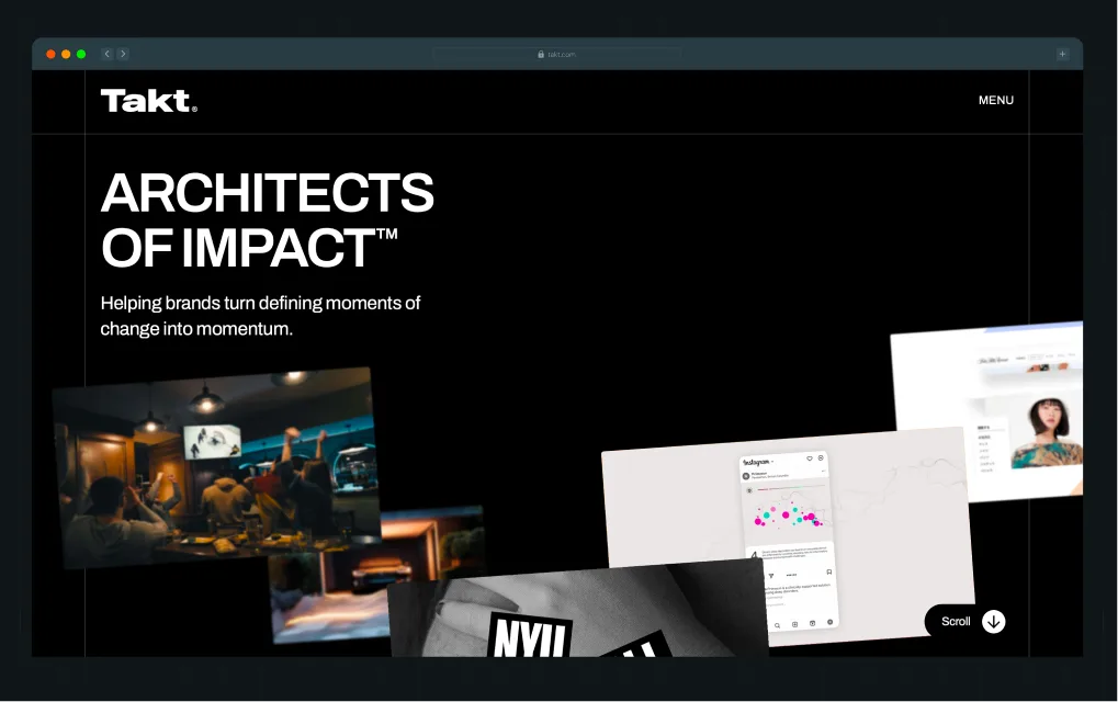
Takt is a Vancouver-based brand and digital agency with an impressive roster of enterprise clients and a strong track record in design-led brand execution. They've worked with tech companies including Alphabet, Microsoft, and a Google-backed startup, Primasun. Their strength is in brand clarity and visual systems, which makes them a good fit when a SaaS company needs to look the part as much as convert.
What is it best for?
- Brand strategy and visual identity paired with a website launch
- Enterprise-level design execution with strong stakeholder management
- Companies that need to project credibility quickly in a new market or category
- Award-quality design that reflects a maturing brand
Who is it best for?
Mid-to-enterprise SaaS teams, where brand positioning and visual identity are the primary priorities.
Notable clients: Amazon, Alphabet, Microsoft, CBC, CIBC, NHLPA, NYU, UBC
3. Major Tom
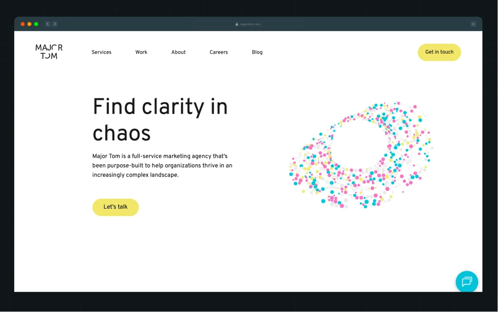
Major Tom is a full-service agency with offices in Vancouver, Toronto, and New York, built on a model that combines strategic consulting with the execution of marketing and development.
For SaaS companies investing in growth and needing a website that integrates with paid media, SEO, and broader campaigns, Major Tom can be a capable partner. They're not SaaS-native, but their growth-marketing orientation means they approach web projects with conversion and acquisition in mind.
What is it best for?
- Growth-oriented websites that need to integrate with paid media and SEO
- Multi-channel campaigns where the web is one piece of a larger strategy
- Companies that want a long-term agency relationship across web, brand, and performance
- SaaS companies scaling into new verticals or geographies
Who is it best for?
Mid-market SaaS teams that need both a strong web presence and ongoing digital marketing execution under one roof.
Notable clients: Rieker, IPEX, OUAI, Mark Anthony Group, Bakkt
4. Parachute Design Group
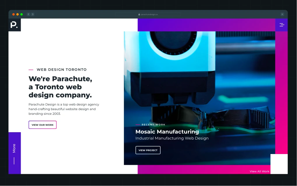
Parachute is a Toronto-based boutique web design firm that's been operating since 2003. They specialize in custom WordPress builds and have a strong SEO-first approach baked into their design process, a practical advantage for SaaS teams who want organic traffic to work harder from launch.
Their work is clean, scalable, and thoughtfully executed. They're not a SaaS-specialist shop, but for mid-stage companies that need a solid, professionally structured site without a massive agency budget, Parachute offers genuine quality.
What is it best for?
- Custom WordPress websites with SEO built into the architecture from day one
- Professional, credibility-building design for B2B companies
- Clean UX and scalable content management for growing marketing teams
- Long-term website partnerships with ongoing support
Who is it best for?
Mid-stage SaaS teams that want a reliable, professional web partner without enterprise price tags.
Notable clients: TBond Brand Loyalty, MaxAssist, Aecon Green Energy Solutions, KiSP Inc.
5. Func Media
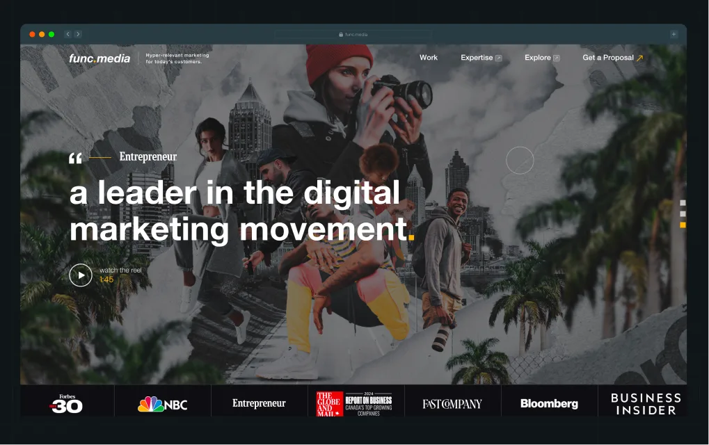
Func Media is a full-service digital agency specializing in web design, development, branding, and performance marketing. Their process is structured around discovery, UX and wireframing, development, and post-launch optimization to ensure continuous performance improvements.
The focus is on building websites that combine strategy, usability, and long-term scalability rather than just visual design. Their work spans end-to-end digital execution for brands that need both creative direction and technical delivery under one roof.
What is it best for?
- Discovery-led website projects for brands that need structured thinking before execution
- UX and wireframe-heavy builds with a strong focus on user journeys and sitemap planning
- Full-service digital execution across design, development, content, and marketing
- Mid-market to enterprise companies that want ongoing optimization after launch
Who is it best for?
Companies that need a process-driven agency capable of handling both strategy and execution across large-scale digital projects.
Notable clients: Musi, Illumi, Deliverr, GGPoker
6. Techno Thinksup Solutions
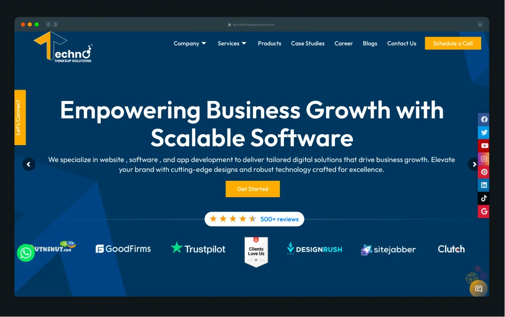
Techno Thinksup Solutions is a full-stack software and digital solutions company based in Canada, focused on web design and development, mobile apps, ERP systems, and AI-driven business tools. The agency positions itself as a “digital transformation” partner for startups and SMEs, offering end-to-end execution from discovery and UX to development and post-launch support.
Their work spans multiple industries, including healthcare, finance, retail, education, and manufacturing, with an emphasis on scalable systems rather than standalone websites.
What is it best for?
- End-to-end web and software design and development for SMEs and startups
- ERP, CRM, and workflow automation systems for operational efficiency
- Multi-industry digital transformation projects (healthcare, retail, education, etc.)
- Companies that need both web presence and backend system development
Who is it best for?
Startups and SMEs that want a single vendor for web, app, and software development, focused purely on conversion strategy or product-led growth websites.
Notable clients: Biz Finder App, The Living Hub, Techno CRM Web Application
7. Digia
Digia is a development-forward agency with strong technical capabilities across complex builds. If your SaaS product has backend integration requirements, custom functionality, or technical architecture that most design-led agencies can't support, Digia is worth evaluating.
Their design sensibility is secondary to their engineering depth, making them a fit for SaaS companies with complex technical requirements rather than companies primarily focused on positioning and conversion.
What is it best for?
- Complex web builds with custom integrations and backend requirements
- SaaS companies with technically complex product offerings needing matched website infrastructure
- Enterprise-grade builds where performance and security are non-negotiable
- Teams with internal design resources who need a strong development partner
Who is it best for?
SaaS companies with technically complex products where development capability matters more than conversion strategy.
Notable clients: Ubbli, The Urban Writers, Converso, Pharmhill
8. morphsites
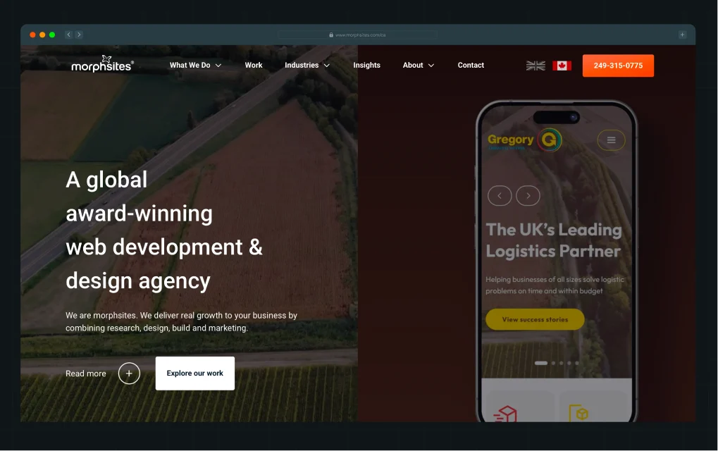
morphsites is a Canada-based, award-winning web development and digital agency that combines research, UX design, development, and marketing to drive measurable business growth. Their work focuses heavily on building complex, performance-driven digital platforms, including e-commerce systems, customer portals, ERP integrations, and lead-generation websites.
Additionally, their portfolio covers high-impact transformation projects such as scaling Coombe Farm Organic from £0 to over £1.2M annual revenue, building high-performance legal and booking platforms, and developing enterprise-grade ordering systems with deep backend integrations.
What is it best for?
- Complex web platforms with heavy integrations (ERP, CRM, ordering systems)
- E-commerce and revenue-focused websites designed for measurable growth
- SEO-driven rebuilds for brands recovering or scaling organic visibility
- Long-term digital partnerships combining design, development, and marketing
Who is it best for?
Mid-market to enterprise businesses that need more than a website, specifically those requiring custom systems, performance optimization, and full-stack digital growth support.
Notable clients: Coombe Farm Organic, PenCarrie, Legend, WilkinsonEyre, First Vehicle Leasing, Devon’s Top Attractions
9. Excited Agency
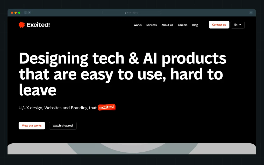
Excited Agency is a SaaS-focused product design and UX agency that specializes in building launch-ready websites, redesigns for product-market fit, and scalable design systems for startups and scale-ups. Their work is centered on product storytelling, conversion-focused UX, and interface design that simplifies complex SaaS products into clear, intuitive user journeys.
The agency operates globally, working across 20+ countries, with a strong emphasis on UX research, prototyping, and iterative design that evolves alongside product growth.
What is it best for?
- Launch-ready SaaS MVP websites for early-stage startups
- UX-driven redesigns focused on improving product-market fit and conversions
- Scalable SaaS design systems for growing B2B platforms
- Product storytelling that simplifies complex software into clear user journeys
Who is it best for?
Early-stage to growth-stage SaaS companies that need a product-aware design partner focused on UX, onboarding, and conversion.
Notable clients: XILO, Verida, ClubReady, Ravel, Doobi, InsuredMine, Timeero, The Streamable, Audzilla, Countd
10. Powered by Search
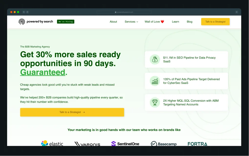
Powered by Search is a B2B SaaS growth agency that focuses on performance-driven digital experiences, with a strong emphasis on landing page design, conversion-focused UX, and SaaS website optimization.
Their “Predictable Growth” methodology extends into how SaaS websites and campaign landing pages are structured, prioritizing clarity of offer, buyer-stage alignment, and continuous optimization. Instead of static marketing sites, they build conversion systems where pages are designed to capture demand, guide users toward high-intent actions, and improve performance through testing and iteration.
What is it best for?
- SaaS landing page design focused on demo and trial conversions
- Conversion-led website and funnel optimization for B2B SaaS
- Messaging and offer structuring for high-intent acquisition pages
- Performance-focused redesigns tied directly to paid and organic traffic
Who is it best for?
Growth-stage SaaS companies that already have traffic and product-market fit and need their website and landing pages optimized for higher conversion rates.
Notable clients: Elastic, Fortra, Basecamp, SentinelOne, PointClickCare, ThreatX, TouchBistro
{{specficService}}
Where Most SaaS Web Design Agencies Go Wrong
Most Canadian web design agencies will show you a portfolio full of beautiful sites, with smooth animations, clean grids, and big hero shots. But "beautiful" and "high-performing" aren't the same thing in SaaS.
Most agencies make the same three mistakes.
1. They start with wireframes instead of positioning
Most agencies open a project by jumping straight into layouts. They ask you for your logo files, your brand guidelines, and a list of pages you want. What they skip is who this website is actually talking to and what that person needs to believe before they'll book a demo.
The result is a pretty website with confused buyers. The homepage looks great in a Figma presentation and falls flat the moment a real prospect lands on it.
2. They treat SaaS websites like brochures
A brochure website is typically a static, information-heavy site that lists a company’s features, services, and credentials in a linear format and does not guide users toward a decision. It works for industries where visitors primarily need awareness or validation like a law firm or local service business, but SaaS buyers need much more context to evaluate fit.
SaaS websites have to do something much harder.
They're decision systems. A SaaS buyer isn't just looking for information; they're running a mini due diligence process. They want to know if your tool handles their use case, beats the tools they're already comparing you against, and has customers who look like them.
A brochure layout gives them a corporate overview. It doesn't give them the answers they need to move forward, and a site that doesn't support that process loses the deal before a conversation ever starts.
You see this problem clearly in SaaS teams with strong products but underperforming websites.
NativeMSG, an enterprise messaging platform, had exactly this issue. Their site leaned heavily on feature lists, and prospects struggled to understand what Rich Communication Services (RCS) could actually do for them.
ThunderClap shifted the site away from a brochure-style structure to a decision-focused experience:
- Built 40+ real message mockups so users could see RCS in action instantly
- Reframed the site around outcomes like engagement, ROI, and conversions
- Created clear product pathways (Creator, Cloud, Connect) to simplify understanding
- Used a distinct visual system to communicate trust, structure, and category leadership
As Ayush Barnwal, Team Lead at ThunderClap, explains:
“They did not want to be another messaging vendor. They wanted to own RCS entirely. Our visual-first approach helped people understand the product in minutes.”
See how NativeMSG’s redesign turned a complex technology into a clear, visually compelling, and authoritative RCS brand.
That’s the difference. A brochure tells. A high-performing SaaS website helps buyers decide.
3. They ignore the sales layer
Your website has to handle objections, handle comparisons, and build trust at every scroll depth. Most agencies don't think beyond the UI.
As Kiran Kulkarni, Partner and Head of Growth at ThunderClap, puts it, most SaaS homepages do not fail on design.
They fail because they are built to impress stakeholders instead of converting buyers. They deliver a launch-ready site that looks polished on day 1 and gives your sales team nothing to work with on day 90.
The objections your buyers raise on the site, the competitors they're mentally comparing you to, the trust signals they look for before they'll share their email address… those aren't afterthoughts.
Best Practices for High-Performing SaaS Websites
Here's what separates SaaS websites that generate pipeline from ones that generate compliments.
They reduce time-to-clarity
Unbounce's conversion benchmark report shows that landing pages written at a 5th to 7th-grade reading level convert at 12.9%, while pages written with professional-level copy convert at just 2.1%.
Within five seconds of landing on your homepage, a buyer should know three things:
- Who this is for
- What it replaces
- Why it matters
If they have to read three paragraphs to get there, you've already lost a portion of them. Top-performing B2B SaaS companies convert visitors to leads at 8–15%, while average companies sit at around 1.5%. The gap almost always comes back to clarity.
They build momentum across pages
High-performing SaaS sites aren't a collection of isolated pages. They're a connected journey:
- The homepage earns the click to the use case page
- The use case page earns the click to the product page
- The product page earns the demo request
Every page has a clear job, and each hands the baton to the next.
Most agency-built sites are designed page by page, which is why they feel fragmented. Visitors are dropped onto a homepage that doesn't link to the features section, which doesn't link to the case studies, which are buried three clicks deep anyway.
They embed proof where decisions happen
98% of buyers read reviews before making a software purchase decision. But the common mistake is collecting that proof on a dedicated case study page that most buyers never visit.
High-performing SaaS sites distribute proof throughout the buying journey. For example:
- A relevant customer quote sits next to pricing
- A logo bar with recognizable names anchors the hero section
- A short video testimonial lives on the features page, right next to the feature it validates
This matters even more in Canada, where SaaS is increasingly export-driven. With over 600 SaaS companies selling globally and competing in mature international markets, buyers are not just comparing you locally. They are comparing you to the best in the US and beyond.
Proof isn't a section of the site. It's a thread woven through every decision point.
They are built for constant change
SaaS companies don't stay still. They release new features, add ICPs and shift their positioning as the market evolves. And the Canadian market is accelerating this.
Cloud adoption is nearly universal, with 92% of Canadian companies using cloud solutions and allocating around 29% of their IT budgets to it. SaaS already accounts for a major share of that spend and continues to grow rapidly.
A website built as a static deliverable becomes a liability within six months.
High-performing SaaS sites are built on flexible systems, such as modular components, content management system (CMS) layers, and design systems, that let your team make changes quickly without involving a developer for every update.
That's the difference between a website that compounds over time and one that ages out by the next funding round.
{{specficBlog}}
How SaaS Teams Actually Pick Agencies (What They Don’t Say Publicly)
Most SaaS companies don’t choose an agency because of an awards page or a polished portfolio.
Those things help get an agency shortlisted. They rarely decide who gets the engagement.
What actually shapes the decision happens much earlier, often during the first discovery call. The strongest agencies reveal themselves through the way they think, the questions they ask, and how quickly they understand the realities of selling software in a crowded market.
They look for "Do they get our product?"
One of the clearest signs you’re talking to the right agency is how quickly they grasp your product, buyer journey, and sales complexity.
A good SaaS agency doesn’t stay at the surface level, asking generic questions about brand colors or preferred layouts. They want to understand:
- How buyers evaluate your product
- Where prospects drop off in the funnel
- What objections sales teams hear repeatedly
- Which features actually influence pipeline
- How does your positioning compare to competitors
Forrester's 2024 Buyers Journey Survey found that 92% of buyers start their purchase journey with at least one vendor already in mind, and 41% have a single preferred vendor selected before formal evaluation begins. This means your website is rarely educating from zero. It helps buyers quickly validate or eliminate you.
The agencies that win are the ones that feel like they already understand the world you're operating in.
Awards and visual portfolio matter less than the quality of the first hour of conversation.
They look for agencies that challenge the brief instead of blindly agreeing with it
74% of B2B buyers say they faced too many competing options in their last major purchase decision. In SaaS website projects, this often shows up as confusion after delivery rather than during briefing.
Execution has become commoditized. Insight is not.
The agencies that command real respect are the ones that push back on the brief, ask what the website needs to do for the sales cycle, and form a point of view on messaging before opening Figma.
This is where real differentiation shows up.
Our work with Wizcommerce is a clear example of this approach in action. Wizcommerce builds AI-assisted sales tools, B2B storefronts, and ERP integrations for wholesale businesses. During discovery, we worked closely with leadership, marketing, and product teams to map buyer personas, sales workflows, and operational challenges.
The process identified key issues such as fragmented systems, unclear messaging, and outdated tools, which slowed down sales teams and confused buyers.
Instead of jumping into design, those insights shaped the foundation of the website strategy. We built a conversion-focused platform that clearly communicated Wizcommerce’s AI-powered sales assistant, storefront capabilities, and ERP integrations across multiple buyer types, including business owners, sales leaders, and operations teams.
The result was a site structured around clarity and decision-making, designed to scale with their growth while supporting SEO and analytics for ongoing optimization.
They prefer agencies that talk about systems, iteration, and scalability early
The best SaaS companies treat their website like a product, not a one-time campaign. That means the right agency will naturally discuss:
- CMS flexibility
- Scalability
- Testing workflows
- SEO structure
- Analytics
- Conversion tracking
- Speed of updates
- Internal team ownership
If every conversation revolves around launch timelines and visual direction while completely ignoring post-launch operations, iteration, and experimentation, the agency may not understand how modern SaaS growth teams operate.
Great SaaS websites evolve continuously as messaging changes, ICPs shift, features expand, pricing evolves, and product categories mature.
The agencies worth hiring build systems that make those changes easier, rather than creating long-term dependencies for every small update.
They avoid agencies that feel like vendors
The clearest signal that a SaaS team will have a great agency engagement is when the agency feels like a partner rather than a supplier. Gartner shows that 61% of B2B buyers prefer a rep-free buying experience and 73% actively avoid vendors that blast irrelevant outreach.
The same dynamic plays out in agency selection. SaaS teams are looking for someone who challenges their assumptions, pushes back when needed, and co-owns the outcome. Agencies that act like order-takers might deliver what you asked for. They rarely deliver what you need.
The Right Agency Starts With the Right Questions
Canada's SaaS market is growing rapidly, and the competition for buyers' attention is intensifying. A website that doesn't convert isn't just missing revenue. It's actively losing ground to competitors whose sites answer buyer questions faster.
Most web design agencies can make your site look good. Very few can make it work the way a SaaS product needs to. Before you shortlist agencies, get clear on what your website actually needs to do:
- Does it need to replace early sales conversations?
- Does it need to educate buyers who've never heard of your category?
- Does it need to handle objections from a skeptical CFO who's evaluating three other tools?
Those questions will tell you more about which agency is right for you than any design portfolio will.
If SaaS conversion strategy and messaging clarity are the priority, start with ThunderClap. Here are a few things that make ThunderClap stand out:
- Revamped 129+ B2B websites for fast-growing companies
- Launched 144+ websites across SaaS, fintech, and AI sectors
- Delivered conversion improvements of up to 50% for clients
The best SaaS website isn't the most beautiful one. It's the one that makes your buyer's next step obvious.
{{ctaBlock}}
FAQs
1. Do web design companies in Canada specialize in specific industries?
Yes, many Canadian agencies develop expertise in certain sectors over time. You'll find agencies that focus on tech and SaaS, healthcare, financial services, and e-commerce. When evaluating agencies, ask specifically about their experience with companies at your stage and in your category, not just startups in general.
2. Can Canadian web design companies handle global projects?
Absolutely. Canada's top agencies regularly work with clients across North America, the UK, and beyond. Most operate remotely or have established workflows for international projects, and English-language SaaS companies in particular experience little friction when working with Canadian teams, regardless of where they're based.
3. Are Indian web design agencies familiar with Canadian market needs?
Some are, particularly those like ThunderClap that have built significant project experience with Canadian and North American B2B SaaS clients. The key is to assess their understanding of your specific buyer, not their geography. Familiarity with Canadian SaaS buying behavior, market positioning, and competitive context matters more than the agency's headquarters location.
If you're researching fintech branding agencies, you probably have a short list of non-negotiables.
- First, real fintech experience (ideally your specific niche). You need a team that understands compliance, regulated-market messaging, and how to build trust with customers sharing sensitive financial data.
- Second, a team that ties brand to business outcomes. Not one that hands you a logo and a 40-page style guide and disappears. One that understands how your brand affects pipeline velocity, investor perception, and user acquisition, and can tell you, specifically, which brand investments will move those numbers.
- Third, an understanding that fintech branding carries real stakes. Your brand must resonate with regulators, enterprise buyers, and end users simultaneously. A vague value proposition or inconsistent identity costs you across all three.
That's what makes brand differentiation in finance so critical and so difficult to get right without the right agency behind you.
In this article, we'll cover the top 10 B2B branding agencies for fintech, explore what separates a specialized fintech branding partner from a traditional agency, and explain why branding in financial services requires a fundamentally different approach than in most other industries.
TL;DR
- A B2B fintech branding agency builds positioning, compliance-aware messaging, visual systems, and a brand narrative that regulators, investors, and end users all trust.
- The best fit for your stage matters. An agency that excels with Series A startups may not be well-suited to an enterprise repositioning. Match the agency to your growth stage and primary challenge.
- The top B2B branding agencies for fintech combine strategy, messaging, design, and user experience to build trust, improve conversions, strengthen market perception, and support long-term growth.
Quick Picks: Top 10 Fintech Branding Agencies at a Glance
Looking for the highlights? We’ve got you covered.
How Did We Evaluate the Best Fintech Branding Agencies? Our TRUST Score Methodology Explained
To evaluate the best branding agency for fintech companies, assess their domain expertise, strategic depth, and portfolio relevance. In a highly regulated industry where trust is the primary currency, a branding partner must balance compliance with modern design.
At ThunderClap, we evaluated 10+ top B2B branding agencies for fintech using a framework called the TRUST Score, an acronym for the five factors that matter most in fintech branding:
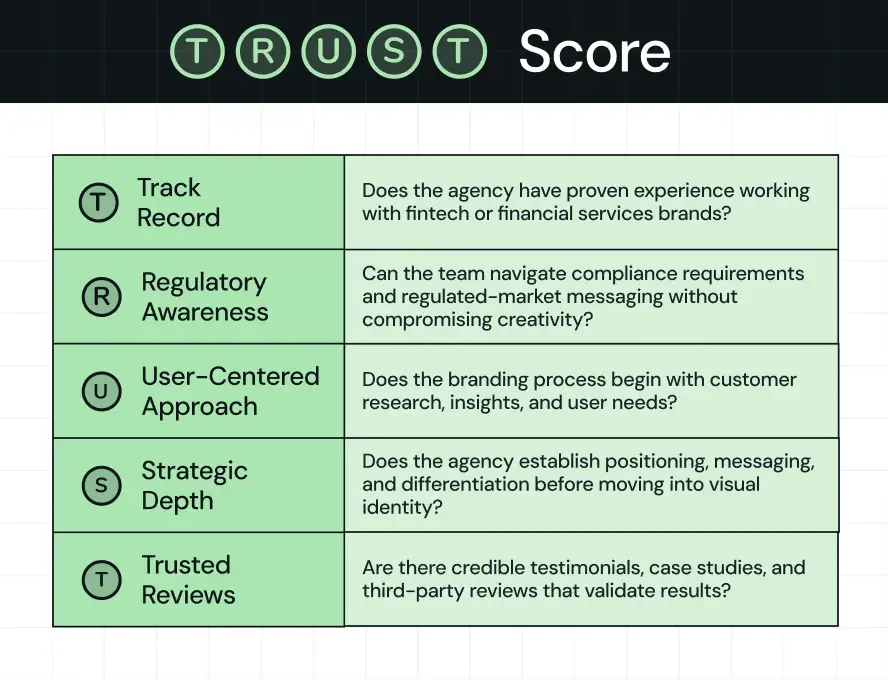
To build this list, we reviewed company websites, portfolio case studies, verified reviews on Clutch, G2, and DesignRush, Reddit discussions on r/fintech and r/startups, and industry directories including Agency Spotter and The Manifest. We also reviewed editorial coverage on SoftwareWorld and independent analyst write-ups.
We review this list every six months. No agency paid for inclusion or placement in this guide.
{{specficBlog}}
What Makes a Good Fintech Branding Agency?
A great B2B fintech branding agency bridges the gap between complex, data-driven financial technology and human-centered financial trust. Compared to general marketing firms, they build holistic B2B brand strategies that strengthen institutional credibility at every customer touchpoint.
These five specific pillars define top B2B branding agencies for fintech:
1. Compliance-aware brand messaging
Fintech brands operate under a different set of rules than most industries. Every claim, value proposition, and marketing asset must balance persuasion with regulatory requirements. Strong fintech agencies know how to create messaging that builds trust and drives growth without creating compliance risks.
2. Strategic positioning before design
Great fintech design agencies define how the market should perceive your company before they create visual assets. They identify your competitive advantage, clarify your market position, and develop a differentiated narrative that informs every branding decision. Design should be the result of strategy, not the starting point.
3. Scalable brand identity systems
A fintech startup's needs change dramatically as it grows. The best agencies build brand identity systems that scale from early-stage growth through enterprise expansion. This includes visual guidelines, messaging frameworks, and governance standards that maintain brand consistency across all channels and touchpoints.
4. Onboarding flow branding
In fintech, brand does not stop at the marketing website. It extends into the product. KYC flows, verification screens, error states. These are brand touchpoints, too. An agency that thinks about onboarding flow branding thinks about the full customer experience.
5. Social proof and proven results
Trust is the foundation of every fintech design agency. The strongest agencies can point to fintech-specific case studies, verified client reviews, and measurable business outcomes. Look for social proof that shows experience with regulated products, payment platforms, lending companies, wealth management firms, or other financial services brands.
10 Best Fintech Branding Agencies for High-Growth Startups
Do you really have the time to evaluate dozens of fintech branding agencies across all the above parameters? If not, we've done the research for you. Below, you'll find our curated list of the 10 best fintech branding agencies for high-growth startups in 2026.
1. ThunderClap: Best for B2B fintech positioning, identity, and compliance-ready messaging
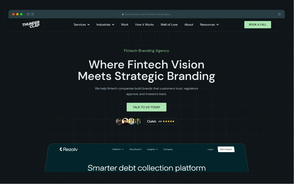
Best for: B2B fintech companies that need strategic branding, website experiences, and messaging systems that build trust and drive growth.
Would you work with a fintech branding partner that’s as invested in building your brand trust as you are in building your product? That’s ThunderClap, the ultimate standard in fintech branding and website design.
At ThunderClap, we help fintech companies transform complex products into brands that customers trust, investors understand, and markets remember. Our team combines brand strategy, messaging, design, and conversion-focused execution to help ambitious fintech companies stand out in crowded markets and accelerate growth.
Having partnered with more than 129+ B2B, SaaS, and fintech organizations, we understand the unique challenges of building credibility in highly regulated industries where trust, clarity, and differentiation are essential. Hence, we work across a wide range of fintech categories, including challenger bank positioning, payments, lending platforms, wealth management solutions, embedded finance products, and B2B fintech providers.
Our expertise extends beyond visual identity. We help companies develop positioning strategies, compliance-aware messaging frameworks, and scalable brand systems that align business goals with customer expectations. Our regulatory brand audit process is designed to identify positioning weaknesses, messaging inconsistencies, and potential compliance risks before they impact growth.
We follow a four-step process designed specifically for complex B2B buying cycles:
- Discovery & strategy: We start with brand audits, competitor analysis, customer research, and positioning workshops to uncover what makes your fintech company different. Before any design work begins, we define your market position, messaging, and strategic narrative.
- Design & prototype: Next, we translate strategy into a complete brand system, including brand messaging, visual identity, logo design, typography, color systems, and brand guidelines. We develop messaging for multiple stakeholders (the CFO who cares about ROI, the compliance lead who cares about liability, the product team that wants to ship). Interactive prototypes capture feedback before any final direction is locked in.
- Develop & test. Every design decision gets tested against a single question: "Will this help a prospect move to the next stage?" Conversion-optimized visual design, UX testing, and performance validation run before launch. This step separates the brand from the execution.
- Launch & growth enablement: We support launch planning, website implementation, SEO foundations, CRM integrations, and internal brand adoption to help your new brand drive measurable business results.
Our goal is simple: help fintech companies build brands that accelerate growth and strengthen trust.
For example, when the founders of Rezolv approached us, they had a strong product vision and deep technical expertise but lacked a clear brand identity or market narrative.
The challenge was translating a complex fintech product into something prospects could immediately understand and trust.
We partnered with the team to develop a complete brand system, including positioning, messaging, logo design, visual identity, and website experience. Complex product workflows were distilled into clear customer-focused narratives, making it easier for prospects to understand the platform's value and engage with the business.
Following the rebrand and launch, Rezolv reported a 39% increase in prospect engagement along with faster adoption among target customers.
Website: thunderclap.com
Rating: 4.9 (G2)
Company Size: 11–50 employees
Services
- Brand strategy and positioning
- Visual identity and design systems
- Compliance-ready style guide development
- Regulatory brand audit
- Conversion-focused UX/UI
- Compliant messaging and copywriting
- Webflow development
What do the customers say
"As an early-stage company, we needed a clear brand identity and messaging before launching. ThunderClap delivered exactly that. Concise, impactful copy and branding that feels right" - Karan Mehta, Founder, Rezolv
Notable projects: Neokred, Refo, Mysa, Rezolv, Zamp, roommaster PMS, Deductive AI
{{specficService}}
2. Ramotion: Best for brand-product integration and design systems
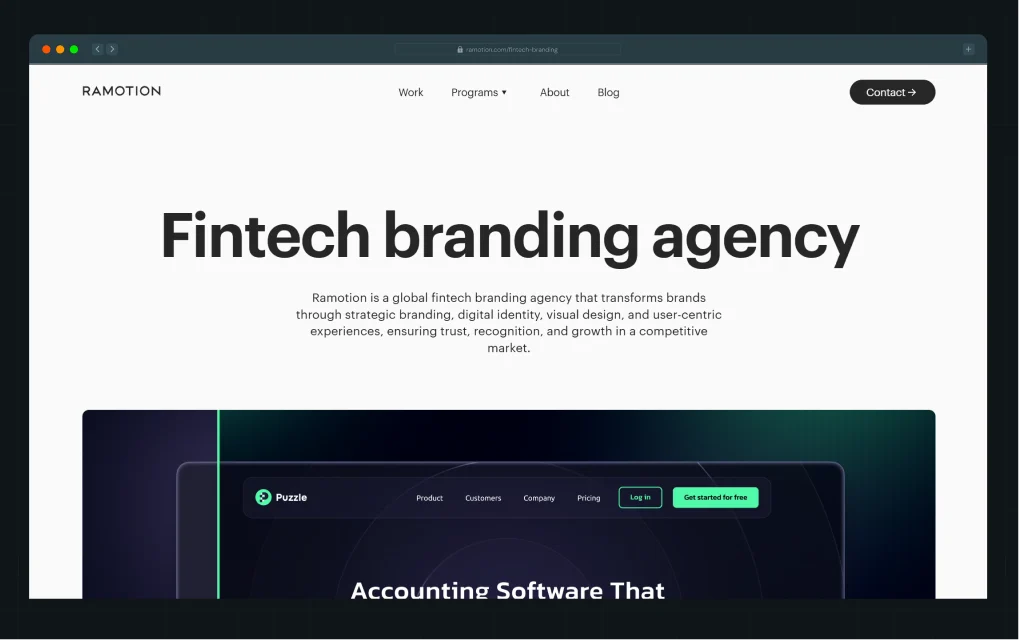
Best for: High-growth B2B fintech companies that need their brand and product to feel like one coherent system.
Ramotion describes its work as sitting "at the intersection of product and brand," and its client list proves it. Truebill, Xero, Tokenex, Ripple, and Borea AI have trusted the studio. For fintech specifically, Ramotion brings structured brand strategy, a strong ability to connect positioning with visual systems, and a portfolio that skews toward high-growth tech companies where brand recognition supports enterprise sales.
Their review records consistently highlight high-quality work, communication, timeliness, and collaboration. For funded startups and enterprise teams, the value comes from their ability to build a brand system where the marketing website, product UI, pitch deck, and onboarding all feel connected. In fintech, disconnected touchpoints signal risk. Ramotion works to eliminate that signal.
Website: ramotion.com
Rating: 4.9 (Clutch)
Company Size: 11-50 employees
Services
- Brand strategy and corporate identity
- Visual identity and brand guidelines
- UX/UI design and web apps
- Design systems and product branding
- Brand messaging and tone of voice
- Web design and Webflow development
What do the customers say
“We partnered with Ramotion to redesign our entire marketing site from the ground up—new pages, messaging, graphics, and visual identity. Operating under an extremely tight timeline, they seamlessly integrated into our team and delivered at every phase of the project. The end result was a beautiful, functional, and high-converting website.” - Nick Wentz, VP Marketing at Clearbit.
Notable projects: Stripe, Puzzle, Final, Filecoin, Wyre, Coinread
3. form.agency: Best for financial sector brand identity and regulated messaging
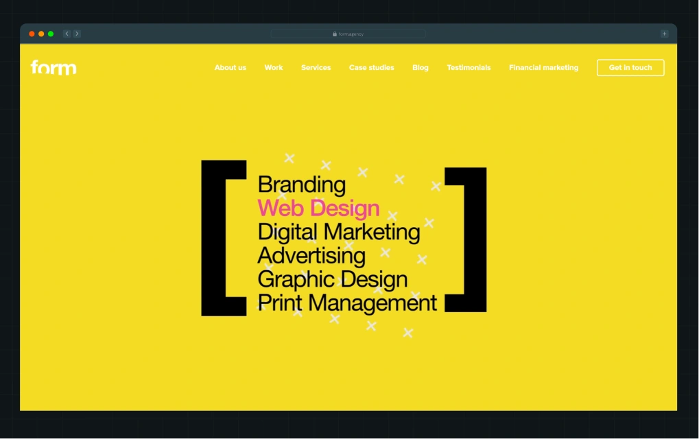
Best for: Mid-market and enterprise fintech companies with complex compliance requirements or multi-jurisdictional brand campaigns.
form.agency is a UK-based branding and design agency with studios in Kent, London, and beyond. Their services include brand strategy, logo design, visual identity systems, tone of voice, brand messaging, and full brand guidelines.
What sets them apart is their structured, collaborative process that moves from discovery and strategy through to design and delivery. This keeps every brand decision intentional and consistent across all touchpoints. With experience across multiple industries, they build branding that is both authentic and commercially effective. Clients choose Form Agency for their clarity, friendly approach, and ability to turn ideas into cohesive brand systems that build trust and long-term recognition.
Website: form.agency
Rating: 4.8 (Clutch)
Company Size: 10–49 employees
Services
- Brand identity design and brand strategy
- Global advertising campaign creation
- Financial sector copywriting and regulated messaging
- Web design and brand collateral
- Fintech brand identity systems
What do the customers say
"They care immensely about our brand as if it's their own." - Farah Farhat, Marketing Manager, INFINOX
Notable projects: Saxo Bank, INFINOX (Alpine F1 partner brand), ActivTrades
4. Siege Media: Best for building brand authority through content and SEO
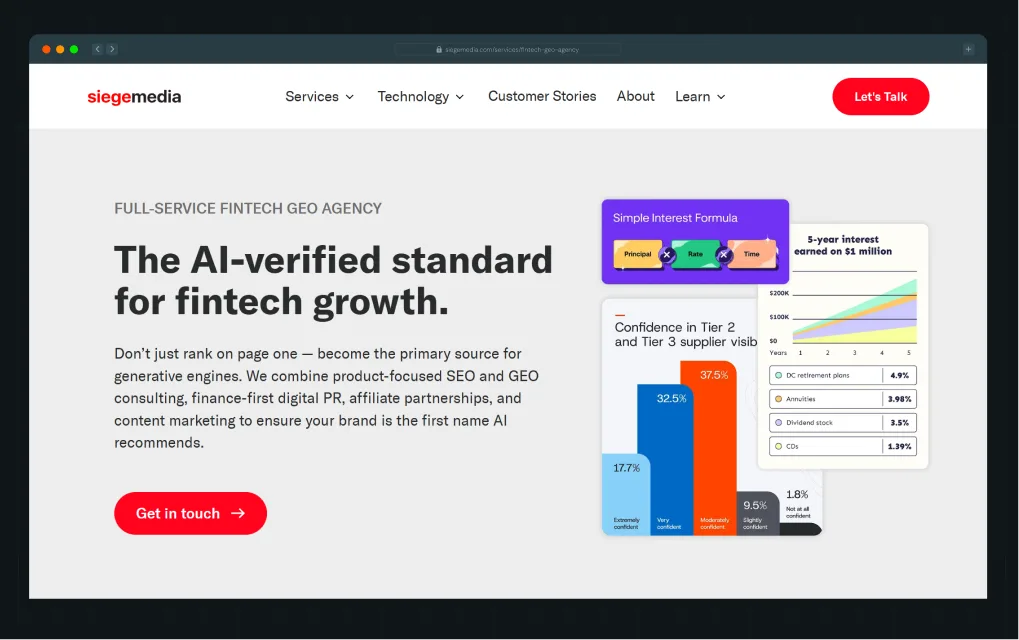
Best for: Fintech companies at the growth stage that want to use brand storytelling on their website and in organic channels to build authority and trust over time.
Siege Media approaches brand differentiation in finance from a different angle than most agencies on this list. Rather than leading with visual identity, they lead with content strategy, SEO, and digital PR. In financial services, where trust is critical and often hard to earn, strong content plays an important role in shaping credibility and educating users. Siege Media helps fintech companies improve search visibility and establish thought leadership across topics such as personal finance education, regulatory updates, and product insights.
Fintech brands that depend on inbound marketing or want to strengthen organic growth while refining a consistent brand voice will find their approach particularly relevant. In fact, they have generated over $148 million in yearly client traffic value and driven a 540% increase in Stash's organic traffic within a year.
Website: siegemedia.com
Rating: 4.9 (Clutch)
Company Size: 50–249 employees
Services
- Brand storytelling and content strategy
- GEO and digital PR
- Brand messaging development
- Interactive content creation
- Web design (supporting services)
- AEO (Answer Engine Optimization)
What do the customers say
“They’re the absolute best in this business.” - Maddy Martin, VP of Marketing, Smith.ai
Notable projects: The Zebra, QuickBooks, Quicken Loans, Stash, Zillow
5. Metabrand: Best for seed-stage fintech positioning and startup branding
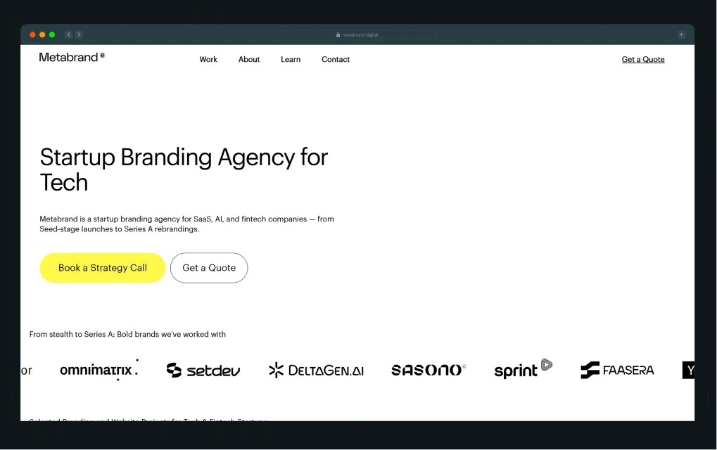
Best for: Fintech startups at the seed or Series A stage that need positioning, identity, and a high-converting website, delivered as a single package.
Founded by former senior strategists and designers from agencies such as Landor & Fitch and Interbrand, Metabrand brings enterprise-level brand thinking to fast-moving startup environments without the bureaucracy of traditional agencies. Their work is shaped by a clear understanding of buyer psychology in early and growth-stage companies. At this stage, startups are not just competing on product features but on trust, clarity, and perceived credibility. Investors need confidence in the vision, customers need instant understanding of complex products, and teams need a brand that can scale with them.
Metabrand addresses this challenge through a sprint-based process that turns complex technical products into clear positioning, strong brand messaging, and conversion-focused digital experiences. The result is branding that helps startups move from early traction to serious market credibility.
Website: metabrand.digital
Rating: 5.0 (Clutch)
Company Size: 10–49 employees
Services
- Brand positioning and messaging
- Logo and visual identity system
- Compliance-ready style guide development
- Webflow website design and development
- UI and design-system direction for onboarding flow branding
- Fintech brand identity for payments, banking apps, and trading platforms
What do the customers say
"Their proactive approach, attention to detail, and commitment to achieving the highest quality set them apart." - Matthieu Poirier, President, Simple Créatif
Notable projects: EveryTrade, Sasono, OXZ Capital, MatrixPay
6. Ballistic Media: Best for strategy-led brand and marketing integration
.webp)
Best for: Growth-stage and mid-market B2B fintech companies that need a brand strategy connected to measurable pipeline outcomes.
Ballistic Media is a branding agency for fintech companies that helps fast-growing startups and mid-sized platforms build strong digital identities. They combine brand strategy, UX design, and full-stack Webflow development to deliver end-to-end solutions that balance aesthetics with performance, conversion, and compliance.
Their strength lies in translating complex fintech offerings into clear, SEO optimized, and conversion-driven websites. Ballistic Media is best suited for fintech companies seeking a partner who unites strategic branding with fast, reliable, high-performing Webflow execution.
Website: ballistic.media
Rating: N/A
Company Size: 10–49 employees
Services
- Brand strategy and positioning
- PR and brand storytelling
- SEO and content marketing
- Webflow design and development
- Conversion rate optimization
- Fintech-specific brand messaging and compliance-aware copy
What do the customers say
“Our leads tripled in just six months. The team’s strategy and hands-on support made all the difference.”- Neil Dahiya, Co-Founder & CEO, Hyperrank AI
Notable projects: Rootsy, Hyperrank AI, SportEx, Eyes AI
7. CSTMR: Best for full-funnel branding and financial services marketing
.webp)
Best for: Fintech companies at the growth or mid-market stage that need branding and performance marketing to work from the same strategy.
CSTMR’s model is built around three refined engagement scenarios: scaling established fintechs, resetting marketing foundations for companies that have plateaued, and supporting new products or businesses at launch. What sets CSTMR apart is its intentional integration of brand marketing with performance marketing. Rather than treating them as separate functions, they combine long-term brand building with short-term demand generation.
This is especially important in financial services, where trust is a prerequisite to conversion, and customers typically require multiple touchpoints before making a decision. The firm also holds SOC 2 Type 1 certification, reinforcing its commitment to security and compliance standards.
Website: cstmr.com
Rating: 4.9 (Clutch)
Company Size: 10–49 employees
Services
- Brand strategy, positioning, and B2B brand strategies
- Fintech brand identity and visual design
- Brand messaging and messaging house development
- Website design and development
- Content marketing and SEO
- Performance marketing and growth campaigns
What do the customers say
“CSTMR has been a great partner when it comes to thinking about growth and future opportunities.” - Head of Sales, Loan Origination Platform
Notable projects: Kudzu, Validmind, American Bankers Association, Bankuity, Valt
8. Confetti Design: Best for UI-forward fintech brand systems
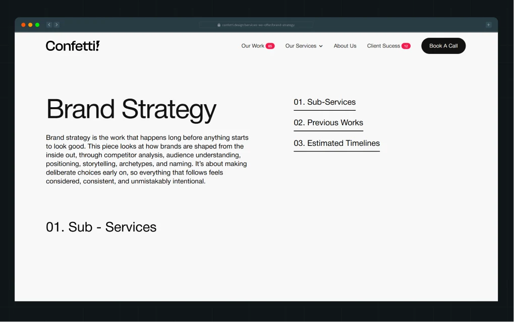
Best for: Early-stage fintech startups and growth-stage companies that need a strong visual brand system connected to their product UI.
Confetti Design Studio is a branding agency helping businesses build and evolve strong brand identities through a modern, subscription-based model. Instead of one-off design projects, it offers ongoing branding support that scales with business growth. Clients start with core identity systems and expand into strategy, messaging, tone of voice, campaigns, and digital experiences.
The studio acts as an embedded branding partner, integrating with internal teams to ensure consistent direction across all touchpoints. Its key differentiator is this always-on, flexible subscription approach that replaces fragmented freelancers with a unified, strategic, and cost-transparent branding system focused on long-term brand equity and recognition.
Website: confetti.design
Rating: 4.9 (Clutch)
Company Size: 10–49 employees
Services
- Fintech brand identity and branding strategy
- UX/UI design for fintech products
- Onboarding flow, branding, and product design
- Web design and development
What do the customers say
"Their creativity and expertise in branding and website design surpassed expectations." - Executive, Anonymous
Notable projects: SPJ, Rizir, Miduty, Vendo, AOBA
9. TripleDart: Best for B2B SaaS fintech brand messaging and demand generation
.webp)
Best for: B2B fintech companies at the growth stage that need brand positioning and messaging connected to their pipeline strategy.
TripleDart operates as a full inbound GTM team for fintech and B2B SaaS companies. They rank among the few agencies in the fintech space that treat brand messaging and demand generation as one integrated system. Fintech marketing demands accountability, speed, and precision, and this is the operating model they bring. Their team comes from high-growth B2B SaaS companies such as Freshworks, Zoho, and Remote, giving them a strong understanding of complex buying cycles, multi-stakeholder decision-making, and fintech messaging challenges.
They also use Slate, their proprietary AI workflow platform, to scale content, schema, and LLM visibility across tools like ChatGPT and Perplexity.
Website: tripledart.com
Rating: 4.8 (G2)
Company Size: 50–249 employees
Services
- Brand messaging and positioning for B2B fintech
- Content marketing and SEO (including fintech SEO)
- B2B brand strategies for pipeline generation
- Paid media and performance marketing
- Account-based marketing (ABM)
- Brand differentiation in finance through thought leadership
What do the customers say
“Triple Dart felt like an extension of our internal team. From audits to implementation and tracking, they owned the process and freed us up to focus on other growth initiatives.” - Patrick N., Senior Digital Marketing Manager
Notable projects: Infobip, Locus, Edmingle, Fyle, Signeasy, CleverTap
10. NinjaPromo: Best for Crypto, DeFi, and neobank branding at a global scale
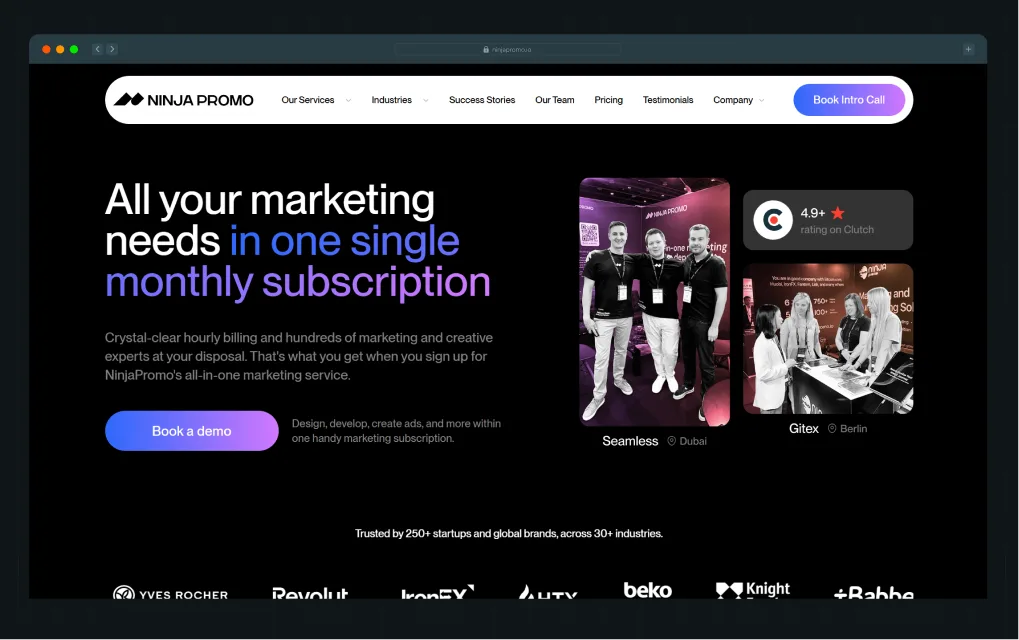
Best for: Crypto exchanges, DeFi protocols, neobanks, and blockchain-based fintech companies that need brand strategy, social, and influencer marketing to work together across markets.
NinjaPromo is a full-service marketing and branding agency that operates as an embedded growth partner for scaling companies. Through a subscription model, they combine branding, strategy, paid media, SEO, content, design, development, and analytics into one integrated system. Their approach connects brand identity with measurable business outcomes, ensuring consistency across all customer touchpoints. Backed by research and performance marketing, they focus on building brands that are both recognizable and conversion-driven.
The agency is best suited for companies that want a dedicated, cross-functional team to manage ongoing marketing and branding needs within a structured, scalable system designed for speed and continuous optimization.
Website: ninjapromo.io
Rating: 5.0 (G2)
Company Size: 50–249 employees
Services
- Branding and visual identity for crypto and fintech
- Social media marketing and community management
- Influencer marketing for fintech and Web3 brands
- Paid advertising (Google, Meta, LinkedIn, Amazon)
- PR and brand storytelling
- Web design and development
- Human-centered finance positioning and messaging
What do the customers say
“They took the time to understand our business, which focuses on large-format printers, IT equipment, and procurement services. Their team built campaigns aimed at the right audience, instead of just trying to drive more traffic. I appreciated their emphasis on measurable results and ongoing optimization. Communication was clear and consistent, and they stayed responsive throughout the engagement.” - Merry C.
Notable projects: Ubisoft, Amazon, Coinbase, HTX
These agencies bring different strengths and expertise, but the best results come when you choose the right partner at the right time. So, when should a fintech company invest in branding support?
When Should You Hire a Fintech Branding Agency?
Many fintech founders wait too long to invest in branding, often viewing it as something to address after product development or funding milestones. In reality, branding directly impacts trust, adoption, investor confidence, and long-term growth.
If any of the following scenarios sound familiar, it may be time to partner with a B2B fintech branding agency.
1. You're preparing for launch
Early brand decisions influence how investors, partners, and prospective customers perceive your company. A strong brand foundation helps establish credibility from day one, while a weak or inconsistent identity can create friction that becomes more expensive to correct later.
2. Your positioning no longer reflects your business
As fintech companies grow, products evolve, target audiences change, and new capabilities emerge. Whether you're moving upmarket, expanding into B2B, entering new verticals, or introducing additional services, your brand should accurately reflect where the business is today, not where it started.
3. You're entering a highly regulated market
Sectors such as payments, lending, insurance, wealth management, and digital assets require a careful balance between compelling marketing and regulatory compliance. A fintech branding agency can help develop messaging that builds trust, clearly communicates value, and aligns with industry requirements.
4. Your customer experience feels fragmented
If your website, sales materials, product interface, investor deck, and marketing assets all tell different stories, prospects may question your business's maturity and credibility. Consistency across every touchpoint is essential for building trust and strengthening brand recognition.
5. You're struggling to differentiate in a crowded market
Many fintech design agencies make similar claims about innovation, security, speed, and customer experience. If your messaging sounds interchangeable with competitors, a specialized fintech branding agency can help uncover a more distinctive position and develop a brand narrative that is both memorable and defensible.
Interesting read: Why Partnering with a B2B Brand Positioning Agency Accelerates Market Differentiation
Which Fintech Branding Agency Fits Your Situation?
Choosing the right fintech branding agency depends on three factors: your growth stage, your business model, and the challenge you're trying to solve.
Some agencies specialize in fintech positioning and compliance-driven messaging. Others focus on product design, startup launches, enterprise transformation, or growth marketing. The best choice is rarely the biggest agency. It's the one with the experience, process, and expertise that aligns with your specific goals.
Choose ThunderClap if:
- You're a B2B fintech company at the growth, mid-market, or enterprise stage
- You need positioning, identity, compliance-ready messaging, and website execution from one team
- You want a documented 10-week process with measurable conversion outcomes
- You're ready to redefine your B2B SaaS identity for a new stage of growth
Choose CSTMR if:
- You need a partner that understands financial services marketing and can connect brand strategy with business growth goals
- You need branding and growth marketing to share the same strategy
- You're willing to commit to a six-month-plus engagement to get compounding results
Choose NinjaPromo if:
- You need a partner that can combine creative strategy with performance-driven marketing to support continuous growth
- You need a community, an influencer, and a brand to work together across global markets
- You want the flexibility of a subscription model over a fixed retainer
At ThunderClap, we view fintech branding as more than a creative exercise. Our process helps fintech companies simplify complex offerings, establish credibility faster, and create brands that support customer acquisition, investor confidence, and long-term growth.
Our work begins with strategic discovery and positioning, followed by visual identity development, messaging architecture, and conversion-focused digital experiences. Whether you're launching a new fintech product, entering a regulated market, repositioning an established platform, or preparing for your next stage of growth, we help build the strategic foundation that turns ambitious fintech companies into category leaders.
{{ctaBlock}}
FAQs
1. Why does a fintech company need a specialized branding agency?
Fintech brands face a trust challenge that most industries do not. Customers hand over financial data, payment details, and sometimes their entire financial life. A specialized branding agency for fintech companies understands how to build trust signals, craft compliant messaging, and design visual systems that simultaneously earn the confidence of regulators, investors, and end users.
2. How is branding for fintech different from branding for other industries?
Fintech branding is subject to regulatory constraints that most creative agencies are not equipped to handle. Your copy has to pass legal review. Your visual identity has to signal security and reliability, not just innovation. And your brand has to resonate with multiple stakeholders, including the CFO evaluating ROI, the compliance officer evaluating risk, and the end user evaluating ease of use, all within a single coherent system.
3. What does a fintech branding agency include in a brand identity package?
At minimum, a strong fintech brand identity package covers brand positioning and messaging, visual identity (logo, typography, color system), a brand style guide, and tone-of-voice guidelines. A strong package also includes a compliance-ready style guide, messaging tailored to your specific fintech category, and guidance on how the brand extends into the product, including branding for the onboarding flow.
4. Can a branding agency help a fintech company with compliance-ready design?
Yes, but not all agencies can. Look specifically for agencies with financial services clients in their portfolios and ask for examples of brand work that underwent legal review. Agencies like ThunderClap, form.agency, and CSTMR have this capability built into their process. A regulatory brand audit and a compliance-ready style guide are the two specific deliverables to ask for.
5. At what stage should a fintech startup invest in professional branding?
Before you launch, if at all possible. Brand decisions made at the pre-seed or seed stage shape investor perception, early user trust, and hiring quality. If you've already launched but your brand doesn't reflect your current positioning or growth stage, you need a rebrand. The cost of waiting is higher than the cost of getting it right.

How to Turn Your B2B Website into a Self-Serve Growth Engine? (PLG Ready in 2026)
In 2013, Slack originated as an internal communication tool built by Stewart Butterfield’s team while they were developing the game Glitch. When the game shut down in 2012 after failing to find a player base, the team quickly realized the internal chat tool they had built for themselves was the real gold.
Within 24 hours of public launch, 8,000 companies were on a waitlist. That's a PLG website doing its job.
Today, 58% of B2B SaaS companies already run a PLG motion, and 91% of them are increasing investment in it. Because the data is hard to argue with:
- Freemium models convert visitors at a median conversion rate of 12%, which is 140% higher than free-trial conversion rates.
- PLG strategies produce conversion rates up to 3x higher than sales-driven funnels.
- Top PLG companies hit net revenue retention (NRR) above 120%.
But a free trial alone isn't PLG. Your website has to earn the signup. This guide shows you exactly how.
TL;DR
- PLG websites must communicate product value within seconds and show the product early, wherein abstract branding costs you signups.
- Support self-serve evaluation with transparent pricing, visible product workflows, social proof, and friction-free navigation.
- Guide visitors toward activation with clear calls to action, intuitive onboarding paths, and pages designed around user intent.
- Treat messaging, UX, CRO, and product education as one system instead of optimizing each in isolation.
- The strongest PLG websites reduce friction at every stage of the buyer journey, helping more visitors become active users.
Why Does PLG Change the Role of a B2B Website?
In a traditional sales-led model, the website's job is to generate leads for a sales team to close. In a product-led model, the website is the sales team. It has to do work that used to happen across multiple sales touchpoints, in a single visit, often in under five minutes.
This shift changes the design brief entirely.
For PLG companies, the website is often the first onboarding experience, the first product walkthrough, the first trust signal, and the first conversion moment, all at once. Mixpanel's 2026 State of Digital Analytics report, which analyzed behavior across 12,000+ companies, identified product as the new primary growth channel, with leading B2B companies anchoring their growth strategy on in-product signals such as feature adoption and time-to-value. The website is where that chain starts.
Take Notion and Linear, for example. Neither relies on sales outreach to drive initial adoption.
Notion leads with a clear value proposition, a live product interface, and a prominent "Get Notion free" CTA that encourages immediate product exploration.
.webp)
- Linear communicates performance as a brand value: dark mode by default, sub-100ms interactions, keyboard shortcut indicators visible in the UI.
.webp)
Both sites reduce the number of steps between "first visit" and "first product interaction" to a minimum. They rely on interface-driven storytelling, workflow visibility, and immediate product context instead of traditional enterprise marketing tactics.
What Do Self-Serve Buyers Expect From a PLG Website?
Self-serve buyers don't want to be ‘sold to’ anymore. They want to understand, evaluate, and experience the product on their own terms before ever speaking to a rep.
In fact, a Gartner survey found that 75% of B2B buyers now prefer a rep-free buying experience, a signal that the website has effectively become the first product experience.
Users expect immediate product clarity
Visitors should understand what the product does, who it's for, what workflow it improves, and why it's different within seconds of landing. According to a 2026 analysis of top-performing B2B SaaS landing pages, the average high-converting H1 headline contains 8 words. This constraint forces clarity and eliminates jargon that confuses visitors before they've seen the product.
Factors.ai is a strong example of this approach in practice.
During a busy GTM phase, the company needed a complete website overhaul and rebrand without disrupting momentum. To create a more premium experience while keeping the existing logo and color palette intact, Factors.ai partnered with ThunderClap.
One of the strongest sections on the site visualizes the execution timeline. It shows how teams move from raw buying signals to live campaigns within three weeks. The visual storytelling gives users immediate context about the workflow and expected outcomes without forcing them to read long explanations.
The website also uses bold visual patterns, vibrant colors, customer quotes, and recognizable client logos to guide users through the evaluation process. Enterprise security badges strengthen trust early in the journey. Clear actions like “Get a demo” and “Learn more” appear throughout the experience, helping visitors move forward without any difficulty.
As Ayush Barnwal, Partner at ThunderClap, noted, the redesign helped Factors.ai establish a premium, globally ready brand.
Buyers want to evaluate products independently
B2B buyers want to self-educate and test products before engaging sales, relying heavily on peer reviews and social proof.
A strong PLG website supports this evaluation process with self-serve tools that help buyers move forward without waiting for a sales conversation. This can include free trials, interactive demos, product tours, AI chatbots, documentation, and clear onboarding resources. Each element helps users understand the product better and feel more confident taking the next step.
HubSpot's pricing page is an instructive example. It lays out feature tiers, shows what each plan includes, and gives buyers everything they need to self-qualify without a discovery call.

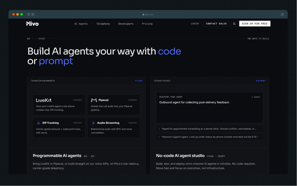
Plivo, the cloud communications platform, does the same for its developer audience, covering API documentation, integration specs, and setup expectations directly on the website so technical evaluators can form a view before any sales contact.
Product visibility builds trust faster than marketing claims
Screenshots, GIF walkthroughs, UI previews, and workflow demonstrations reduce evaluation anxiety faster than any testimonial. For example, Loom's homepage uses a product video shot from a real user's screen.
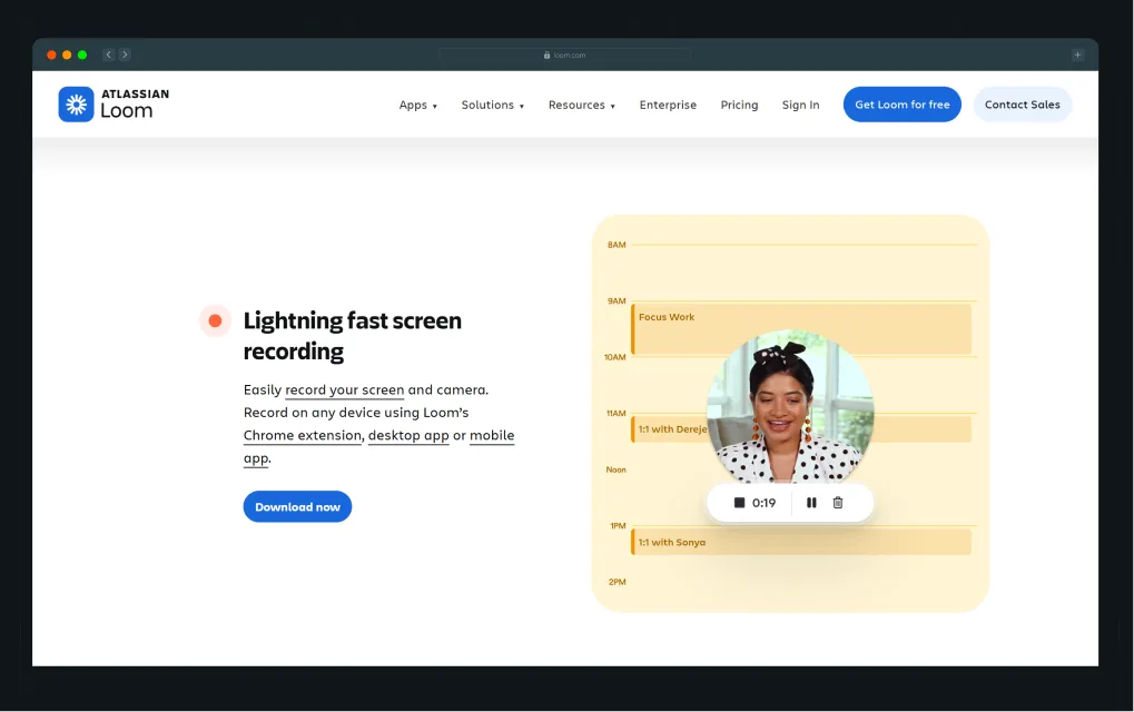
These choices tell visitors these brands are confident enough in this product to show it to you before you've given them your email.
PLG websites reduce uncertainty by helping users mentally experience the product before signing up.
How are the Best PLG SaaS Homepages Structured?
In 2026, the gap between average and elite SaaS homepages has become enormous. According to Unbounce benchmark data aggregated across 57 million conversions, the median SaaS landing page converts at just 3.8%.
Similarly, the top-performing quartile converts at 11%+, proving that homepage structure and clarity now directly shape growth outcomes in PLG SaaS.
Hero sections focus on workflows, not slogans
The best PLG heroes answer three questions within five seconds:
- What is the product?
- What problem does this solve?
- Who is it for?
Twilio’s hero section immediately explains the product category, the use case, and the target audience. The headline, “The platform for conversations in the AI era,” positions Twilio within AI-powered customer communication from the first second. The supporting copy adds operational context by explaining that the platform helps humans and AI agents coordinate conversations across channels.
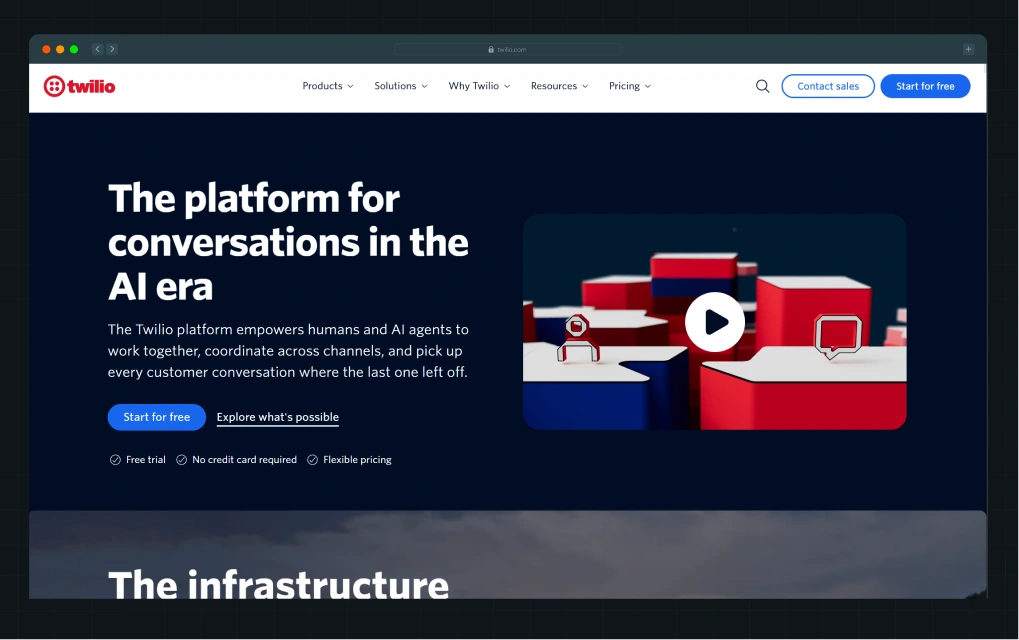
The CTA structure is also clear and intentional. “Start for free” is visually dominant, while “Explore what’s possible” supports users who are still evaluating. Trust signals like “No credit card required” and “Flexible pricing” reduce friction early and support self-serve onboarding.
Multiple competing CTAs can reduce conversion by up to 266%, so hierarchy matters.
Product sections help users understand the experience visually
Figma uses interactive walkthroughs to let visitors move through product experiences at their own pace. Progressive information reveals that where the product story unfolds as the user scrolls reduces cognitive overload and keeps visitors engaged longer.
UI storytelling, where the product interface is the hero visual rather than abstract illustration, has become the dominant pattern in top-performing SaaS sites in 2026.
A strong example of this comes from Deductive AI’s recent rebrand. Instead of explaining observability infrastructure through dense technical messaging, the team built the entire visual system around a single operational insight: “No more digging for root causes in the dark.”
As Ayush suggested in his recent LinkedIn post, the interface visuals, system flows, and product diagrams were designed to make complex telemetry and debugging workflows feel traceable, resulting in significantly higher engagement on the new site.
Strong homepage hierarchy guides users toward action naturally
The page structure that performs well across high-growth PLG companies follows a consistent sequence:
- Value proposition: What this product does and for whom
- Product understanding: A visual demonstration of the core workflow
- Workflow explanation: How this fits into the buyer's day
- Trust signals: Logos, testimonials, usage numbers
- CTA: a low-friction next step (try, explore, start)
Recruiterflow, the recruiting CRM built for agencies, structures its homepage around this hierarchy. They cover the workflow clarity early and use whitespace to reduce visual noise between sections.
Generous whitespace and deliberate section prioritization let the product story breathe rather than compete for attention.
Product-led CTAs reduce friction better than sales-led CTAs
"Book a demo" asks the visitor to commit to a conversation before they've understood the product. "Start free," "Explore template," or "See it in action" ask the visitor to take one low-risk step.
The difference in conversion psychology is significant.
For example, Instantly replaces static CTAs with interactive product experiences, encouraging users to engage with the platform immediately.
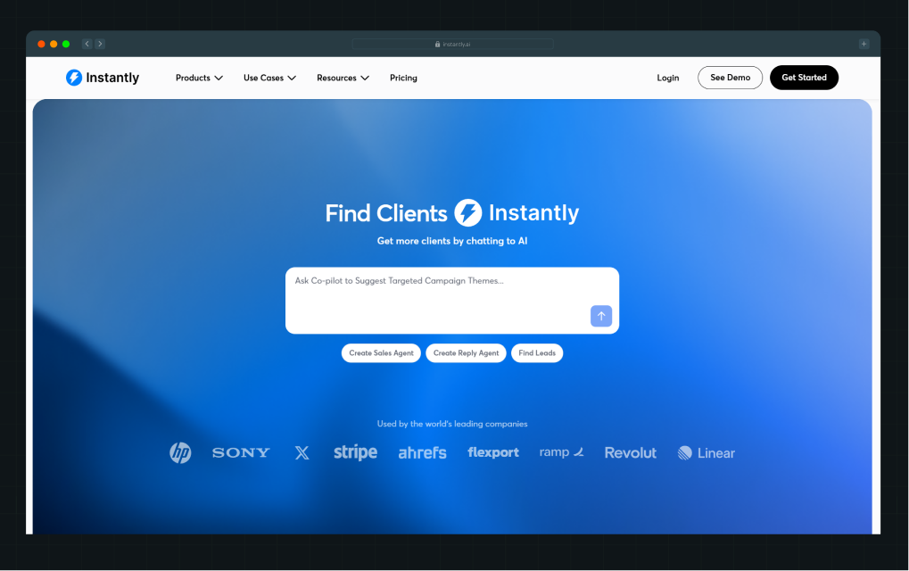
PLG CTAs support self-serve behavior because they match the buyer's actual mindset at that stage. Gartner’s 2025 B2B buying survey found that 73% of buyers actively avoid vendors that send irrelevant outreach. This highlights why low-friction CTAs like “Get started” or “See it in action” outperform demo-first experiences in the early evaluation stages.
“Many B2B buyers feel overwhelmed and frustrated by the outreach they receive from sellers and the seller’s organization. Bad prospecting actively damages relationships with potential customers,” said Robert Blaisdell, VP Analyst in the Gartner Sales Practice.
“CSOs must rethink their outreach strategy to improve engagement and deliver the experience customers demand.”
The best PLG homepages reduce the gap between curiosity and product interaction.
What B2B Website Design Decisions Reduce Friction in Self-Serve Buying?
As self-serve buying becomes the default, even small UX decisions in navigation, onboarding, and pricing now determine whether users convert or quietly drop off before ever signing up.
Navigation should mirror user workflows
Role-based navigation, use-case organization, template libraries, and integration discovery pages let visitors self-direct through the product story that's most relevant to them. A shallow information architecture, with fewer clicks to reach the right answer, matters enormously for PLG sites that see high-volume, high-intent traffic.
Asana structures its website around how different teams work, helping visitors quickly find content that matches their role. Visitors can browse dedicated pages for marketing, IT, operations, and other functions, each with tailored workflows, templates, and resources.
.webp)
From there, they can explore team-specific use cases such as sprint planning, campaign management, product launches, bug tracking, onboarding, and IT request management without having to dig through unrelated content. Its template library is also categorized by department, making it easy for prospects to jump directly to workflows that fit their needs.
Recruiterflow does the same for recruiting agency verticals. This directly affects whether a visitor self-qualifies and moves toward sign-up or bounces in search of relevance.
Signup flows should minimize interruption
OAuth login options, progressive onboarding, fewer required fields, and clear empty-state guidance are the mechanics of a frictionless signup. Each additional required field in a signup form reduces conversion. Each redirect or verification step increases the risk of abandonment.
Calendly's sign-up flow is a masterclass in reducing interruptions. It uses Google, Microsoft, or email login, provides immediate access, and includes an onboarding flow that surfaces value in the first session.
.webp)
The product does not ask users to configure everything before they experience anything.
According to UserGuiding’s State of PLG in SaaS for 2026 Report,
"The expectation has shifted toward instant, direct access: try first, account later; value now, commitment later."
This is partly because users now expect consumer-level immediacy. They want to start using a product instantly, not wait through demos, email verification loops, or complex setup flows.
If users cannot experience value quickly, they leave.
In fact, Amplitude’s 2025 Product Benchmark Report suggests that more than 98% of new users become inactive within two weeks for half of all products. The steep drop in activation rates from Day 1 to Day 14 shows how quickly engagement declines when onboarding introduces friction or delays the delivery of value.
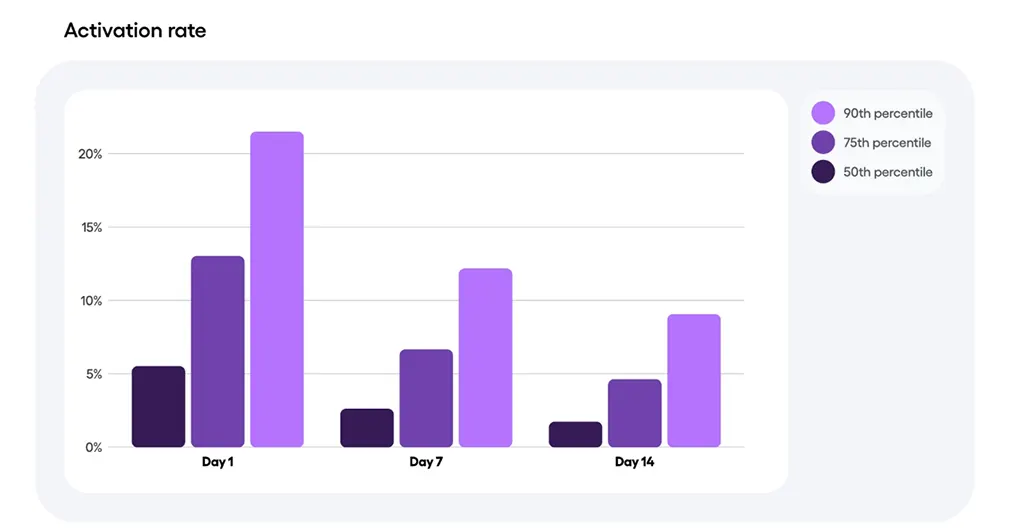
This behavior is also shaped by how users discover products today.
Many users now enter through TikTok workflow videos, AI search recommendations, YouTube demos, or Reddit discussions. They arrive with context and intent already formed. They expect the product to work immediately.
That is why strong PLG onboarding removes unnecessary steps, reduces setup challenges, and helps users take meaningful action as quickly as possible.
Pricing pages are part of the onboarding journey
In a PLG model, the pricing page is where self-serve buyers complete their evaluation. Transparent pricing, tiered feature comparisons, implementation expectations, and clear self-qualification language all reduce the uncertainty that kills conversion.
As we saw earlier, HubSpot's pricing page lets visitors choose their role, see relevant features by tier, and understand what free versus paid access unlocks.
Interactive product experiences improve self-serve conversion
Guided walkthroughs, template libraries, sandbox demos, and onboarding previews give visitors a controlled product experience before signup. Supademo's platform is specifically built to create these interactive demo experiences, and high-growth SaaS companies increasingly embed them directly into product and use-case pages.
Small UX decisions compound significantly in self-serve acquisition funnels.
How Do PLG Websites Reduce Time-to-Value (TTV)?
Time-to-value (TTV) measures how quickly users experience meaningful product value after landing on the website or signing up.
According to OpenView Partners benchmarks, TTV should stay under 30 minutes for PLG SaaS products, with leading companies achieving TTVs of 5 to 15 minutes. The website is where the TTV clock starts, not the product dashboard.
Great PLG websites compress the learning curve
Great PLG websites reduce time-to-value fast. For example, Canva asks a simple question upfront: “What will you design today?”
Based on the answer, users enter a workflow built around presentations, social media posts, resumes, or other goals. This simple decision helped Canva cut time-to-value significantly, with many users reaching their first successful output in just 2 to 3 minutes.
The same pattern appears across top PLG products. Loom gets users to their first video in around 30 seconds. Calendly helps users create a booking link in roughly 2 minutes. Grammarly delivers visible value within seconds through live writing corrections.
The faster users experience value, the more likely they are to activate and convert. Best-in-class PLG products typically deliver time-to-value in under 5 minutes.
Users who complete onboarding are also far more likely to return. According to industry benchmarks, activated users are 38% more likely to come back after one week. Every minute removed from onboarding improves the odds of retention.
Product education is embedded into the website itself
Stripe is one of the strongest examples of this model. Its documentation, API references, sample code, and interactive testing environment allow developers to understand implementation requirements before creating an account.
The documentation itself is part of the product experience and helps users independently evaluate complexity, integrations, and use cases.
GitLab follows a similar approach through deep onboarding resources, workflow documentation, and public user journey mapping.
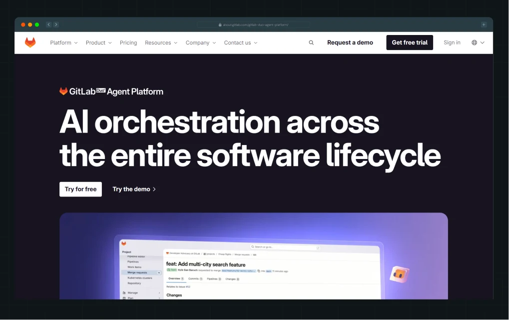
Visitors can explore deployment flows, UX processes, implementation guides, and platform capabilities directly on the website without first entering a sales cycle.
This approach reduces hesitation during evaluation. When users understand onboarding expectations, the implementation effort, and real workflows before signing up, they arrive with greater confidence and clearer intent.
Activation matters more than traffic
One of the biggest PLG challenges is the gap between signup and actual product activation. Many SaaS companies focus heavily on increasing traffic and signups while overlooking whether users ever reach meaningful value inside the product.
Growth Marketing and Product Strategy leader Oluwasemiloore Akoni shared a strong example of this problem in his LinkedIn post. Despite attracting 300,000 monthly website visitors, the product’s activation rate sat at just 1.6%. The issue was the large gap between signing up and the user’s first successful outcome.
His team redefined activation around a user’s first successful transaction. Then, they removed or delayed every onboarding step that did not directly help users reach that outcome faster.
Within three months, activation increased from 1.6% to 3.4%. Retention improved alongside it, even though the team never introduced separate retention tactics. Users simply returned because they had experienced real value early.
The example above suggests that the goal is not just to generate signups. It is to attract the right users, set the right expectations, and move people toward meaningful product adoption as quickly as possible.
Which Pages Matter Most in a PLG SaaS Website?
In PLG SaaS, every page is a conversion surface, not just a destination. The most effective websites are designed as connected intent layers, where each page answers a specific stage of the buyer journey and quietly moves users closer to activation.
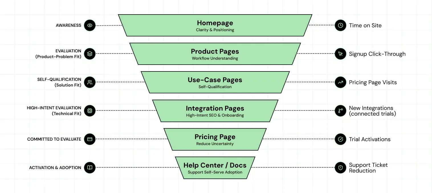
Each page in this list serves a specific stage in the self-serve buyer's journey.
- Product pages that only list features without showing workflows miss the point.
- Use-case pages that speak to every persona equally serve none of them.
- Integration pages that hide behind generic descriptions lose the high-intent, comparison-stage traffic that should convert at the highest rate.
What Common PLG Website Design Mistakes Hurt Sign-Ups?
In PLG SaaS, small website mistakes can quietly hurt sign-ups. Most of them end up confusing users rather than helping them quickly understand the product and take the next step.
- Hiding the product behind abstract branding: If your hero section features a lifestyle illustration, a motion graphic of circles, or an abstract visual metaphor (and no actual product UI), you've replaced product clarity with brand performance. Visitors who can't picture themselves using the product within the first scroll will leave before they scroll.
- Using vague messaging instead of workflow clarity: "Transforming how teams collaborate" tells a visitor nothing. "Manage engineering sprints, flag blockers, and ship faster without switching tools" tells them exactly what the product does and why it matters. The messaging hierarchy on a PLG website must flow from outcome to workflow to feature, never the reverse.
- Overloading the homepage with features: Feature-dense homepages create cognitive overload and dilute the core value proposition. Visitors don't come to your homepage to learn about all 47 features. They come to understand whether this product solves their specific problem. Every feature added above the fold is a decision a visitor must process before they can take action.
- Forcing demo calls too early: Placing a "Book a Demo" CTA as the primary or sole conversion path tells self-serve buyers that they can't evaluate your product independently. For PLG companies targeting high-volume sign-up funnels, this is a structural CAC problem. In this case, you're spending sales resources on users who could have self-served, and you're losing the ones who won't.
- Making onboarding feel complex before sign-up: If your sign-up page asks for company size, team structure, use case, and a phone number before a visitor has seen the product, you hurt sign-ups, turning it into an interview rather than a simple first step. Progressive onboarding works better because it only asks for details when they are actually needed.
A PLG website is a functional part of the product experience. It should behave like one: fast, clear, interactive, and oriented around what the user wants to accomplish.
How Do Startup and Enterprise SaaS Companies Approach PLG Design Differently?
In simple terms, startups focus on getting users to try the product as fast as possible, while enterprises focus on building trust, clarity, and support for complex buying decisions.
Here’s how.
Startup PLG websites prioritize speed and activation
For a web design agency serving startups in the PLG space, the brief is almost always the same. That is, to build something lean that gets users to activation quickly.
These sites usually focus on one main action, like signing up, starting a trial, or exploring a template. The messaging is simple and often tested and changed quickly. The navigation stays minimal, and the product story focuses on one key use case instead of many.
At this stage, getting users to sign up quickly matters more than adding depth or complexity. The website should be easy to build, easy to change, and quick to improve, so even a small team can update it without needing engineers.
Enterprise PLG websites prioritize scalability and trust
A web design agency for enterprises building PLG sites faces a different challenge:
How to maintain self-serve simplicity while also supporting multi-stakeholder evaluation, governance requirements, and integration complexity?
Layered navigation, security and compliance pages, deep integration documentation, and scalable design systems become essential as PLG companies move upmarket.
HubSpot and Webflow both demonstrate this balance well. HubSpot maintains a self-serve signup path while simultaneously offering enterprise-grade documentation, partner ecosystem pages, and stakeholder-specific product tours. Webflow includes both a "start building" path and an enterprise contact flow without making either feel like an afterthought.
According to a 2025 analysis from T2D3, companies with established self-serve motions often exceed $300k in revenue per employee, compared with under $100k for companies without them.
Enterprise PLG design doesn’t remove self-serve. It builds on it and supports more complex buying needs.
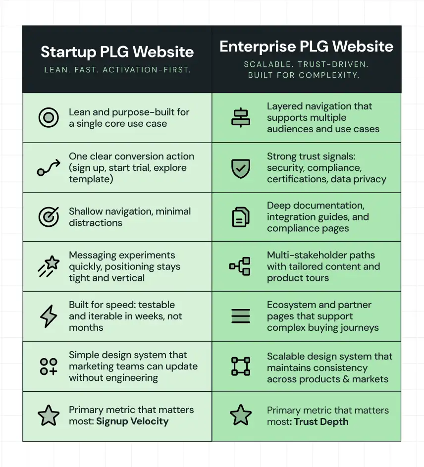
As PLG companies scale, the website must support both self-serve simplicity and enterprise complexity, and the design system holds them together.
When Should SaaS Teams Work With a PLG Web Design Agency Like ThunderClap?
A specialized PLG web design agency like ThunderClap becomes valuable when your website needs to do more than explain your product. If self-serve buyers need to understand workflows, evaluate features, and move toward activation without sales involvement, your website needs a different approach than a traditional marketing site.
SaaS teams usually reach this point when:
- Their messaging does not clearly communicate the product value to self-serve buyers
- Visitors struggle to understand the product without booking a demo
- Conversion rates have plateaued despite steady traffic
- The website lacks product-led elements like interactive demos, onboarding flows, or clear user paths
- Marketing, product, and sales teams are not aligned around the website experience
This is where specialized PLG agencies bring value. They combine messaging strategy, UX design, CRO thinking, and product storytelling to create websites built around activation and adoption.
A successful PLG website brings together messaging, UX, product education, and website strategy to help users reach value faster. For SaaS teams looking to turn their website into a self-serve growth channel, working with a specialized partner can help bridge the gap between product strategy and website execution.
At ThunderClap, we help B2B SaaS companies build conversion-focused websites that combine buyer research, PLG messaging, scalable design systems, and product-led experiences.
{{ctaBlock}}
FAQs
1. What is a self-serve B2B website?
A self-serve B2B website lets buyers research, evaluate, and sign up for a product without talking to a sales rep. It gives visitors transparent pricing, visible product demos, and a frictionless signup path so they can make a purchase decision independently.
2. Why are self-serve websites important for B2B companies?
Self-serve websites reduce customer acquisition costs and speed up the buying cycle. Since 75% of B2B buyers prefer a rep-free sales experience, a website that supports independent evaluation converts more of your traffic into active users without proportionally scaling your sales team.
3. What is time-to-value (TTV) in PLG websites?
Time-to-value is how quickly a user experiences meaningful product value after their first visit or sign-up. For high-performing PLG products, your TTV should be under 30 minutes, with top companies hitting 5 to 15 minutes. Your website directly influences TTV by setting expectations, simplifying onboarding, and showing product value before the user signs up.
4. How do PLG websites improve conversion rates?
PLG websites improve conversion by showing the product early, reducing signup friction, using workflow-oriented messaging, and giving buyers everything they need to self-qualify. PLG strategies like interactive demos and contextual upgrade prompts produce conversion rates up to 3x higher than purely sales-driven funnels.
5. What is the best website design for PLG-led SaaS businesses?
The best website design approach for PLG-led SaaS businesses helps users understand, evaluate, and experience the product independently. It combines clear messaging, product-led UX, interactive demos, and conversion-focused design. For SaaS companies looking for a specialized partner, ThunderClap helps B2B SaaS teams build PLG-focused websites that connect product strategy with user experience. Its approach combines messaging, UX, CRO, and product storytelling to create websites designed around activation and self-serve growth.
You can attract traffic all day, but you can’t force a stranger to turn into a qualified lead.
That’s the quiet frustration within B2B marketing teams. They build smarter funnels, run cleaner ads, invest in content, and still watch great prospects disappear the moment they hit the website. Not because the offer is bad. Or, because the product lacks power. The website just doesn’t carry the weight and reassure. Hence, it doesn’t convert.
At ThunderClap, we have rebuilt over 129 B2B websites for SaaS, fintech, AI, and enterprise tech teams. We worked with brands like Amazon, Storylane, Factors, Deductive AI, and Zenda, and even created landing pages that AI flagged for measurable performance gains. After seeing hundreds of user journeys up close, we’ve learned a few hard truths about what actually drives conversions:
- Buyers want proof, not poetry
- Navigation often serves internal politics rather than buyer flow
- Pages lack intent signals and don’t guide the visitor toward a natural CTA path
- Messaging is vague, generic, or misaligned with the ICP's pain points
It’s evident that a high-converting B2B website behaves, gets attention, builds trust, and clearly shows the next step. That’s what this guide breaks down. The website design principles that turn curious visitors into qualified leads who actually want to talk to you.
TL;DR
- B2B teams lose visitors in the first few seconds because buyers can’t understand the product or the value fast enough.
- Cluttered messaging, weak proof, and dead-end pages kill momentum and make great prospects walk away.
- ThunderClap’s TLA Framework fixes this by stacking Clarity, Proof, Conversion, and Flow into a system that guides every visitor toward action. Here’s how it works:
- Clarity tells them what you do
- Proof earns their trust
- Conversion gives them the right CTA
- Flow moves them through the journey without any dead ends
- ThunderClap has rebuilt 129+ B2B websites and consistently lifts conversions by turning your site into a buyer-ready engine that sells for you.
The ThunderClap Lead Architecture Framework
High-performing B2B websites aren’t built by chance. They follow a deliberate system designed for how B2B buyers actually make decisions. At ThunderClap, we call this the ThunderClap Lead Architecture (TLA Framework), a four-part approach that ensures every visitor understands, trusts, and takes the next step.
Here’s the framework in action:
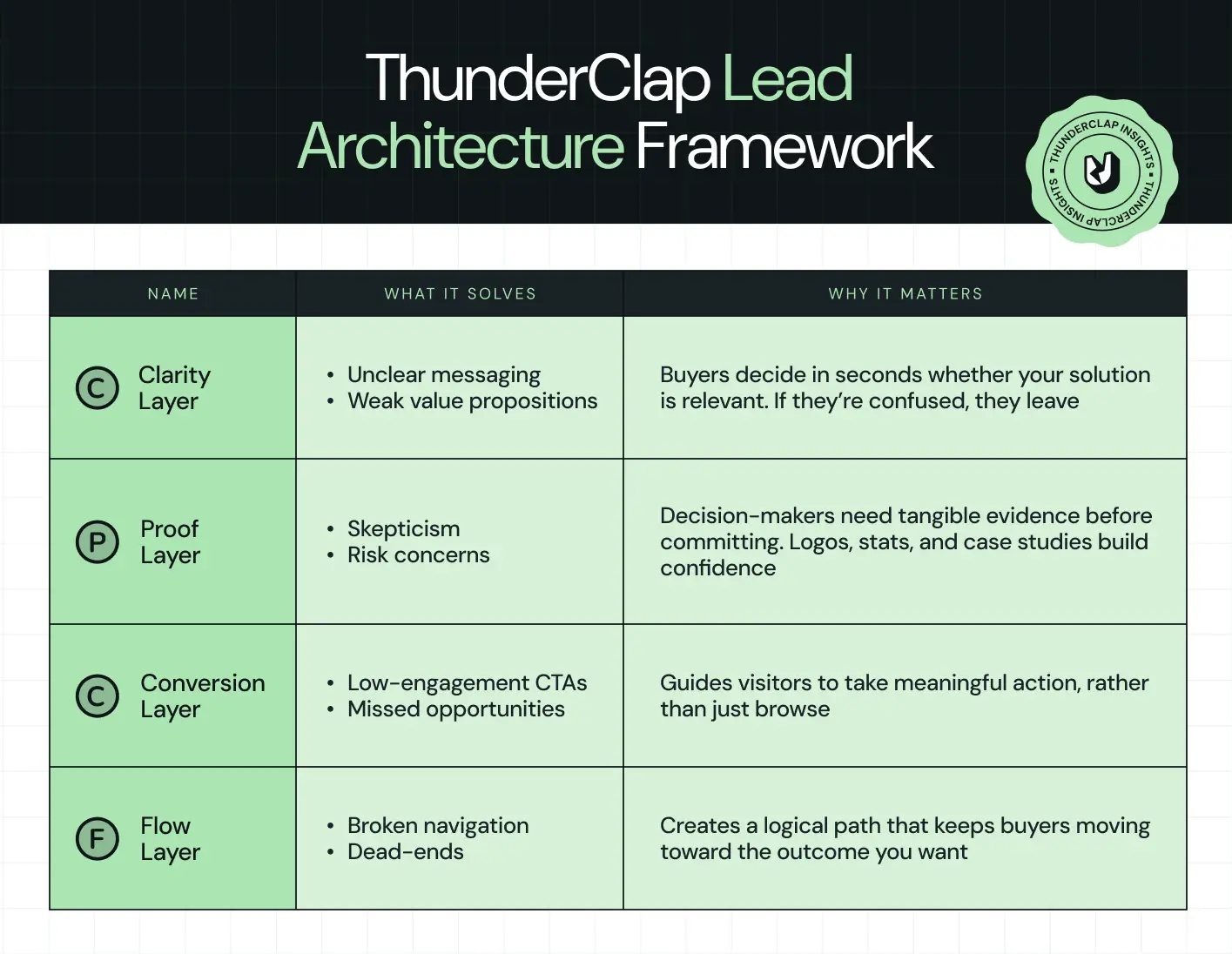
Every B2B site we’ve built, from SaaS platforms to enterprise tech, follows this framework. Skip a layer, and visitors hesitate. Nail all four, and your website becomes a lead-generating engine, not just an online brochure.
The TLA Framework is the backbone of our design process. In the following sections, we’ll dive into each layer and explain how it solves real buyer problems while boosting conversions.
Also read: 20 Proven SaaS Conversion Optimization Hacks to Boost Your Sales
Principle #1: Clarity Beats Cleverness (Clarity Layer)
Your website has only five seconds to make someone stop scrolling and pay attention. In that tiny window, visitors need answers to three simple questions:
- What do you do?
- Who is it for?
- Why should I care?
If your messaging is clever but unclear, you lose them instantly. Clarity means stripping away fluff and giving visitors exactly what they need upfront:
- Hero messaging that is straightforward and outcome-driven
- Subheadline that explains the benefit, not the feature
- Scannable page layout with enough whitespace to breathe
- Product visuals or simple UI animations that show how the solution works
But why does clarity matter so much? Because B2B buyers are decisive yet impatient. According to a 2025 report, conversion rates for B2B websites average only 2%–5%, while top performers reach 5%–11.45%. Another study found that 90% of B2B buyers compare 2–7 sites before making a decision, and that 80% of B2B purchase decisions are driven by UX, not just price or product.
Even minor tweaks in hero messaging, images, or CTA clarity can yield measurable gains. For example, refining your hero section headline and subheading can improve conversions.
When we redesigned ClearlyRated’s website, the original hero section tried to list multiple awards and features. It looked impressive but left visitors guessing what the product actually delivered.
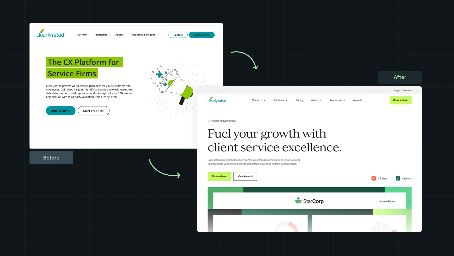
We rewrote the hero in outcome-first language, emphasizing how verified reviews build trust and drive higher sales. The subheadline highlighted the measurable results clients could achieve, and we paired it with a clean visual of the platform interface. The layout allowed the eye to quickly scan from the headline to the visual.
Within weeks, the website engagement metrics showed visitors immediately understood the product’s value. Clarity turned confusion into curiosity, and curiosity into action.
Principle #2: Proof Converts Skeptical B2B Buyers (Proof Layer)
B2B buyers are naturally cautious. They won’t trust a bold claim unless there’s evidence to back it up. That means proof must be where visitors can see it and absorb it without having to think too hard.
Good proof on a page can include:
- Client logos above the fold to show credibility immediately
- Compliance badges like SOC 2 or ISO to signal reliability
- Short, results-driven testimonials that highlight real outcomes
- Case studies that reflect challenges your target buyers face
- Live status pages or integration links to demonstrate functionality
When we worked on the RecruiterFlow project, we built a flexible Webflow system that made it easy for their team to manage pages, publish content, and stay aligned across the buyer journey. Here’s what we did:
- Migrated pages, ebooks, webinars, customer stories, and case studies to a unified system
- Added HubSpot tracking so the team could see how users engaged with each asset
- Set up a responsive design that worked seamlessly with their WordPress blog
- Created reusable components, a style guide, and training videos so the team could run fast without friction
This kind of foundation matters because your proof only shines when your website supports it. Clean structure, strong tracking, and easy updates help every content format, whether it’s videos, case studies, or testimonials, work harder across the funnel. With the new system, RecruiterFlow’s team could clearly and confidently showcase proof, guiding skeptical visitors toward demos and conversions.
Here’s our proof placement blueprint showing exactly where each element belongs and how it impacts leads:
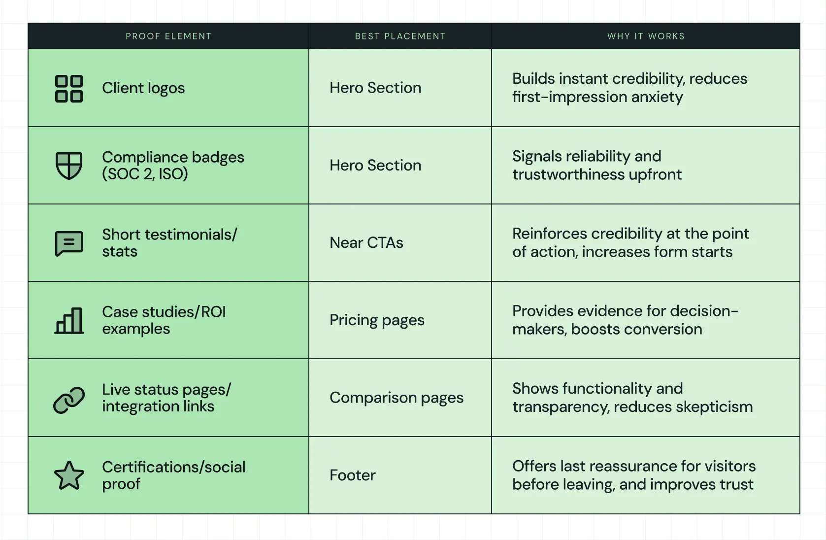
For example, RecruiterFlow showcases strong social proof at the bottom of their pages, combining testimonials with industry recognitions.
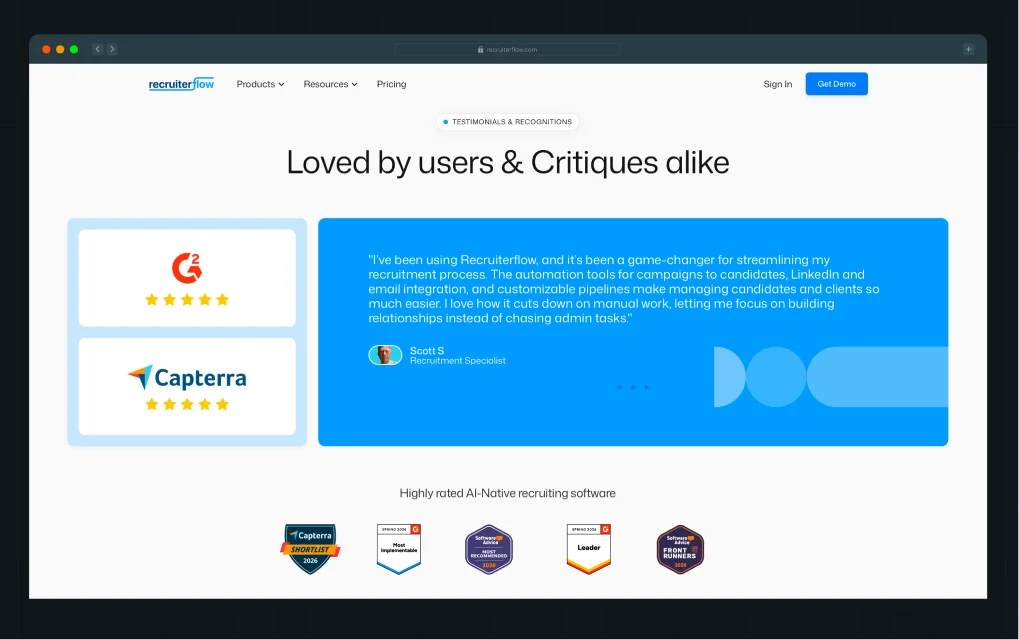
This strengthens credibility across multiple touchpoints, helping skeptical buyers feel confident and guided toward conversion.
{{specficBlog}}
Principle #3: Conversion Architecture (Conversion Layer)
One CTA doesn’t work for B2B. Visitors have different needs and intentions at varying points in their journey. Conversion architecture means giving multiple entry points for them to take action without feeling forced:
- Ungated demo videos to explore the product quickly
- ROI calculators or industry guides for evaluators who need context
- Instant booking calendars for prospects ready to speak with sales
- Full demo requests for those prepared to commit
According to a 2025 analysis of 1,000+ B2B website A/B tests, CTAs rank among the most critical conversion elements across B2B sites. The data shows that when a B2B web design agency experiments with the placement, copy, and structure of CTAs, they consistently separate high performers from the rest.
A great example is the Avanti Fellows website, a student-centric platform packed with media and interaction. Qamar Aziz, our Webflow Lead and GSAP Developer, put it best when he said,
“Avanti Fellows needed a visually rich site with sliders, animated elements, and interactive content. Their previous WordPress site was replaced with Webflow, allowing us to replicate the Figma designs with full animation support.”
Here’s what that looked like in practice:
- Migrating from WordPress to Webflow to eliminate plugin issues
- Rebuilding five animated pages with Lottie files and interactive sliders
- Setting up media and student resource pages with thoughtful motion
The result was a visually engaging site that matched their Figma designs with smooth, intentional animations. The combination of smooth animations, clear navigation, and media-rich content made it easy for visitors to take the next step, whether that was watching a demo, exploring resources, or booking a session.
{{specficService}}
Principle #4: Journey Flow Dictates Lead Quality (Flow Layer)
The order in which visitors see information matters more than fancy visuals or color schemes. Flow dictates how naturally a visitor moves from curiosity to decision.
Good flow includes:
- Navigation organized around buyer intent, not product features
- Prominent placement of pricing, product, solutions, and proof
- No dead-end pages; every page suggests a logical next step
- Comparison and alternatives pages integrated into the navigation
When we redesigned Storylane’s site, we realized trust sometimes comes from personality, not rewrites. We introduced mood boards, a clean yet playful visual identity, and custom illustrations. We even restructured the navigation to mirror the buyer journey: awareness → evaluation → decision.
The copy stayed untouched, yet impressions rose by 36% and demo requests increased by 30%.
That is the power of thoughtful B2B web design supporting your narrative. Each page guided visitors naturally through awareness, evaluation, and decision stages, while visual identity and illustrations made the journey intuitive and memorable. Comparison pages and alternative solutions were seamlessly integrated, allowing visitors to answer questions without friction. Flow ensured buyers reached the right information at the right time, boosting engagement metrics and overall lead quality.
Here’s a complete breakdown in this LinkedIn post by Kiran Kulkarni, Partner and Head of Growth at ThunderClap, where she shares the detailed process and before-and-after results.
B2B Website Design Is a System, Not a Homepage Makeover
A B2B website can look clean and modern, but that doesn’t mean it works. As a Webflow Enterprise Partner, we see too many sites that shine visually yet leave visitors confused, skeptical, or unsure of the next step. High-converting B2B websites follow an architecture that guides visitors through clarity, proof, conversion, and flow, so every interaction counts.
Take a moment to audit your own site using the TLA Framework. Ask yourself:
- Are visitors getting your message in five seconds?
- Do they see proof that builds trust?
- Are CTAs helping them act at the right time?
- Does the journey feel natural and simple?
Answering these questions can reveal gaps that hold back leads and growth.
If you want your website to actually generate qualified leads and reflect the thoughtfulness of your brand, talk to the team that builds systems that work. As the best B2B website design agency, ThunderClap helps clients turn browsers into meetings.
{{ctaBlock}}
FAQs
1. How is B2B website design different from B2C design?
B2B website design focuses on guiding thoughtful, careful buyers who often involve multiple stakeholders. Unlike B2C, the goal isn’t quick impulse purchases. It requires clear messaging, proof, and structured conversion paths. A B2B web design agency builds sites that speak to business decision-makers while keeping the experience simple, intuitive, and focused on driving qualified leads.
2. How long does it take to design and develop a B2B website?
The timeline varies depending on complexity, features, and content needs. At ThunderClap, as a leading SaaS web design agency, typical projects take 6 to 12 weeks from concept to launch. This includes research, messaging, design, development, and testing, giving the site time to perform fully for visitors and for lead generation.
3. Why do B2B companies need a specialized website design agency?
B2B websites must clearly communicate value, prove credibility, and guide visitors toward actions that matter. Inexperienced designers often miss these subtle but critical points. Working with the best B2B website design agency, like ThunderClap, ensures your site converts with structure, clarity, and intent while supporting your sales and marketing efforts every step of the way.
You’ve probably seen this movie before.
Act 1: Your team decides, “We need a redesign.” You pick an agency with the best portfolio and the smoothest deck.
Act 2: Kickoff! Figma files are flying, and stakeholders love the mockups. Launch day feels like a win.
Act 3: A quarter later, your activation rate hasn’t picked up, and churn is still high. Your CEO asks: “So... what did we actually get for $80K?”
Credits roll (No sequel planned).
You hired a UI/UX design agency that redesigned your interface, but not your experience. This guide is about avoiding that movie. By the end of this guide, you’ll have a practical decision framework to choose the right UI/UX design agency for B2B and SaaS.
Let’s go!
TL;DR
Here’s the short version of how to choose a UI/UX design agency for B2B and SaaS:
- Start with the business problem and define success in activation, retention, expansion, or ACV uplift.
- Prioritize B2B and SaaS expertise. A strong SaaS UI/UX design agency will speak in terms of funnels, cohorts, and user states.
- Stress-test their process and UI/UX design services. Look for a clear flow: discovery → research → IA → prototypes → UI → handoff → post-launch optimization.
- Read case studies for outcomes. You want reduced churn by X% or +Y% trial-to-paid, not just “We redesigned the dashboard.”
- Understand pricing and models upfront. Most B2B projects fall between $10,000 and $50,000, with extensive platforms often exceeding this range.
- Run a paid pilot. Start with a narrow scope (onboarding, one key flow) before trusting an agency with your entire product.
If you want a quick feel for what strong SaaS-focused partners look like in the wild, you can cross-reference this with ThunderClap’s roundup of the top B2B web design agencies.
What a UI/UX design agency really does for B2B and SaaS products
A good agency understands users and jobs-to-be-done. This means conducting interviews, observations, and analyses to understand how people use your product. When someone tells you, “IT admins want a clean dashboard,” ask them how they know.
- Did they watch 12 IT admins fail the same task?
- Did they run task-based usability tests?
- Or are they guessing based on best practices from 2019?
The best UI/UX design agency for B2B will hand you a journey blueprint that shows where users drop off and why. They map sign-up, onboarding, upgrade, renewal, and support flows. Then they reduce friction at each step.
For example, when your PM says, “We need a settings page for the new AI feature,” you shouldn’t start from scratch. You can reuse components that already work. For Supademo (an interactive demo platform), ThunderClap delivered a Webflow component library that the Supademo team could update without compromising design consistency.
Also, look at the UI/UX design services page for any serious agency, and you’ll see the same building blocks: UX research, journey mapping, information architecture, wireframing, prototyping, UI design, and design systems. If an agency jumps straight to color palettes and animations, you’re not looking at the best UI/UX design agency for B2B; you’re looking at a surface-level studio.
For context on how UX and web design intersect for B2B growth, ThunderClap’s B2B Website Optimization Strategy is a helpful companion read.
Step 1: Define the business problem before you shop for “the best UI/UX design agency.”
Most RFPs start with: “We need a redesign”. Instead, write a one-page “why now” doc before you speak to any UI/UX design agency. Many strong agencies (and every real UI/UX design agency for SaaS) will push you to clarify these before talking about UI.
Where are you leaking value?
Onboarding drop-offs? Feature adoption stuck at 12%? Renewal risk is rising because users are not receiving the new dashboard?
Which metrics matter?
Activation rate, time-to-value, NPS, support ticket volume, trial-to-paid conversion, expansion MRR, or net revenue retention? Pick 2-3 north-star KPIs and write them down.
What are your constraints?
Tech stack (React? Vue? Legacy Rails?), design tokens already in use, non-negotiable brand assets, or release timelines dictated by board meetings or funding milestones?
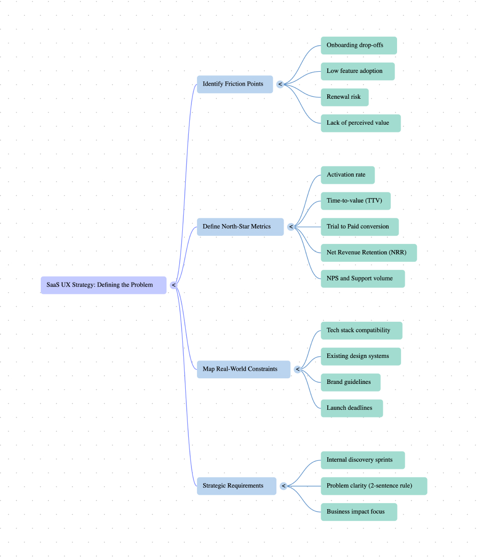
Step 2: Shortlist agencies with B2B and SaaS depth
Designing simple apps or marketing websites is different from building enterprise products with multi-step onboarding, role-based dashboards, and workflows that span teams and regions.
When vetting agencies, look specifically for SaaS-relevant websites. Do not judge by intricate landing pages. Check for a portfolio in a similar or sister industry. Also, see if they reference the SaaS vocabulary. For fintech and AI, see if they reference compliance (SOC 2, HIPAA, GDPR), data sensitivity, and industry-specific UX constraints.
You can cross-check agencies you’re considering against ecosystem players in lists like Top SaaS design agencies.
Ayush Barnwal, Partner and CEO, ThunderClap, runs us through common mistakes that happen during SaaS website development in this detailed piece:
Step 3: Read their UI/UX design services page like a product spec
Don’t just skim. Treat them like product documentation. Ask: what do they do, who do they work with, and what proof do they show?
Clear, end-to-end design services
Don’t just skim. Treat them like product documentation. Ask: what do they do, who do they work with, and what proof do they show?
What to look for
You should clearly understand how they go from research to final product. Don’t focus on a long list of deliverables. Focus on whether their process is clear and repeatable for products like yours.
- Research
- User journey mapping
- Prototyping
- Implementation support
ThunderClap focuses on B2B and SaaS work.
- Work connects website experience with product experience
- Their process covers strategy → structure → UI → implementation
How to compare
When you look at other agencies, ask:
- Do they talk about business outcomes?
- Do they understand SaaS workflows?
- Or do they just show generic redesigns and visuals?
The closer their work is to your product and users, the more useful they’ll be as a long-term partner.
“The team is thoughtful, responsive, and has exceptional design sensibility. Bringing our collective brand vision to life wasn’t easy, but the results speak for themselves - it looks amazing!” - Darryl Pinto, Growth Marketing Manager, Amazon
{{specficService}}
Step 4: Tear down their case studies for outcomes and constraints
Every UI/UX design agency claims they’re strategic. The proof is in their case studies. When evaluating, ask:
Do they state the problem in business terms?
“Reduce onboarding drop-off by 20%” is very different from “modernize the interface.” The best UI/UX design agency will frame the problem as a revenue or retention issue.
Are there real numbers?
Even directional metrics (+35% trial-to-paid, -25% support tickets, +80% organic demos) matter more than “great feedback from users.” If a case study doesn’t include a single KPI, it’s a portfolio piece.
Do they mention constraints?
Legacy tech, strict branding, partial rollouts, or short timelines all show they’ve executed in real-world conditions.
For example, when ThunderClap worked with 101 Gen AI (an AI for healthcare platform), we built to explain the product while maintaining a coherent visual language across every touchpoint. Find the entire case study here:
Step 5: Understand UI/UX pricing, models, and what drives costs
Budget shouldn’t be the only filter, but it’s a real one. The ranges below are directional, not quotes, but they’ll help you spot outliers. From multiple pricing guides and Clutch data, you can expect:
- Project-based pricing: Many UI/UX redesigns range from $8,000 to $50,000, with SaaS platforms and design systems exceeding $ 100,000.
- Hourly rates:
- India / South Asia: roughly $20–$60/hour
- US / Canada / Australia: often $100–$150/hour or more
- UK / Western Europe: typically $50–$100/hour
- Retainers: For ongoing UI/UX design services (continuous UX improvements, experiments, and support), agencies offer monthly retainers based on a fixed number of hours or a dedicated designer.
What influences cost?
- Scope (number of flows and screens, depth of research)
- Complexity (multi-role permissions, heavy data viz, mobile + web parity)
- Research intensity (field studies vs light usability testing)
- Location and seniority of the team
For web-and-UX combined projects, ThunderClap’s research on web design cost vs. ROI is a useful reference point for evaluating investment vs. outcomes.
{{specficBlog}}
Step 6: Evaluate collaboration style and process (beyond the pitch deck)
Finding the best UI/UX design agency for your product is as much about fit as it is about craft. On your discovery calls, look for these signs:
- Concrete examples: Can they describe how their process played out on a real project, what changed after research, what they cut, and what they shipped first?
- Engineering empathy: Mature agencies talk about design + dev handoff, not just handing over Figma files. They’ll mention design tokens, responsive behavior, and component libraries.
- Communication: Weekly reviews? Async Loom updates? Slack channels? The UI/UX design agency for SaaS you pick should mesh with how your product team already works.
(🎁 Bonus) Build vs Buy vs Partner: A decision tree for UI/UX design capacity
Before you hire any UI/UX design agency, ask: Should you even outsource this? Here’s a simple decision tree to help:
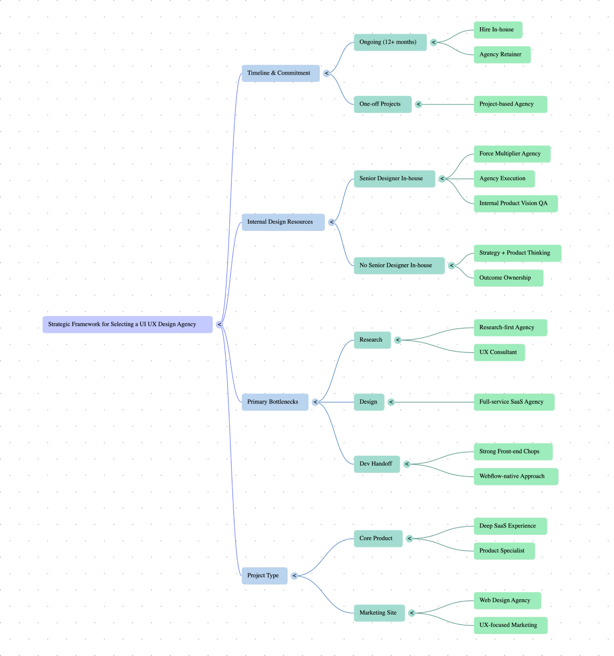
Where ThunderClap fits into your UI, UX, and website stack
ThunderClap’s sweet spot is where website, product story, and growth meet. With 140+ B2B websites shipped for numerous SaaS, fintech, AI, and B2B service brands, including Amazon, Razorpay, Storylane, Factors AI, roommaster, Rezolv, Shopline, and Deductive AI, ThunderClap behaves less like a generic “design factory” and more like a focused UI/UX design partner for revenue teams for:
- B2B marketing sites
- Product-led storytelling across web, demo, and trial
- Conversion architecture that aligns UI, copy, and funnels
If you already work with a UI/UX design agency for SaaS on your in-app experience, ThunderClap can own the “website + narrative + conversion” layer, tying together what users see on your site with what they experience in-product. For a sense of how that looks in practice, explore:
Factors (marketing attribution SaaS): ThunderClap redesigned their website to better position their product-led growth motion, resulting in higher-quality demo requests.
{{ctaBlock}}
FAQs
1. How to choose a UI/UX design agency
Start with your business goals, not a moodboard. Shortlist agencies with solid B2B or SaaS work, strong UX research, and outcome-focused case studies. Review their UI/UX design services, process, and collaboration style. Then compare pricing, run reference checks, and start with a focused pilot before committing to a full redesign.
2. How is a UI/UX design agency different from a web design agency?
A UI/UX design agency focuses on how your product works, including flows, usability, dashboards, and in-app experiences. A web design agency is typically focused on website marketing, storytelling, SEO, and page conversions for pages such as home, pricing, and resources. There’s overlap, but product usability and retention are firmly in the UI/UX territory.
3. How much does it cost to hire a UI/UX design agency?
Costs vary by scope, complexity, and region. Many UI/UX projects range from $8,000 to $50,000, with SaaS platforms often exceeding $100,000. Hourly rates often range from $20-$60 in South Asia to $100-$150+ in the US and other high-cost markets.
Every B2B company now follows the same playbook. Content marketing, SEO, paid ads, and visually stunning websites. Best practices everywhere. And it works, until it doesn't.
You hit a threshold, traffic plateaus, and conversions stall. Not because your B2B SaaS marketing strategies are broken, but because you're doing exactly what your competitors do.
According to Madhav Bhandari, Head of Marketing at Storylane, the only solution is to break the existing mould to command attention, which he calls pattern interrupt marketing:
"The idea is to identify category patterns and deliberately break them, repeatedly. Not one viral campaign. Not one channel. A portfolio of pattern interrupts running in parallel, so you're constantly giving the market new reasons to notice and remember you."
At Thunderclap, we've seen this across 140+ website design projects, including ones for Factors, Storylane, Z47, Amazon, and others. When everyone follows best practices, best practices become table stakes.
And in this article, we break down 7 pattern-interrupting B2B SaaS marketing strategies used by brands like ClickUp, Storylane, Apollo, Factors, roommaster, and PostHog, and show how they map across the buyer journey from awareness to ARR.
Your Hack: Map the 5 B2B SaaS marketing strategies across the Buyer Journey
The B2B buying journey isn't linear anymore. Buyers don't follow a neat funnel where marketing generates leads and sales close them. According to Wynter's research, 91% of B2B marketing leaders arrive at sales calls already familiar with the vendor.
They've researched your website, checked reviews, asked peers, and narrowed you down to one of three finalists, all before talking to your sales team.
This is why pattern interrupts matter at every stage. If your acquisition looks like everyone else's, you're invisible. If your pricing page reads like your competitors', you lose the deal. If your upsell feels generic, you lose the customer. The brands growing right now interrupt patterns across the entire journey, not just at the top.
They don't rely on one tactic; they stack strategies across three key stages: awareness, consideration, and conversion. Here's how those 5 pattern-interrupting B2B SaaS marketing strategies from ClickUp, Storylane, Apollo, Factors, roommaster, and PostHog line up across the buyer journey.
5 Winning B2B SaaS Marketing Strategies for 2026: From Awareness to ARR
B2B SaaS Marketing Strategies For Awareness Stage
In the awareness stage, first impressions matter most. Here are 2 best content marketing strategies for B2B SaaS companies in 2026 that help you dominate search and build brand recall even before buyers know they need your product.
1. Volume-Led SEO: Outpublish Competitors to Dominate Search
A recent Semrush study confirms that posting 16+ blogs per month generates over 4 times as many leads as publishing fewer posts. Yet most SaaS teams stay stuck in low-volume mode; they publish two or three blog posts a month and then wonder why SEO feels dead.
The volume strategy flips that. You publish often, cover every real question in your category, and let that content stack up over time. Each article becomes a long-term traffic asset. Eventually, your blog stops being a campaign and starts behaving like infrastructure that brings in traffic even years after publishing it.
Case In Point: ClickUp
When ClickUp entered project management in 2017, Asana, Trello, and Monday.com owned the space with bigger paid search budgets. ClickUp couldn't outspend them, so they went aggressive on publishing.
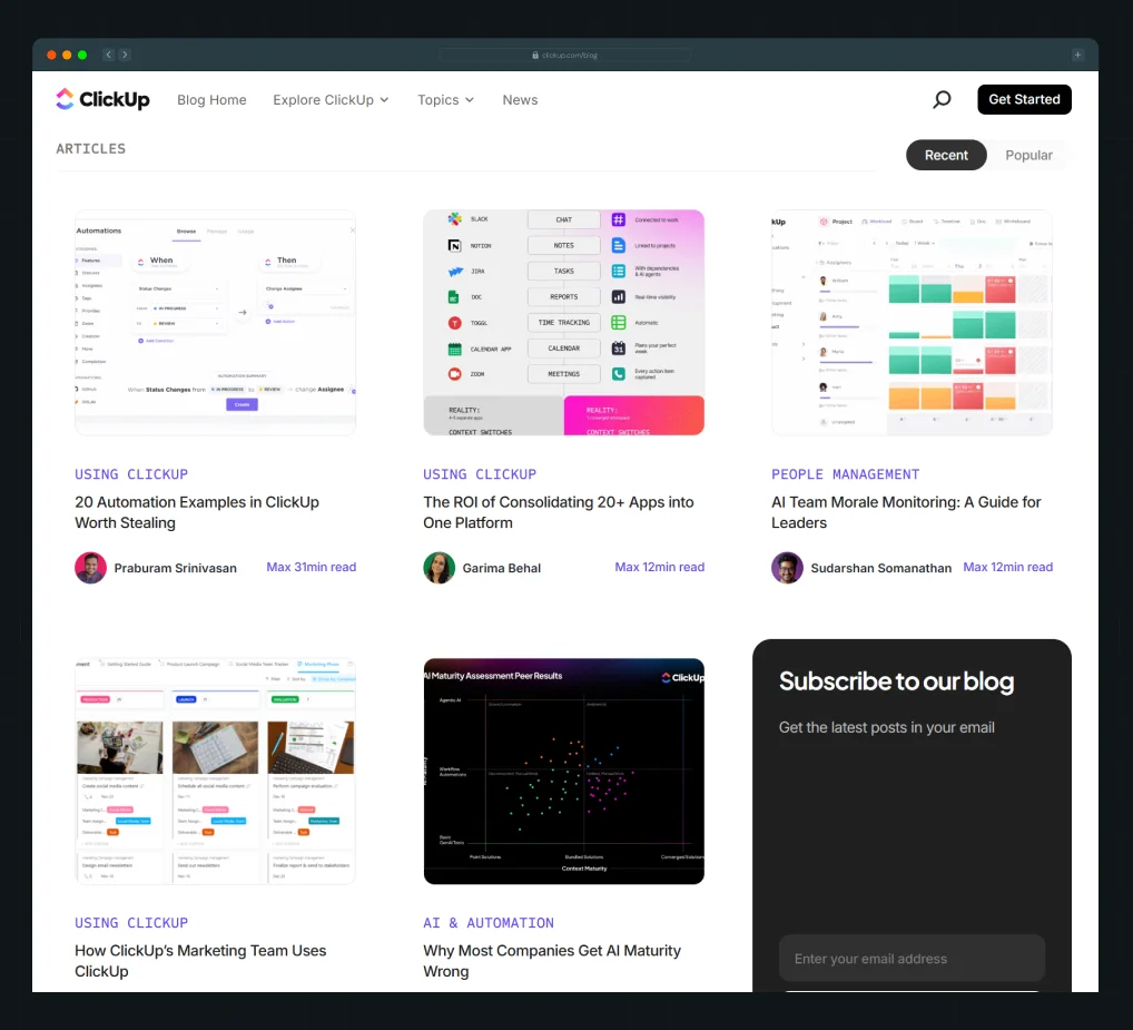
ClickUp’s content strategy had one goal: own every search query in the productivity space. This meant optimizing for search intent at every stage of the buyer journey, not just ranking for keywords. So they published daily: guides, tutorials, comparison pages, and videos.
By 2022, they ranked for 500,000+ keywords and drove 1 million monthly visitors. Today, they publish 200-250 posts monthly with 10 agencies and 50-100 writers. In a way, they're also dogfooding their own product, using ClickUp to coordinate this massive operation. It proves their platform works at scale.
But publishing volume was just one play. ClickUp went aggressive everywhere, product, content, and even entertainment.
While competitors shipped features quarterly, ClickUp shipped weekly. While competitors made boring demo videos, ClickUp launched ClickUpComedy, turning workplace policies into viral music parodies. Their "HR Goes Hard" video, an HR training session turned rap anthem, hit 26 million views.
This wasn't a side project. It was proof that B2B brands can own attention in spaces competitors ignore. ClickUp showed up on Instagram, YouTube, LinkedIn, SEO, product updates, and customer feedback simultaneously.
ClickUp's B2B SaaS content marketing strategy proves volume works, but only when paired with aggressive execution across every channel.
Key Takeaways
- Start with 4-8 posts monthly, covering your core use cases deeply. You don't need ClickUp's volume on day one.
- Build content systems first: templates, workflows, quality checks. The best B2B SaaS content marketing strategies in 2026 prioritize repeatable processes over throwing bodies at the problem.
- Map content to search intent, not vanity keywords. Target the questions your buyers ask when evaluating tools like "[Your tool] vs [Competitor]" or "how to [solve problem] with [tool]."
- Track pages that drive traffic 6+ months after publishing. That's your signal content is compounding, not just getting short-term spikes.
2. Demo-Led SEO: Cast a Wide Net for Long-Term Brand Recall
Ever since Inc. declared SEO “dead,” marketers have argued about whether TOFU still works. The reality is simpler. Generic how-to content is dying because AI gives the same answers faster. What still wins is time-to-value.
If you can show someone how to solve a problem in 15 seconds while everyone else takes five minutes, you win both rankings and memory.
Case In Point: Storylane
Storylane has a tutorial hub with more than 1,500 interactive demos. At that scale, the real challenge is not creating content. It is keeping everything fast, searchable, and easy to use. Those were exactly the constraints we had to solve during Storylane’s website redesign, including making sure every page loads in under two seconds.
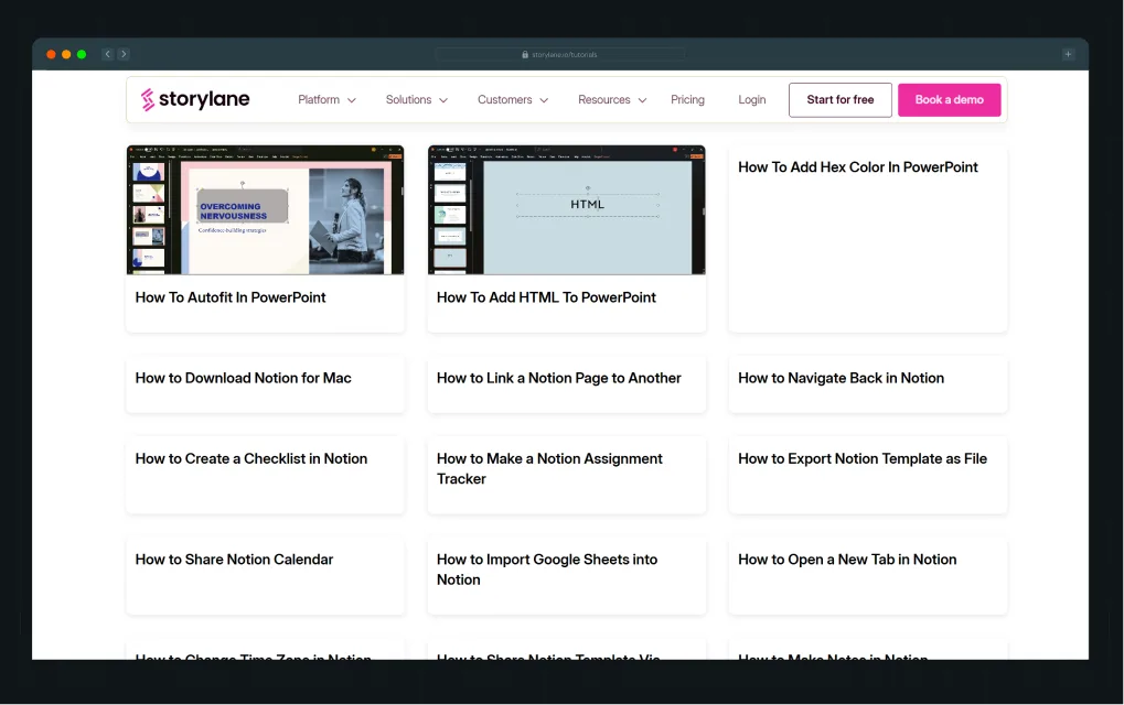
But the interesting part is, none of these tutorials are about Storylane itself.
They're for Canva, HubSpot, Salesforce, and Confluence, tools their audience already uses daily. Every tutorial is built with Storylane, embedding brand recall into workflows where buyers aren't even thinking about demo software yet.
A marketer searching "How to create watermarks in Canva" gets value in 15 seconds. Months later, when they need demo software, they remember Storylane.
- 6x traffic growth in 3 months (25K → 150K monthly visitors)
- 91% of pages ranking in the top 20
- 53% in top 10
Key Takeaways
- The product creates the content. Works best for shareable outputs: demos, videos, templates.
- Target adjacent search volume. Find opportunities where your product naturally bridges two tools your audience already uses, and become the connector, not the competitor.
- Technical execution matters. Load speed and architecture make or break scaled content strategies.
- Play the long game. Brand recall compounds over time, making demo-led content a foundational part of your B2B SaaS go-to-market strategy, optimizing for future buyers, not just immediate conversions.
B2B SaaS Marketing Strategies For Consideration Stage
{{specficBlog}}
You've caught their attention, but you haven't gained their trust yet. Credibility and clarity are the biggest currencies here. Here are 2 strategies to help you position yourself for market differentiation and make proof impossible to ignore.
3. Interactive, Role-Specific Testimonials: Make Social Proof Impossible to Ignore
Most B2B SaaS websites use the same social proof playbook: a few badges, a couple of testimonials, and a line like “Trusted by 5,000+ marketers.” While this follows standard CRO best practices, most buyers scroll right past it.
Interactive, role-based testimonials solve this by making proof hard to ignore. Buyers see people in their exact role, facing the same challenges, and have to engage to get the full story.
As part of a modern go-to-market strategy for B2B SaaS companies, this helps buyers self-qualify and build confidence from the very first touch.
Case In Point: Apollo.io
.webp)
Apollo’s social proof section works because it is both specific and interactive. They use six role-based flip cards for Account Execs, SDRs, Rev Ops, Marketers, Sales Leaders, and Founders. Each card shows a real photo, name, title, and company, so buyers are seeing peers, not generic quotes.
Hover over a card, and it flips to reveal the full testimonial plus concrete outcomes like “75 percent more meetings booked.”
We used a similar approach for Factors.ai, turning their static logo strip into an interactive proof layer as a part of their website revamp. Hover over a logo and the testimonial drops down, stopping the scroll.
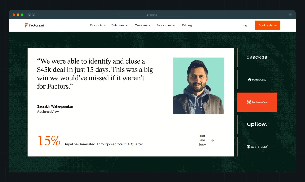
Key Takeaways
- Mix social proof elements. Combine badges, conversion cues, and testimonials strategically to surprise buyers and break patterns.
- Segment by role. Help buyers find validation from peers facing similar challenges, not random customers.
- Add interactivity. Use flips, hovers, expandable sections, or animations aligned with current website design trends to grab attention.
{{specficService}}
4. Clarity-Led Positioning: Make Buyers Understand You in 3 Seconds
While this looks like the basics, this stat might surprise you: 94% of B2B SaaS companies admit they sound like their competitors. The issue isn't design or features. It's confusion.
This means you're leaving money on the table every time a buyer fails to understand what you do.
Try out ThunderClap’s Brand Identity TestTo Know If You Are Just Blending In Or Standing Out.
Case In Point: roommaster
When roommaster approached us, they had one goal: make buyers understand their product. But the challenge went deeper. After 30 years as "InnQuest" with "roommaster" as the flagship product, they were consolidating everything under one brand.
The reason? roommaster wasn't a guest experience tool. It handled the infrastructure beneath hospitality operations, reservations, channels, payments, pricing, and AI in one platform. But the brand didn't reflect that maturity. Multiple product names created confusion.
We positioned them as Hospitality Architects. The site stopped listing modules and anchored one mental model: "You run the hotel. This system handles complications underneath." Post revamp, the website brought in better quality leads and boosted its demo request and organic traffic by 80%.
Key Takeaways
- Test if buyers "get it" in 3 seconds. Show your homepage to someone unfamiliar. If they can't explain what you do, positioning needs work.
- Position around roles, not product categories. roommaster is positioned for "hotel operators who need infrastructure," not just "property management system users."
- Clear positioning improves every channel. When buyers understand what you do, demos convert faster, sales calls close quicker, and organic traffic quality improves.
B2B SaaS Marketing Strategies For Conversion Stage
This is where buyers decide whether to put pen to paper, and small details like pricing transparency can make or break the deal. Here’s a truly unique pricing strategy from PostHog you can use to turn high-intent prospects into paying customers.
5. Transparent Pricing: Give Assurance Where Buyers Expect Tricks
Here's what the typical B2B pricing page experience often feels like as a buyer: asterisks hiding the real price, "contact sales" buttons disguised as CTAs, and "starting at" disclaimers that mean nothing. The whole thing feels designed to trick you into a meeting.
Many sales teams defend this by saying they need to qualify buyers, understand their needs, and build trust through demos. But the best teams flip this. They build pricing pages that give assurance exactly where buyers expect manipulation.
Case In Point: PostHog
PostHog's copy removes hesitation at every friction point. Right next to their free tier, they tell you to just pick this one and upgrade later. Most companies use decoy pricing to push you toward the middle option. PostHog does the opposite.
Instead of tier names like Professional or Enterprise, PostHog shows you the actual math. Costs per event, per session replay, per request. When you adjust the volume slider, your per-unit cost drops as discounts kick in. When most companies negotiate these privately, PostHog displays them on the page.
Their CEO's pricing philosophy section reinforces this. After describing how he thinks about cutting prices, his message to buyers says their pricing is designed to make you happy. They aim to be the cheapest at every scale and tell you to contact them if they're not.
Key Takeaways
- Use copy that removes hesitation at decision points instead of adding qualification friction.
- Show actual per-unit costs so buyers can calculate totals without talking to sales.
- Display volume discounts upfront so buyers can model growth before committing.
Pattern Interrupt Marketing Strategies Only Work When Executed Right
B2B buyers have trained themselves to ignore what looks normal. But here's the risk: there's a thin line between pattern-interrupting and getting completely lost. Go too unfamiliar, and buyers can't relate. Play it too safe, and you're invisible.
When we designed Skyroot Aerospace's contact page, you literally book a launch to space by selecting orbital paths. Bold? Yes. Pattern-interrupting? Absolutely. But it worked because it matched their category. Launching rockets isn't a commodity purchase.
The key is knowing which patterns to break and which to keep. At Thunderclap, we've worked with 88+ B2B companies across SaaS, fintech, AI, and VC. We know what's worn out in each space, what still grabs attention, and how to create the right balance between familiar and fresh.
As a growth marketing agency, we don't just design websites. We position brands for category leadership, working as an extension of your team with in-house product marketers, international designers, and a process built to deliver measurable results.
Pattern interrupts only work when you understand your category well enough to break it intelligently.
{{ctaBlock}}
FAQs
1. What is B2B SaaS marketing?
B2B SaaS marketing is the process of promoting software products to business customers. With complex sales cycles, multiple stakeholders, and buyers tired of overused B2B SaaS marketing strategies, companies need pattern-interrupting approaches to move prospects from awareness to conversion. Effective strategies include content marketing, SEO, transparent pricing, and interactive demos that break category norms while still resonating with buyers' needs and expectations.
2. Why are marketing strategies important for B2B SaaS companies?
B2B buyers complete 70-90% of their research before contacting sales, making the go-to-market strategy for B2B SaaS companies critical. Marketing strategies help you get found, build trust, and convert prospects. In crowded markets, strategy determines whether you stand out or blend in. Following standard playbooks gets you past the gateway, but pattern-interrupting B2B SaaS marketing strategies, like ClickUp's volume-based SEO or PostHog's transparent pricing, help you break through the ceiling.
3. How important is SEO for SaaS companies?
SEO is critical because it's how buyers find you when searching for solutions. A strong B2B SaaS content marketing strategy helps you stay visible at different buyer journey stages, creating brand recall so they choose you when ready. ClickUp exemplifies this, ranking for 500,000+ keywords by answering every audience pain point. They don't blindly promote their product; their positioning makes them the obvious choice when buyers convert.
7 Best Video Production Agencies for SaaS Product Walkthroughs and Feature Videos
Watch this.
In under 60 seconds, you understand exactly what ClickUp does, who it’s for, and why your current setup isn’t cutting it. There's no corporate voiceover reading a feature list. It opens with a problem every buyer already feels (work scattered across too many tools) and, within seconds, shows you the “after” state. The hook is emotional, along with a visual proof, and the ask comes naturally.
That’s what a video built for SaaS buyers looks like.
And then you go back to your own Looms and static screenshots, wondering why your content doesn’t land the same way. That gap is rarely about talent inside your team. It’s about having the right video production agency that fully understands SaaS buyers.
The agencies in this guide are built (or heavily geared) for B2B SaaS and tech, helping teams create explainers, product demos, sales videos, onboarding flows, and customer stories that move the pipeline.
What Is a Video Production Agency for SaaS?
A video production agency is a company that plans, scripts, shoots, animates, and edits video content for brands. They often handle everything from creative concept to final delivery. In SaaS, the right video production agency goes further by aligning each asset with your ICP, funnel stage, and sales motion, so videos shorten time‑to‑value rather than becoming expensive one‑offs.
A true B2B video production agency for software does 4 things consistently:
- Designs each video for a specific touchpoint (hero, pricing page, nurture, sales deck, onboarding) instead of generic brand films.
- Builds a reusable system of assets rather than a single flagship video.
- Measures success using business metrics such as demo completion rate, sales cycle length, or onboarding ticket volume.
Why Video Production Matters So Much for SaaS
Most SaaS buyers want to see the product before committing, and multiple studies show that a large share of consumers prefer video over text when learning about products. Industry reports find that 89-93% of businesses use video and over 90% of marketers report strong ROI, with uplift in brand awareness, lead generation, and direct sales.
On the website side, adding a relevant video to a landing page can increase conversions by up to 80-86%, primarily because video improves understanding and trust while increasing time on page. ThunderClap’s own analyses of B2B sites show that product animations and videos help buyers grasp workflows more quickly and drive conversions when integrated with copy and UX.
A Simple Framework for Choosing a SaaS Video Production Agency
To keep this grounded, apply the S.A.A.S. framework before shortlisting any video production agencies:
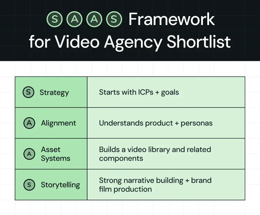
The Best Video Production Agencies for SaaS Companies
Note: Agencies are listed in no‑nonsense, SaaS‑centric terms: what they do best, where they fit, and when to shortlist or skip them.
1. ThunderClap
.webp)
ThunderClap is primarily known as a B2B web design and branding agency, but its team also produces explainers, demos, and event videos for SaaS, fintech, and AI brands as part of integrated website and funnel projects. Case studies such as DropIt (a 90‑second explainer built alongside a sales and event strategy) show how video, motion, and Webflow builds are treated as one system.
Why it stands out for SaaS
- Deep pattern recognition from 129+ B2B website revamps and 140+ launches across SaaS and fintech, with videos included in hero sections, product pages, and sales enablement.
- Proprietary frameworks like the SaaS Story Spine and S.C.R.E.E.N. Test for video storytelling, scripts, UI, and motion design.
Strong track record with brands like Amazon, Razorpay, Storylane, and Deductive.ai, plus Webby and CSS award recognition.
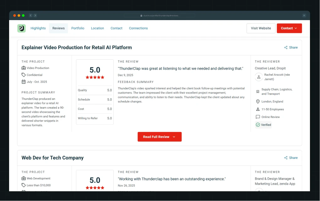
Who ThunderClap Is Built For
ThunderClap’s own ICP is built for mid‑market and enterprise B2B product companies headquartered across India, the US, and the UK. Within those companies, the primary buyers are CMOs, Heads of Marketing/Growth, PMMs, and founders who are staring at:
- A funding round, category pivot, or US/EU expansion,
- Product maturity and differentiation,
- Low demo sign‑ups, unclear positioning, and internal complaints.
In other words, ThunderClap is not optimized for SMBs or one‑off brochure sites; it is built for teams treating their website and product storytelling as core growth infrastructure.
📽️ThunderClap developed an exclusive product explainer video for Amazon Smart Commerce, currently used in their live events and private showcases.
What ThunderClap Actually Does (Beyond Web Design)
ThunderClap covers strategy, messaging, design, development, CRO, and ongoing optimization end‑to‑end. Its core offerings usually bundle:
- Integrated motion and video: product‑led animations, micro‑interactions, and explainer/product videos.
- Website strategy and CRO: full‑stack audits of UX, navigation, messaging, analytics, and conversion points.
- Positioning and copywriting: In-house PMMs clarifying ICPs, value propositions, and narratives.
How ThunderClap Approaches Video for SaaS
Even though ThunderClap’s primary label is a B2B web design & branding agency, video is embedded as a core part of how it designs product stories and landing pages for SaaS and fintech brands.
For WizCommerce, ThunderClap delivers a modern explainer video alongside the website and brand work. This is built to explain the product, support sales, and plug into event/launch campaigns.
So while you might still use a pure product demo video agency for very high‑volume production, ThunderClap is unique on this list as the partner that designs your website, messaging, and video as a single system for SaaS growth.
2. What a Story
What a Story is a dedicated explainer and demo video production agency with a strong focus on B2B SaaS and tech, offering a structured 7-9 step SaaS explainer process from discovery to animation and sound design. They explicitly market themselves as the specialized B2B SaaS explainer & demo video production company and publish detailed content on how to build effective SaaS demo videos.
Why it stands out for SaaS
- Clear, repeatable process: discovery → script → storyboard → design → animation → polish.
- Strong focus on clarity; their own materials show how to turn features into benefits and guide viewers through focused workflows rather than overwhelming them with every feature.
- Collaborative creative direction, giving SaaS teams predictability while retaining quality.
Best for
Seed to mid‑market SaaS companies that need a flagship explainer or demo library and want a partner who lives and breathes software storytelling.
3. Videodeck
Videodeck positions itself as a sales video production company built for B2B and SaaS teams, offering end‑to‑end production for product demos, sales enablement videos, and content marketing clips. Their YouTube presence reinforces this, with multiple videos focused on enterprise product demos and sales team content.
Why it stands out for SaaS
- Explicit focus on sales‑ready video assets used by reps to handle objections, show value, and close deals.
- A video as a service model where teams can send scripts or source content (like webinars or product docs) and get edited, on‑brand videos within days, ideal for fast‑moving SaaS GTM motions.
- Human‑shot content (actors and studios) rather than AI avatars, which matters for trust in higher‑ticket B2B sales.
Best for
B2B SaaS companies with active outbound and sales‑assist motions that need a stream of product, objection‑handling, and content marketing videos.
{{specficService}}
4. Yans Media
.webp)
Yans Media has designed animations in line with marketing strategy, producing explainer videos, motion‑graphics campaigns, and animated ads, with a clear focus on tech, SaaS, and B2B products. Third‑party lists of SaaS video agencies often place Yans near the top due to its specialization in crisp motion stories for decision‑makers.
Why it stands out for SaaS
- Track record with B2B and SaaS brands, including enterprise‑grade tech, suggesting comfort with longer sales cycles and value propositions.
- Strong 2D motion graphics that work well for data‑heavy products, security tools, and platforms where live‑action would not add much.
- Ability to deliver both full explainers and shorter motion snippets suitable for website heroes, product sections, and paid social.
Best for
SaaS products that are abstract, API‑focused, or infrastructure‑heavy, where motion graphics are better suited than studio shoots.
5. KrishaStudio
KrishaStudio runs a dedicated SaaS video production practice focused on explainer, product, and demo videos that explain products clearly, increase conversions, and support sales, onboarding, and growth teams. Their messaging is focused on SaaS pain points such as UI complexity, lead generation, and customer education.
Why it stands out for SaaS
- Positioning for SaaS companies focuses on clarity of explanation and growth.
- Services that map cleanly to SaaS funnels: product explainers, feature spotlights, onboarding, and support videos.
Best for
Bootstrapped to growth‑stage SaaS teams that need explainers and demos without an extensive creative retainer.
6. Levitate Media
Levitate Media is a B2B video company with experience in live‑action event coverage, customer testimonials, and corporate storytelling for tech and enterprise clients. Their own content highlights thousands of events and corporate videos produced, with a flexible model for remote, hybrid, and in‑person shoots.
Why it stands out for SaaS
- Strong fit for live events, user conferences, and customer summits, where capturing talks, panels, and customer interviews is critical.
- Experience in B2B and SaaS brands hosting field events or customer advisory boards.
- Can complement animation‑first partners by handling the human, testimonial, and event side of the video ecosystem.
Best for
Mid‑market to enterprise SaaS companies that run events and want high‑quality footage and testimonial libraries.
7. Motion The Agency
Motion The Agency is a corporate video specialist that produces explainer videos, product demos, and motion‑driven content for B2B brands, with clients including ClickUp and large tech conferences. It is ranked among the top corporate video agencies, with strong Clutch ratings, indicating high client satisfaction.
Why it stands out for SaaS
- Demonstrated ability to work with SaaS brands, suggesting familiarity with UI‑led storytelling and product‑led growth narratives.
- Breadth of services from 2D/3D animation to product demos and motion design.
- Strong focus on quality and structure, appropriate for high‑stakes campaigns, launches, or investor‑facing videos.
Best for
SaaS scale‑ups and enterprise‑adjacent tools where polish, narrative sophistication, and stakeholder impact are paramount.
{{specficBlog}}
Common Mistakes SaaS Teams Make When Hiring Video Partners
Even experienced growth teams run into predictable pitfalls when choosing a product demo video agency or broader partner.
Mistake 1: Choosing by video aesthetics alone
Cinematic shots and beautiful 3D can be seductive, but B2B SaaS buyers convert when they quickly understand what a product does and why it matters. External benchmarks show that while video can drive conversion lifts of up to 80-86%, poorly targeted or unclear videos can have no impact or even hurt performance.
Kiran Kulkarni, Head of Growth at ThunderClap, explains how to choose the right marketing bets and allocate your time and budget, especially when you’re new to video marketing and just getting started.
Mistake 2: Ignoring funnel fit
A single overview video often gets slapped onto the homepage, product page, and sales deck, even though top‑of‑funnel prospects, mid‑funnel evaluators, and late‑stage buyers need different levels of depth.
In a viral LinkedIn post on content attribution, Will Leatherman highlights:
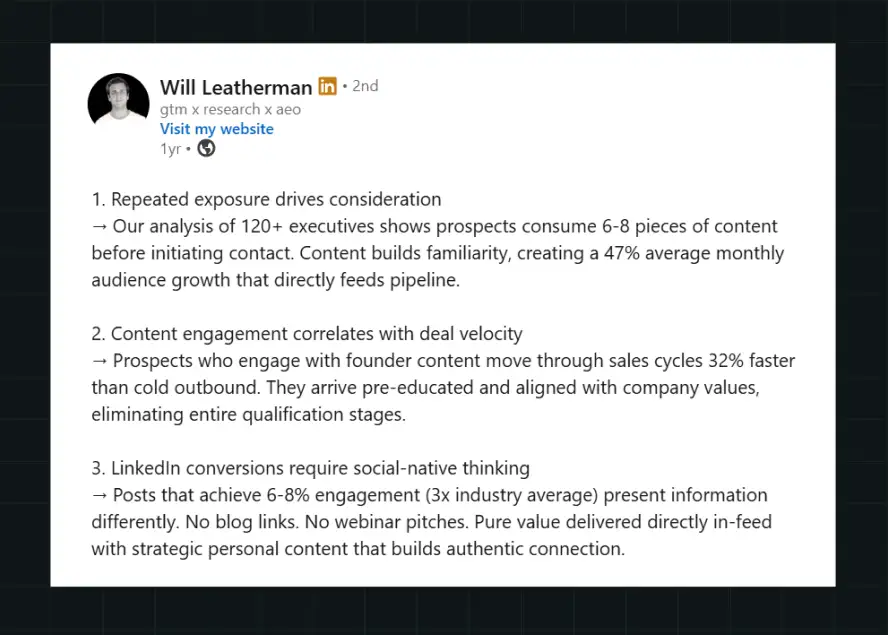
Mistake 3: Not clarifying ownership and updating workflows
SaaS UIs change fast; static, fully hard‑coded screencasts become outdated within months. When evaluating a B2B video production agency, ask how they plan for versioning, updates, and localization.
In this widely shared LinkedIn post, Dylan Hey shows that B2B marketers get better results when they use different types of shots in their videos.
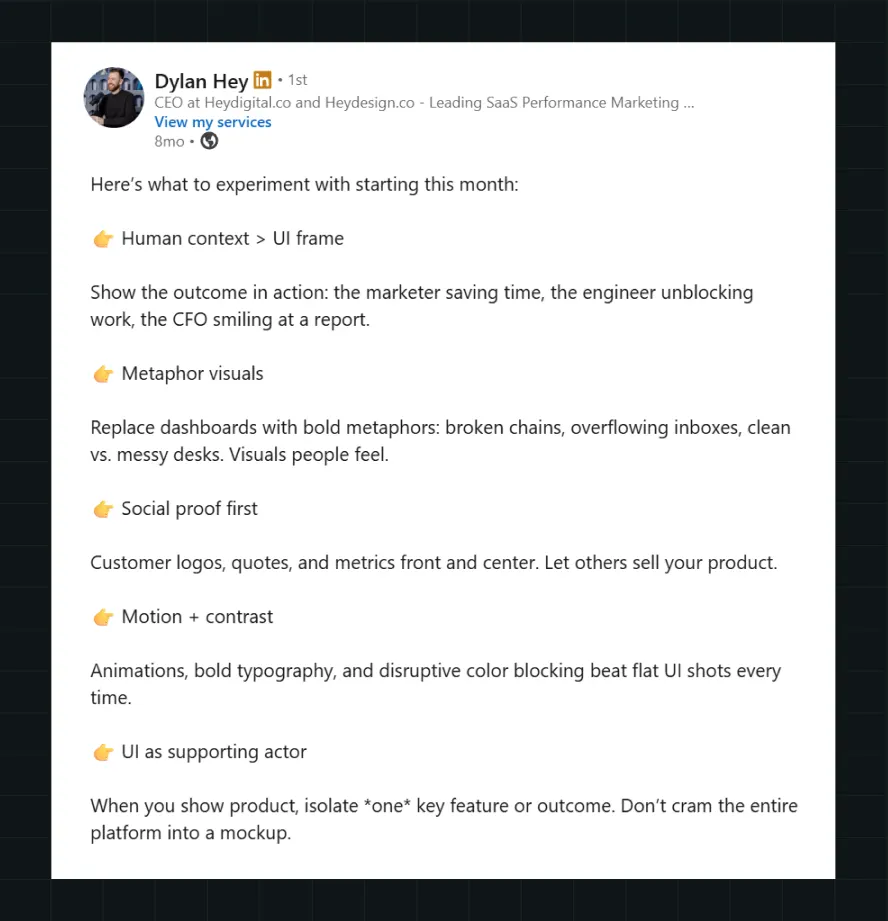
Mistake 4: Over‑investing in one flagship video instead of a system
Many SaaS teams pour most of their budget into a single hero brand film, hoping it will work everywhere: website hero, sales deck opener, paid campaigns, onboarding, and even investor pitches. The result is a beautiful but inflexible asset that can’t adapt to different ICPs, channels, or funnel stages.
Ayush Barnwal, Partner & CEO, ThunderClap, talks about essential tips to keep in mind while building a long-lasting B2B SaaS brand:
Ready to Choose a Video Partner That Understands SaaS Buyers?
In SaaS, video is only valuable when it helps buyers understand the product and trust the story behind it. That is exactly where ThunderClap stands out: as a B2B growth partner that builds clarity, credibility, and conversion into every asset.
ThunderClap has completed 129+ B2B website revamps and launched 140+ websites across SaaS, fintech, and AI, helping fast-growing brands turn complex offerings into sharper, higher-converting digital experiences. Its work with brands like Amazon, Factors, Razorpay, Storylane, Plivo, Z47, Elevation Capital, WizCommerce, 101 Gen AI, and Deductive AI demonstrates the trust SaaS teams place in a partner that understands both storytelling and performance.
Here’s how to evaluate ThunderClap vs others
- We map the video to your ICP, funnel stage, and business goal before we talk style. Most vendors start with the videos.
- We think in video libraries, cutdowns, sales clips, and onboarding assets to build a holistic brand.
- We judge success by demos, pipeline, activation, and retention support, not just views and vanity metrics.
- Our job is to shorten the time it takes for a SaaS buyer to get it, especially when the product is technical or crowded.
{{ctaBlock}}
FAQs
1. How do video production agencies align videos with business goals?
SaaS‑ready video production agencies begin with strategy: they clarify ICPs, buying stages, core value propositions, and the specific behavior each video should influence (e.g., more qualified demo requests, faster onboarding, higher feature adoption). From there, they design scripts, storyboards, and distribution plans that map each asset to a funnel stage and KPI.
2. Do video production agencies help with scriptwriting and storytelling?
Most specialized video production agencies for SaaS provide end‑to‑end support, including scriptwriting, storyboarding, and narrative frameworks. Top agencies like ThunderClap treat script and story as the core of the engagement, often running structured workshops and iterations before any design or animation work begins.
3. How is the success of a video measured?
Success is typically measured using a mix of engagement metrics (view‑through rate, completion rate, click‑through from video to next step) and business outcomes (conversion rate lift on pages with video, increased qualified leads, shorter sales cycles, improved onboarding, and lower support tickets). For SaaS teams, the most relevant KPIs include demo or trial sign‑up rates from pages featuring video, activation milestones reached after onboarding videos, and incremental revenue attributed to video‑assisted deals.
Fintech Web Design That Builds Trust: 8 UX Principles Every Fintech Site Needs
Most fintech brands fall into the growth trap. You obsess over funnels, CTAs, and paid ads, but forget what buyers actually care about: feeling safe. In fintech, the price you pay for ignoring trust is the very thing you’re chasing: conversions.
Trust begins the moment someone lands on your website. Before users trust your product, they judge your website, and if it doesn’t look credible, your funnel leaks before it even starts. That’s where fintech website design becomes your real growth driver.
With the fintech market projected to grow to over 1 trillion by 2032, earning trust is more important than ever.
After shipping 139+ websites, we know the trick is a funnel-first + trust-first UX approach. In this blog, we break down the 8 fintech UX principles we use at ThunderClap, the same ones that helped Razorpay, Zenda, Rezolv, Mysa, and other top fintechs turn their websites into trust- and conversion-driven engines.
8 UX Principles Every Fintech Website Should Follow
Here are the 8 UX principles every fintech web design should follow to earn trust while driving action.
#1 Pick Clean Typography To Build Trust
Typography shapes how you get perceived by your target audience. A 2022 study on typefaces by Monotype and Neurons confirms this.
“Simple shapes of a letter—what many take for granted—can spark a cognitive and emotional reaction, leading to a subconscious judgement around a brand’s honesty, sincerity or innovation,” - Phil Garnham, senior creative type director at Monotype
In the financial services sector, it makes all the difference. The right typeface gives buyers the confidence to trust you with their money. Earlier, traditional serif fonts used to do the trick, but today, brands need to stand out while looking credible.
And according to Ayush Barnwal, Partner at ThunderClap, “the trick is to pick thin, lower weight fonts as they look clean, sophisticated and legible while adding a layer of credibility to your websites”. Cleaner and modern fonts also help create visual harmony and deliver a seamless user experience.
Principle in practice
Rezolv, one of our fintech clients, is a good example of this. As a debt collector platform selling to major banks in India, the brand needs to communicate its value while looking trustworthy. Notice how their website looks modern, approachable, and trustworthy with the right typeface!
#2 Use Product Animations To Boost Conversions
“Why should I trust you over your competitors?” That essentially sums up the modern fintech buyer mindset. And often the difference comes down to how fast you can show them your product’s value.
One way is through product animations because they show and don’t just tell. When added alongside website copy, it helps buyers understand your value proposition, visualize your product, and even get a taste of it.
36% of marketers report that animated content has a measurable impact on their major KPIs. This includes looping product and feature demos, as well as ones that symbolically explain how your product works. In fact, custom-made ones are a great add-on for brand and product recall.
“And that’s exactly why 2 out of 5 of our clients, especially fintech ones, ask for product animations on their websites! It’s about taking the cognitive load off your buyers, simplifying concepts so they know what exactly they are signing up for”, says Ayush.
Principle in Practice
A perfect example of this is our client, Refo, a banking platform. Their website uses product animations to explain its core value proposition, key features, and use cases. Their animations are detailed enough to work with or without copy, instantly conveying value to users.
{{specficBlog}}
#3 Think Beyond The Color ‘Blue’ To Stand Out
Fintech brands' obsession with the color blue is no surprise. Picking a color that signals trustworthiness and stability makes sense when 90% buyers judge your brand based on color alone.
But times have changed. With digital-first millennial and Gen Z buyers, it's more about differentiation than credibility. They already trust fintech brands, but when you look like any other brand out there, with the same blue tones, fonts, and similar fintech branding voice, you force them into decision fatigue.
“The key is to think beyond the color blue. At ThunderClap, we encourage our fintech clients to be bold and experiment with different colors. While not many are brave enough to go all in, green has worked well, most see it as a safe choice”, remarks Ayush.
Also Read: Best practices in B2B web design
Principle in Practice
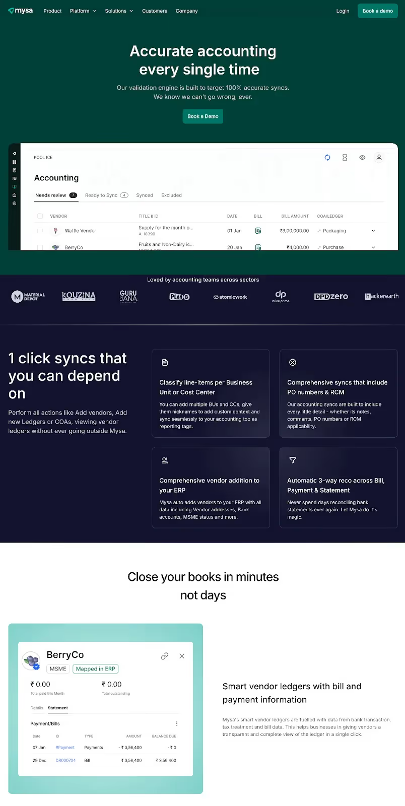
Our client, Mysa, a unified finance and banking platform, uses green against both lighter and darker backgrounds to convey trustworthiness and innovation. The choice also helps them reinforce their AI-powered identity.
#4 Add Microinteractions To Boost Clarity And Engagement
Microinteractions are the quiet workhorses of UX website design. You might not notice them when they’re there, but you’ll definitely notice when they’re missing. And their absence is felt twice as much in fintech websites where buyers expect reassurance at every step.
These tiny design elements guide users through the websites, nudging them to take specific actions. This includes the subtle CTA color changes, pulsing hints, progress rings, and confirmation ticks.
When done right, they speed up time to value, boost engagement, and improve the overall UX.
“For fintech brands, microinteractions are a chance to actually humanize your product. Even simple things like a progress bar or breaking forms into steps stop users from feeling overwhelmed and build trust”, adds Ayush.
Principle in Practice
The best example is US-based neobank Varo’s website. It’s one of those fintech brands that don’t look like one but still nail showing product value and credibility. The website contains multiple microinteractions, like CTA color changes, a clickable stepper for copy, in-line error messages, and a real-time password checker.
#5 Use Product Videos To Deliver Faster Aha Moments
83% of buyers prefer brands using videos over written text for product explanations. That explains why Wistia ranks product videos as the most impactful video type in 2025.
And in the fintech space, that impact is twofold: they cut through the dryness of fintech concepts while building trust in buyers. It’s the shortcut buyers can take to get to the ‘what’s in it for me’ (WIIFT) fast.
And when done right, they can be a chief factor that makes your product and brand unforgettable.
“There’s no single 'best' type of product video. You can go for animated, live-action, or even hybrid ones, depending on what you want to achieve. For instance, animated videos simplify complex ideas, live-action builds trust, and a hybrid approach helps your brand stand out”, adds Ayush.
Principle in Practice
US-based fintech startup Brex’s product video on its website is a great example. In under 2 minutes, the video clearly explains their core value proposition and how the product works.
#6 Show Trust and Security Cues To Reduce Fraud Anxiety
In fintech, your battle is against fear: fear of getting scammed, hidden fees, regulatory issues, and data misuse —the list goes on.
With fraud losses increasing by 25% in 2024 compared to 2023, fintech buyers are more skeptical than ever. Bank-grade encryption means nothing if you can’t prove it to buyers. They need two layers of reassurance at every step: 1) that you are legally compliant, and 2) that you are trustworthy.
Here’s what it looks like in action on a fintech website:
1. Clear assurances at each step
Be upfront about fears and hesitations. Use microcopy to reassure them.
Example: “No hidden fees — what you see is what you pay.”
2. Allow easy corrections
Buyers fear irrevocable mistakes when it comes to banking. Alleviate this by giving them control through easy revision options.
Example: “Review and edit” option or a 30-second correction window after submitting.
3. Guide users through actionable hints
“Why do you need this information?”, “Am I doing it right?”, “Where can I find this?”. These are the questions running through a fintech buyer's mind. Contextual help at the right moment reduces hesitation.
Example: “Your account number is usually 10–12 digits. Find it in your statement.”
4. Visualize security cues
Small steps like lock icons, masking inputs, step confirmations, color cues, and placing CTAs strategically all compound to build stronger buyer confidence. Use them wherever necessary to make users feel safe.
Example: A checkmark that pops up after a successful login.
Principle in Practice


Chime checks all the boxes. From clear assurances, security cues, contextual hints, and easy edits, this finance website design is primed to ease fraud anxiety at every step.
{{specficService}}
#7 Disclose Information Progressively To Prevent Overload
Trust-first design is about earning user confidence before asking for commitment. In fintech, transparency builds trust, but that doesn’t mean dumping every detail at once. Most websites fail here, overwhelming users before they even see your offer.
It’s not about hiding information either, but disclosing it gradually so users never feel lost. Progressive disclosure in fintech web design looks like:
- Breaking crucial financial journeys into digestible steps, showing one decision per screen.
- Using progress indicators to show where users are in the process.
- Offering on-demand depth, like tooltips and collapsible FAQs, gives details without cluttering the main flow.
Principle in Practice
Stripe’s account activation process is a great example. It unfolds progressively, one step at a time, shows a progress bar at the top left, and uses tooltips and FAQ links to give helpful context.
#8 Avoid Financial Jargon To Improve Comprehension
The financial services industry is infamous for fine print and hard-to-understand language. But in fintech, when your trust factor is already at risk, every misunderstood term is a drop in the funnel.
To avoid this, make clarity and comprehension your north star in fintech copywriting. Writing in clear, everyday language benefits everyone, from non-native speakers to older adults, and reduces cognitive load.
Some fintech copywriting tips to avoid overwhelming buyers include:
- Replace insider terms with everyday language: Instead of “overdraft,” use “negative balance,” or “extra charges” for spending beyond available funds.
- Use microcopy to explain outcomes: Use “Deleting this account is permanent” instead of “Delete account.”
- Maintain consistent terminology across screens: Use “Transaction history” on all screens instead of switching between “History” or “Activity.”
- Conduct clarity testing to validate phrasing: Ask real users to explain what your product or a specific feature does based on your copy.
Principle in Practice
Our recent revamp project for Zenda demonstrates this perfectly. The website copy is written in clear, simple language, making it easy for schools and parents (their target audience) to learn the ropes of the platform.
Ready To Put These Principles Into Action?
Adhering to these 8 UX principles, from clear typography and microinteractions to product animations and social proof, gives you a head start over most competitors. But true category leadership comes from funnel-first, trust-first designs.
As a leading fintech design agency, ThunderClap delivers fintech web design services that include:
- Deep fintech expertise: Leaders in fintech branding who understand the buyer’s language, from pre-PMF startups to enterprise brands.
- Growth-driven designs: Websites that resonate with both investors and customers.
- Ability to build for scale and security: Optimized for fast-growing fintech startups without compromising security.
- Competitive timelines: Enterprise-grade fintech websites delivered in under 10 weeks.
- Impressive client roster: Trusted by top fintech brands like RazorPay, Zenda, Mysa, Refo, and Rezolv.
{{ctaBlock}}
FAQs
1. How to make your fintech websites look more trustworthy?
You can make your fintech website design more trustworthy by:
- Opting for a clean and legible typography
- Experimenting with colors other than blue
- Using animations to visualize your product
- Adding microinteractions across the website
- Priming your website for speed and performance
2. What are the common UX mistakes fintech brands commit?
Some of the most common UX mistakes fintech brands commit include:
- Visually blending in with other brands by sticking to the corporate blue color
- Using jargon-heavy language and huge walls of copy to educate the buyers
- Not adding enough social proof
3. Are fintech websites with dark themes less trustworthy?
No, dark themes in fintech website design aren’t necessarily less trustworthy. In a competitive fintech space, standing out visually matters. If a dark theme does that without confusing users, go for it. The key is to maintain trust through clarity and consistency, not just color.
4. Should fintech websites always use the color blue?
While the color blue signals trust, using it in today’s crowded fintech market is not a good move; instead, you can try colors like green, violet, and purple. Or if you are bold enough, you can even experiment with colors like neon green. The key is to have a strong ‘why’ behind it, no matter the color you choose.
5. What should be the load time of a fintech website?
The average load time of any website, regardless of the industry it belongs to, should be less than 2 seconds. Any website that takes longer affects your efficiency and credibility.
6. Does my brand need specialized fintech website design services?
The answer depends on several other factors, such as your goals and budget. For instance, if you aim for category leadership and have the budget, it makes sense to outsource your website to one of the best fintech design agencies.
These agencies, with their deep fintech expertise, let you build a website that cuts through the noise while looking trustworthy. However, if you are just starting out, it is enough to follow these eight principles rigorously.


Interested in seeing what we can do for your website?



.webp)
